Migrating from Material to fossui
July 24, 2026
Most Flutter apps look like Material because Material is what you get for free.
fossui is a small component set for the apps that would rather not. It reads its
own theme, drops into a MaterialApp, CupertinoApp, or a bare WidgetsApp,
and carries one runtime dependency.
This is a migration guide, not a rewrite guide. You do not have to rip out
MaterialApp. You swap widgets one screen at a time and let the two sit side by
side until you are done. Below is the setup, then a widget-by-widget map, then
the one mindset change that trips people up: styling lives in the theme, not on
the widget.
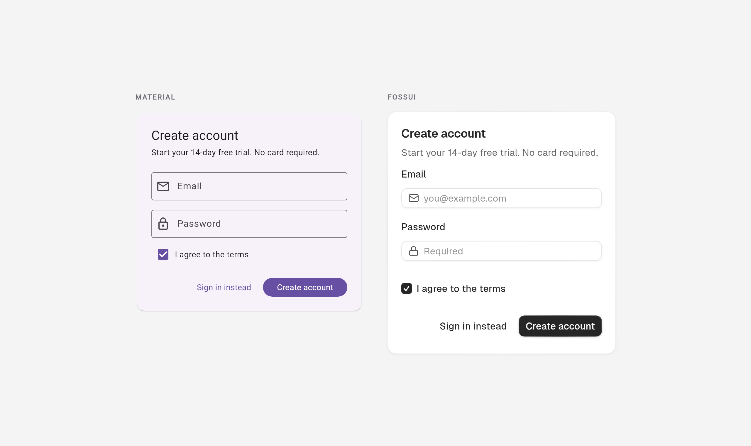
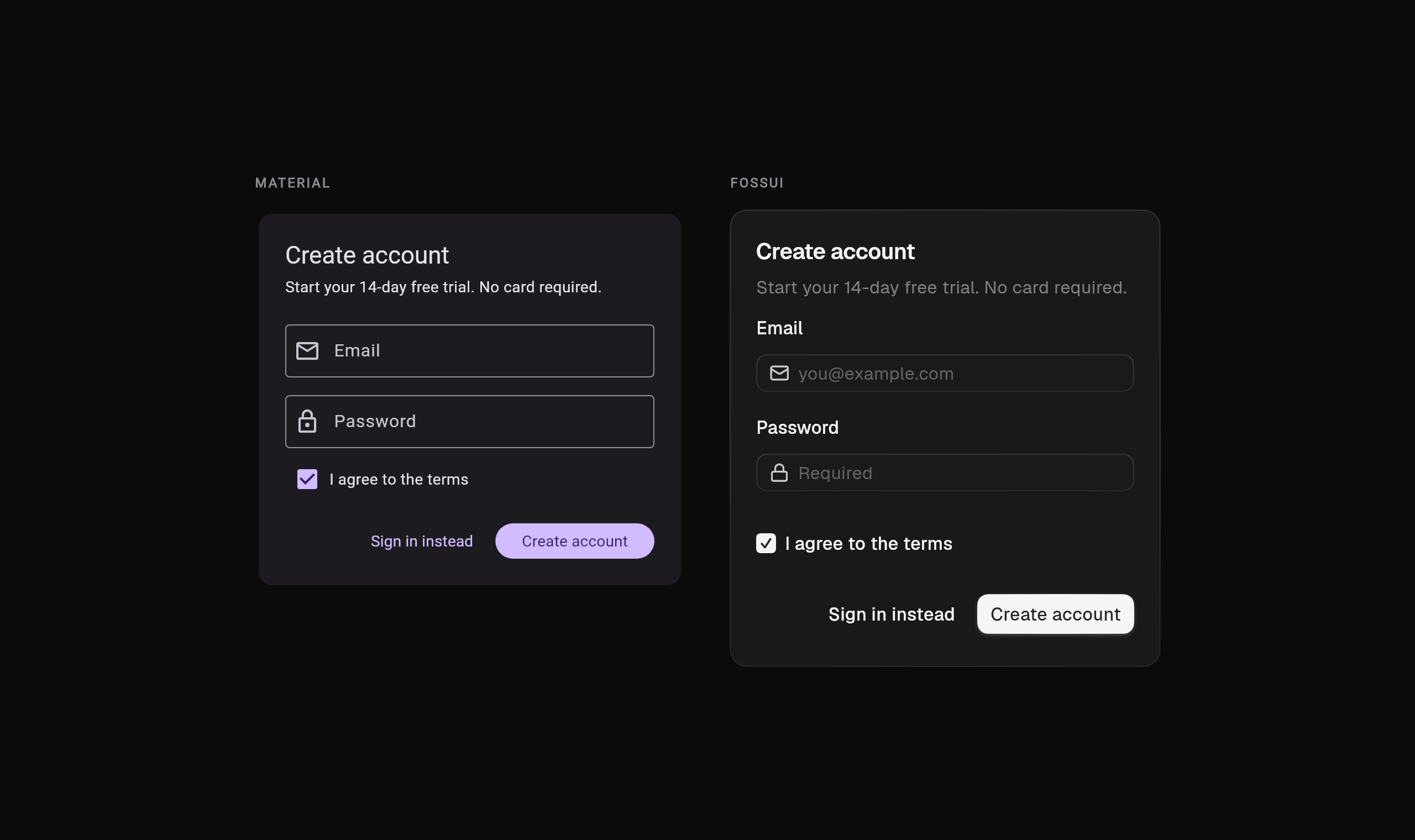
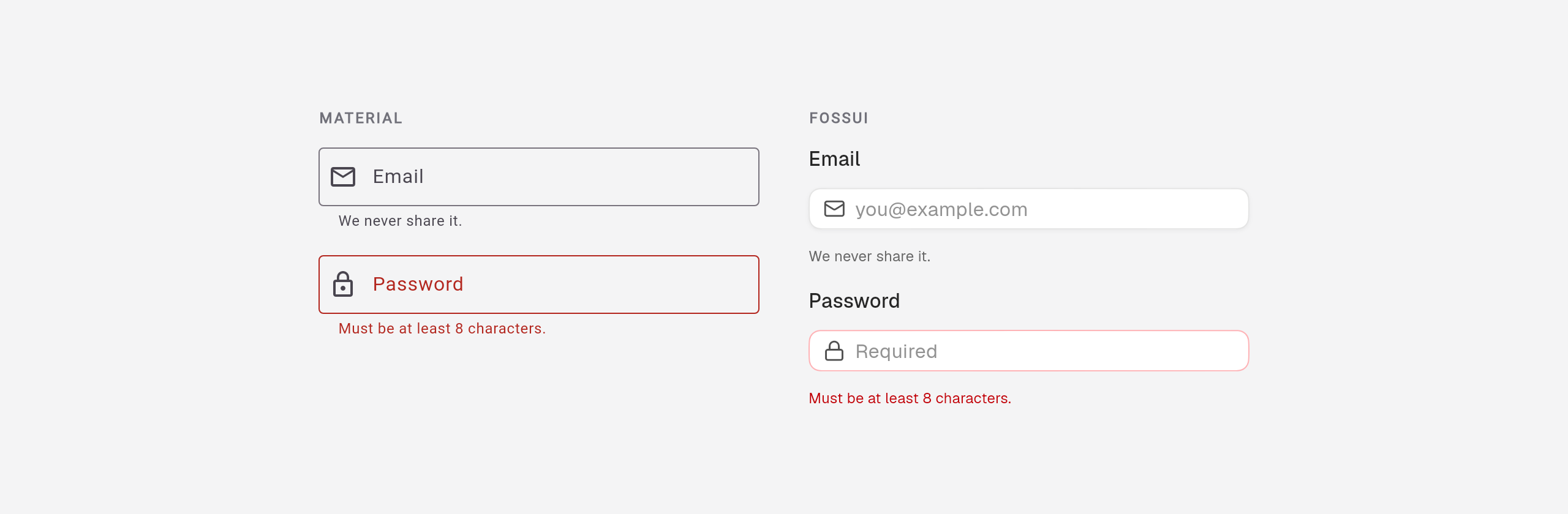
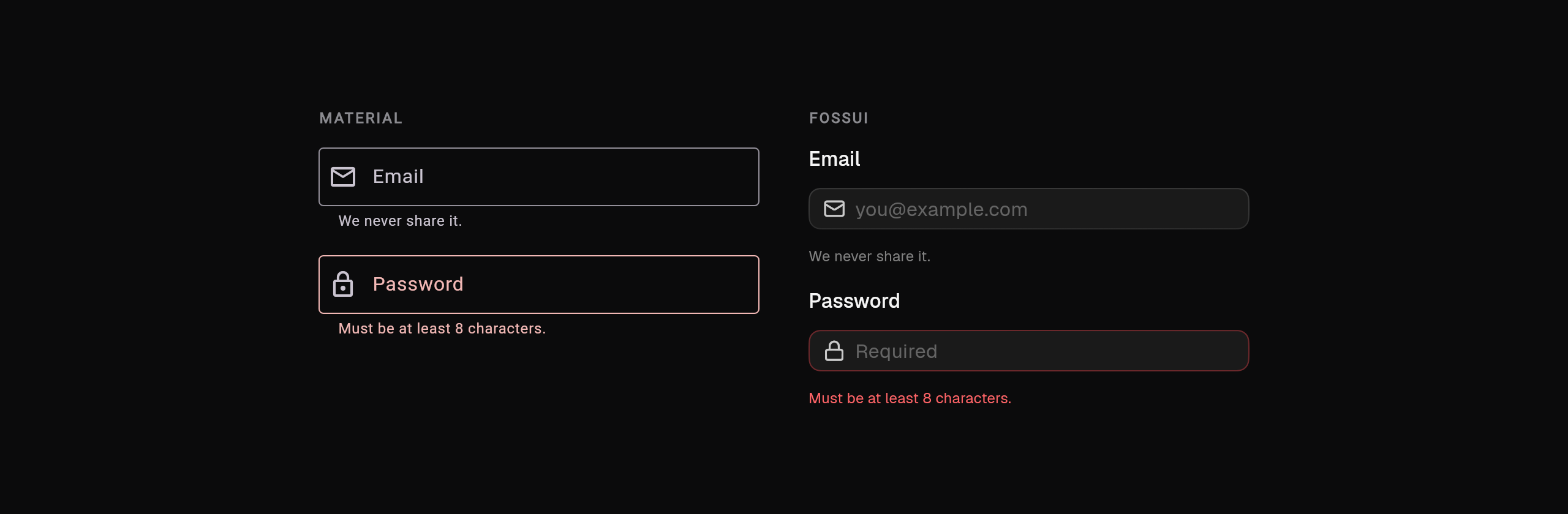
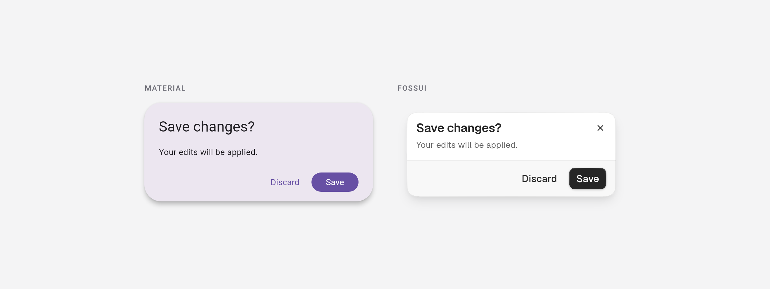
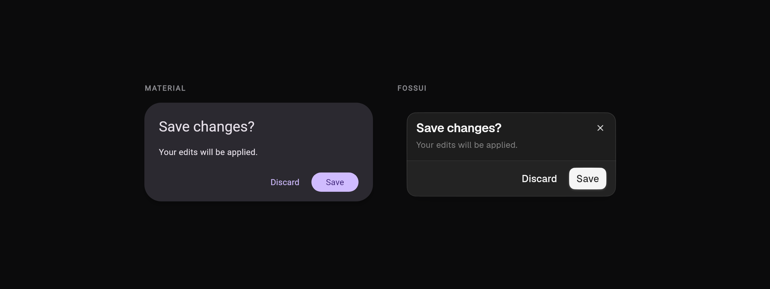
Same screen, same content. The only thing that changed is the design system.
Setup: register the theme
Keep your MaterialApp. Point its theme at fossui's:
import 'package:flutter/material.dart';
import 'package:fossui/fossui.dart';

void main() => runApp(const MyApp());

class MyApp extends StatelessWidget {
  const MyApp({super.key});

  @override
  Widget build(BuildContext context) {
    return MaterialApp(
      theme: FossThemeData.light.toThemeData(),
      darkTheme: FossThemeData.dark.toThemeData(),
      home: const HomePage(),
    );
  }
}
toThemeData() injects the fossui tokens as a theme extension, so every fossui
widget below it finds them. Your existing Material widgets keep working, so a
half-migrated screen is fine.
Not on Material? Wrap the subtree in FossTheme instead and the same components
work unchanged:
FossTheme(
  data: FossThemeData.light,
  child: const MyApp(),
)
Read a token anywhere with context.fossTheme:
final theme = context.fossTheme;
theme.colors.primary;   // Color
theme.radii.lg;         // double
theme.spacing(2);       // 8.0
theme.typography.sm;    // TextStyle
The widget map
Buttons
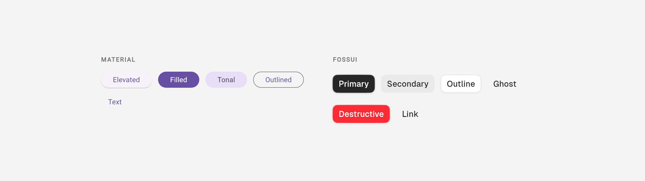
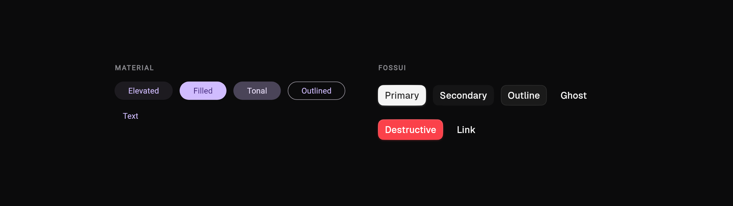
Material spreads buttons across five classes. fossui has one, FossButton, with
a variant:
// Material                              // fossui
ElevatedButton(onPressed: f, child: t)   FossButton(onPressed: f, child: t) // primary
FilledButton.tonal(...)                  FossButton(variant: FossButtonVariant.secondary, ...)
OutlinedButton(...)                      FossButton(variant: FossButtonVariant.outline, ...)
TextButton(...)                          FossButton(variant: FossButtonVariant.ghost, ...)
Variants: primary, secondary, outline, ghost, destructive, link.
Sizes: sm, md, lg (default md).
Icons ride in leading / trailing, and a loading state is built in, so you no
longer swap the child for a spinner by hand:
FossButton(
  onPressed: _save,
  loading: _saving,
  leading: const Icon(LucideIcons.download),
  child: const Text('Save'),
)
An IconButton becomes FossButton.icon, which requires a semanticLabel:
FossButton.icon(
  onPressed: _copy,
  icon: const Icon(LucideIcons.copy),
  semanticLabel: 'Copy',
)
Icon slots take any Widget, so Lucide, Material Icons, Cupertino, or an SVG
all work. fossui ships no icon package; the examples use Lucide by convention.
Text fields
TextField and TextFormField collapse into FossTextField, which folds the
label, helper, and error text you used to build with InputDecoration into
named parameters:
// Material
TextField(
  controller: c,
  decoration: const InputDecoration(
    labelText: 'Email',
    helperText: 'Work address',
    prefixIcon: Icon(Icons.mail),
  ),
)

// fossui
FossTextField(
  controller: c,
  label: 'Email',
  helperText: 'Work address',
  leading: const Icon(LucideIcons.mail),
)
Set errorText to show the error state, obscureText: true for passwords, and
maxLines above 1 to get a textarea (it grows with content and drops the icon
slots).
Cards
FossCard is slot-based rather than a bare container, so the common header and
footer layout is named instead of hand-built:
FossCard(
  title: const Text('Invite your team'),
  description: const Text('Add up to five members on the free plan.'),
  content: const FossTextField(label: 'Email'),
  footer: FossButton(onPressed: _invite, child: const Text('Send invite')),
)
Selection controls
Checkbox, switch, and radio each carry their own label, so CheckboxListTile
and friends are no longer needed for the ordinary case:
FossCheckbox(
  value: _agreed,
  onChanged: (v) => setState(() => _agreed = v),
  label: 'I agree to the terms',
  description: 'You can revoke this later in settings.',
)

FossSwitch(
  value: _notify,
  onChanged: (v) => setState(() => _notify = v),
  semanticLabel: 'Push notifications',
)
Radios are generic and live inside a group that owns the value, which replaces
the shared groupValue you wired across every Radio:
FossRadioGroup<String>(
  groupValue: _plan,
  onChanged: (v) => setState(() => _plan = v),
  children: const [
    FossRadio(value: 'free', label: 'Free'),
    FossRadio(value: 'pro', label: 'Pro'),
  ],
)
FossCheckbox value is tristate (true, false, null), same as Material.
Sliders
Close to a straight swap:
FossSlider(
  value: _volume,
  onChanged: (v) => setState(() => _volume = v),
  min: 0,
  max: 100,
  divisions: 10,
)
Tabs
TabBar plus TabBarView plus a TabController becomes one FossTabs that
holds both the tabs and their content:
FossTabs<String>(
  value: _tab,
  onChanged: (v) => setState(() => _tab = v),
  tabs: const [
    FossTab(value: 'account', label: 'Account', content: AccountPanel()),
    FossTab(value: 'billing', label: 'Billing', content: BillingPanel()),
  ],
)
Variants are segmented (default) and underline.
Badges, tooltips, progress
// Chip / status pill
FossBadge(label: const Text('New'), variant: FossBadgeVariant.success)

// Tooltip
FossTooltip(
  message: 'Copy to clipboard',
  child: FossButton.icon(
    onPressed: _copy,
    icon: const Icon(LucideIcons.copy),
    semanticLabel: 'Copy',
  ),
)

// LinearProgressIndicator
FossProgress(value: 0.6, label: 'Uploading')

// CircularProgressIndicator
const FossSpinner()
Dialogs
showDialog with an AlertDialog maps to showFossDialog with a
FossAlertDialog:
showFossDialog<void>(
  context: context,
  builder: (context) => FossAlertDialog(
    title: const Text('Delete project?'),
    description: const Text('This cannot be undone.'),
    actions: [
      FossButton(
        variant: FossButtonVariant.ghost,
        onPressed: () => Navigator.pop(context),
        child: const Text('Cancel'),
      ),
      FossButton(
        variant: FossButtonVariant.destructive,
        onPressed: _delete,
        child: const Text('Delete'),
      ),
    ],
  ),
)
Dialogs present as a bottom sheet by default (mobile-first); pass
presentation: FossDialogPresentation.centered for the classic centered box.
The rest, at a glance
| Material | fossui |
|---|---|
Divider | FossSeparator |
CircleAvatar | FossAvatar |
ToggleButtons | FossToggleGroup |
ExpansionTile | FossAccordion |
Drawer / showModalBottomSheet | showFossDrawer |
SnackBar | FossToast via FossToastController |
Text with theme styles | FossText(size:, weight:, color:) |
The one real change: styling moves to the theme
This is the part that feels different, and it is deliberate. In Material you restyle at the call site:
ElevatedButton(
  style: ElevatedButton.styleFrom(
    backgroundColor: Colors.green,
    shape: RoundedRectangleBorder(borderRadius: BorderRadius.circular(20)),
  ),
  onPressed: f,
  child: t,
)
fossui does not take color:, borderRadius:, or padding: on the widget. That
is on purpose: per-instance overrides are how a design system drifts into forty
slightly different buttons. You change the look in one place instead.
            MATERIAL                                  FOSSUI
      styling at each call site                  styling in the theme

   ┌───────────────────┐                       ┌────────────────────┐
   │  ElevatedButton   │◄── styleFrom(color)   │    FossThemeData    │
   ├───────────────────┤                       │  colors · radii    │
   │  OutlinedButton   │◄── styleFrom(radius)  │  spacing · type    │
   ├───────────────────┤                       │  shadows · motion  │
   │    TextButton     │◄── styleFrom(padding) └─────────┬──────────┘
   ├───────────────────┤                                 │
   │    IconButton     │◄── styleFrom(...)                │ flows down
   ├───────────────────┤                       ┌─────────┼─────────┐
   │      Card         │◄── shape/color/...     ▼         ▼         ▼
   └───────────────────┘                    ┌──────┐ ┌───────┐ ┌──────┐
                                            │Button│ │ Field │ │ Card │
   every widget restyled by hand           └──────┘ └───────┘ └──────┘
   settings drift apart over time          one source, all consistent
To move the whole app, retheme once:
final theme = FossThemeData.light.retheme(
  const FossThemeSpec(
    primary: Color(0xFF16A34A),
    radius: 22,
    fontFamily: 'Plus Jakarta Sans',
  ),
);

MaterialApp(theme: theme.toThemeData());
For a genuine one-off, every component takes a single style object as the
escape hatch:
FossButton(
  style: const FossButtonStyle(borderRadius: 4),
  onPressed: f,
  child: const Text('Square'),
)
Two levers, in order: retheme for everything, style for the exception. If you
find yourself reaching for style on most instances, that is a sign the theme
should carry the value.
A sensible migration order
- Register the theme. Nothing else has to change yet.
- Swap the leaf widgets first: buttons, text fields, badges. Low risk, quick wins, and it surfaces the theming model early.
- Move containers and flows: cards, dialogs, tabs.
- Delete the Material styling you no longer need (the
styleFromcalls, theInputDecorationboilerplate, the localThemeDataoverrides).
You can stop at any step and ship. Material and fossui coexist under the same
MaterialApp, so a partial migration is a real state, not a broken one.
What to expect
fossui is young and mobile-first. It sizes for touch and targets mobile; web and desktop compile and should work, but they are less exercised, so test the platforms you ship. The component set covers the common ground, not everything Material has. What you get in return is a smaller surface, one dependency, and an app that stops looking like every other Flutter app.