Minimal Flutter UI kits compared: fossui vs Material (2026)
July 25, 2026
Every Flutter app starts with Material, because Material is what ships in the box. It is complete, first-party, and battle-tested. It also means most Flutter apps look like each other.
fossui is a minimal alternative: a small component set built on
package:flutter/widgets.dart that reads its own theme and carries one runtime
dependency. This post compares the two on the two things you actually weigh when
you pick a UI kit: how it looks, and how the API feels to write. Numbers here come
from our own component-by-component audit, so treat them as one opinion with the
receipts attached, not a neutral benchmark. The screenshots are the same widgets
rendered both ways, so you can judge the look yourself. Toggle the site theme and
they follow.
Short version: Material wins on maturity, breadth, and accessibility depth. fossui wins on default look, API shape, and footprint. The rest of this post shows where each of those is true.
How it looks
Same screen, same content, rendered with each kit. The only variable is the design system.
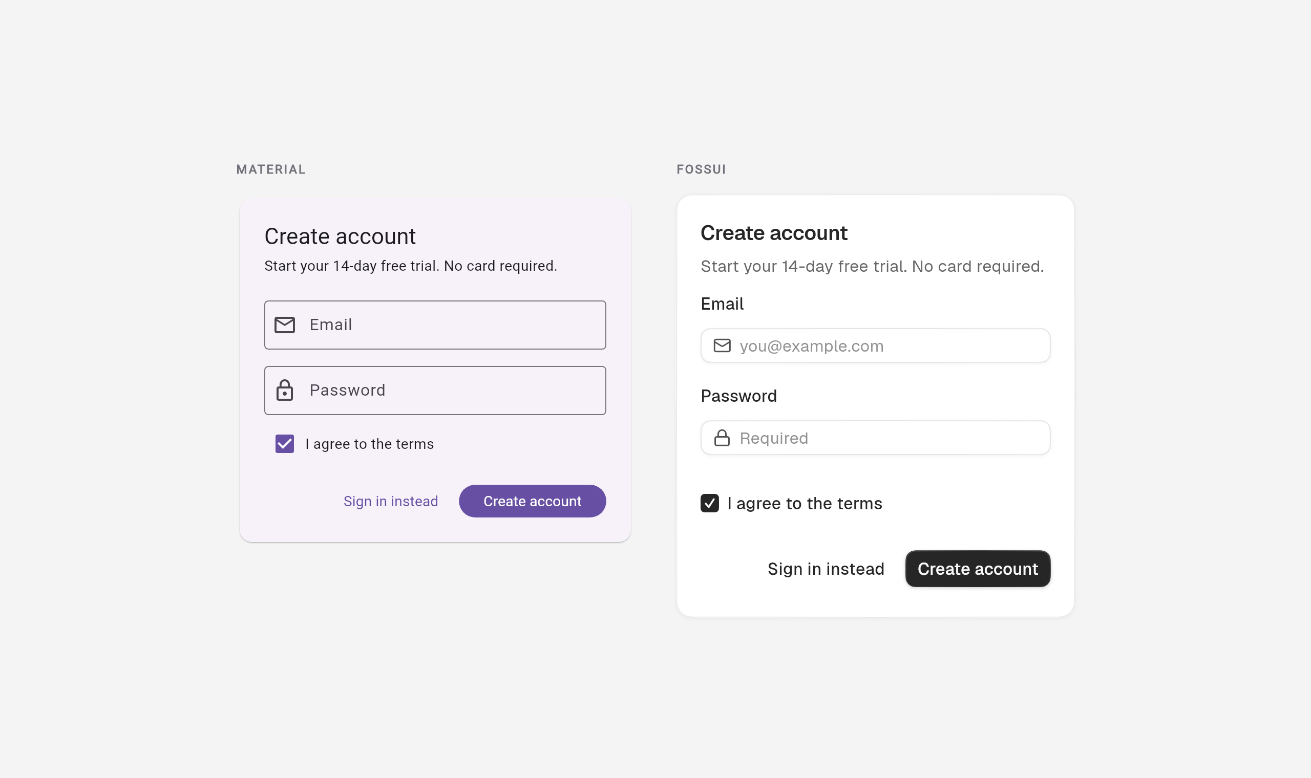
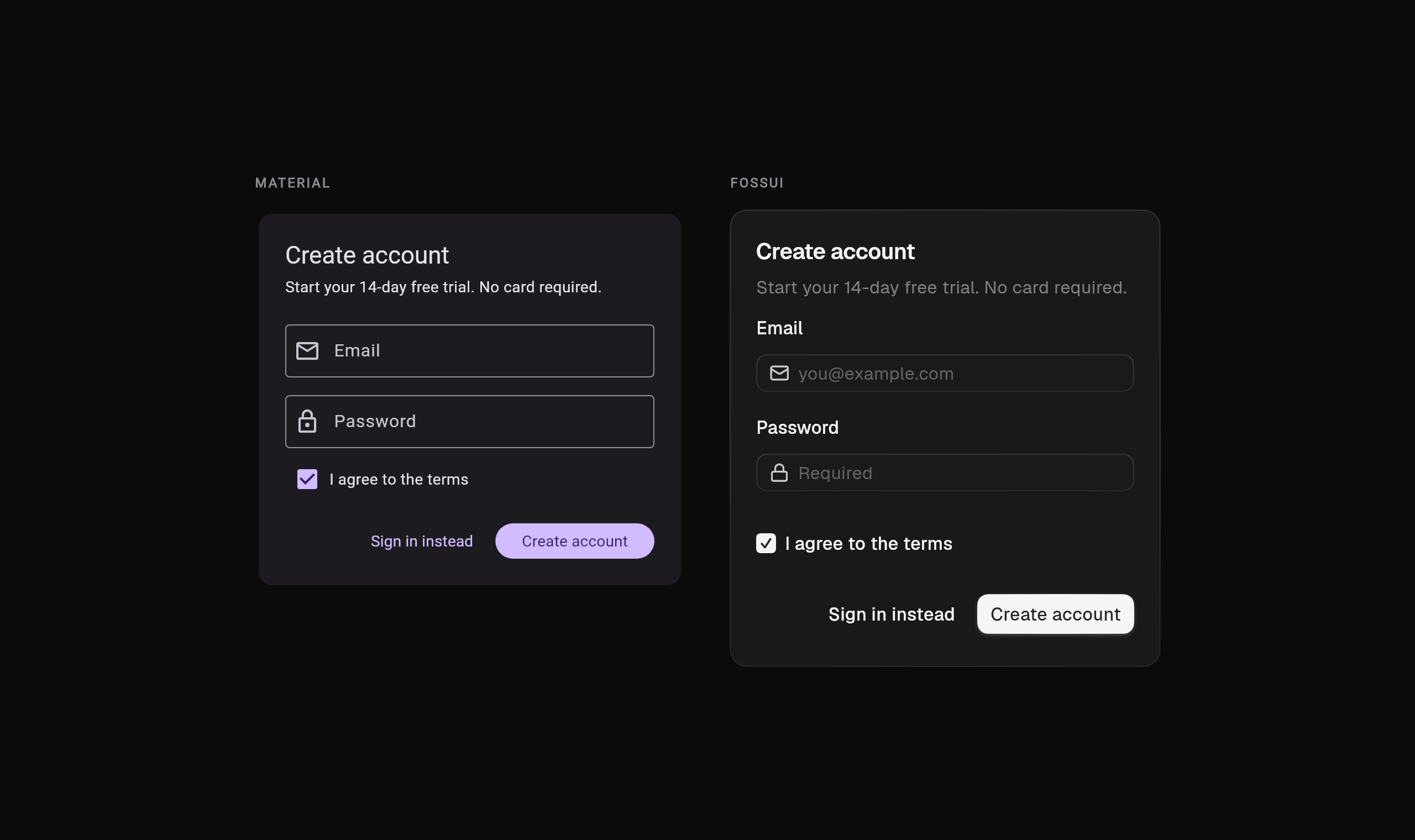
Material 3 gives you tinted surfaces, a seeded color scheme (the purple is the default), rounded-pill buttons, and filled input boxes. fossui renders a neutral palette, superellipse (squircle) corners, a mono primary button, and tighter outlined inputs. Neither is wrong. They are different houses.
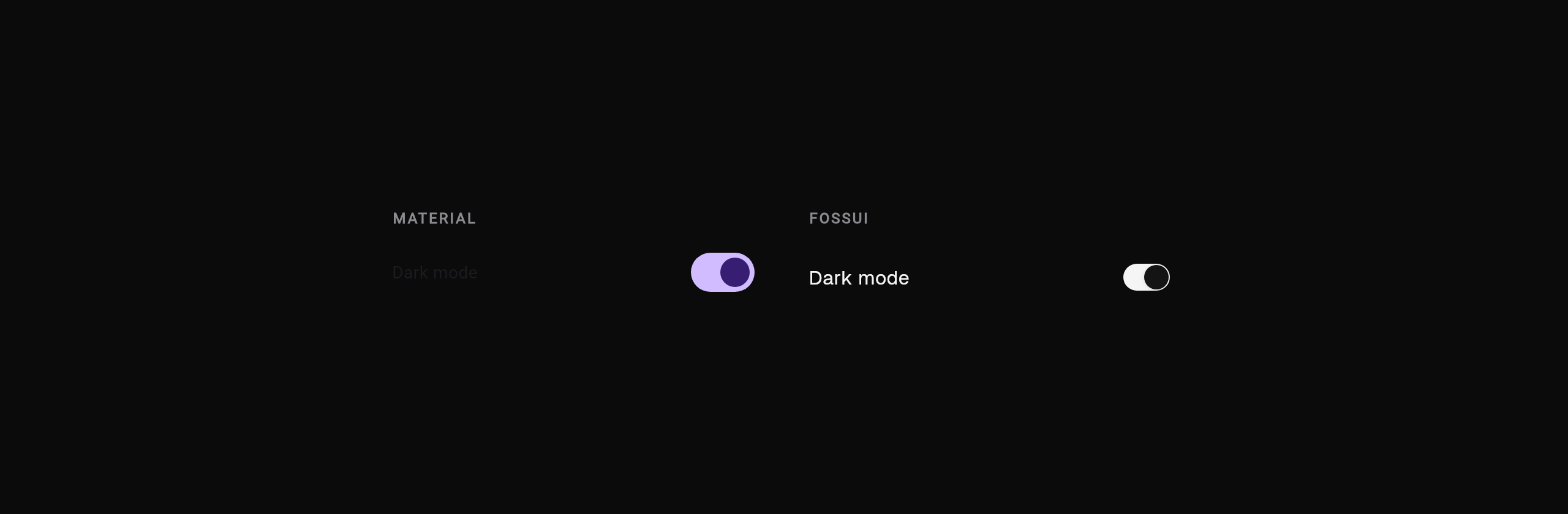
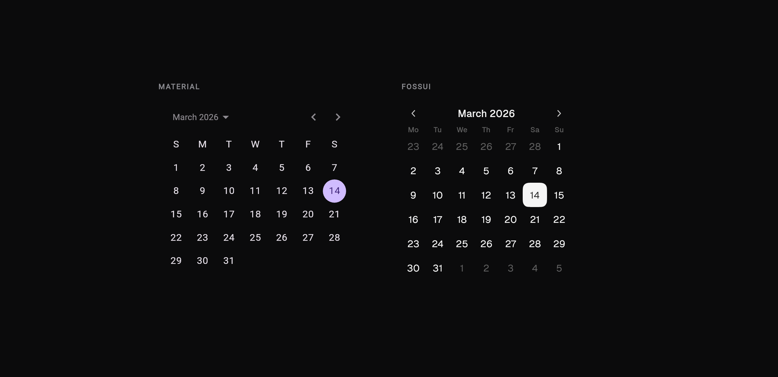
What follows is every component, rendered both ways. Each image swaps with the site theme, so flip the toggle to see the dark pair.
Buttons and toggles
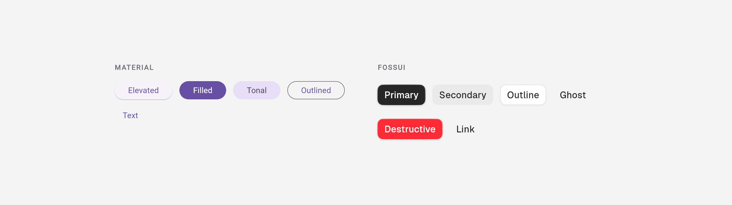
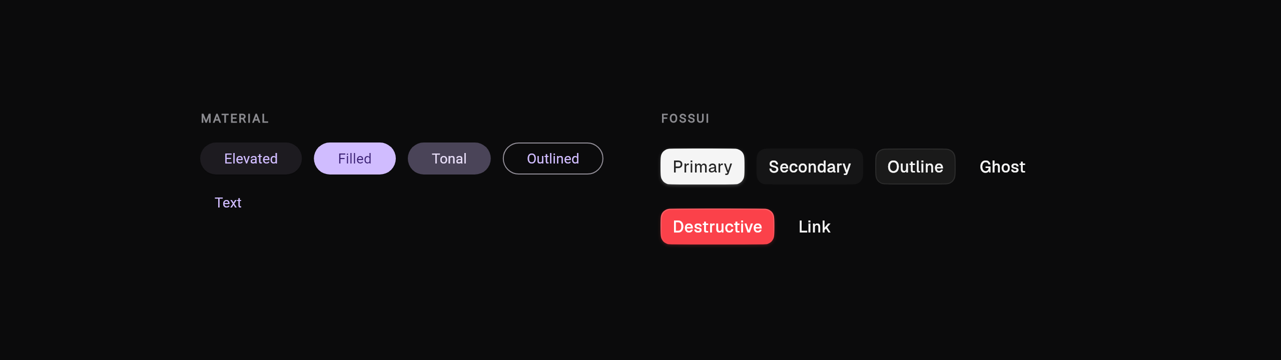
Buttons. Material spreads emphasis across five classes; fossui folds it into
one FossButton with a variant.
FilledButton(onPressed: save, child: const Text('Save'));
OutlinedButton(onPressed: cancel, child: const Text('Cancel'));FossButton(onPressed: save, child: const Text('Save'));
FossButton(
variant: FossButtonVariant.outline,
onPressed: cancel,
child: const Text('Cancel'),
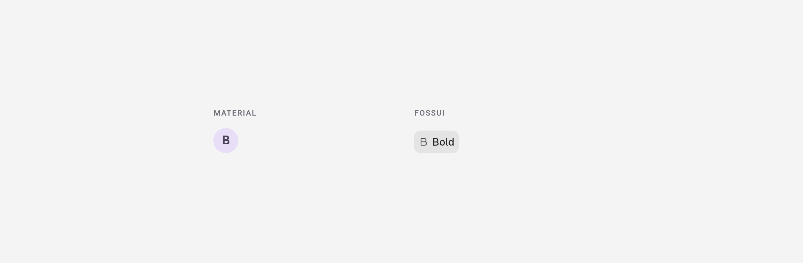
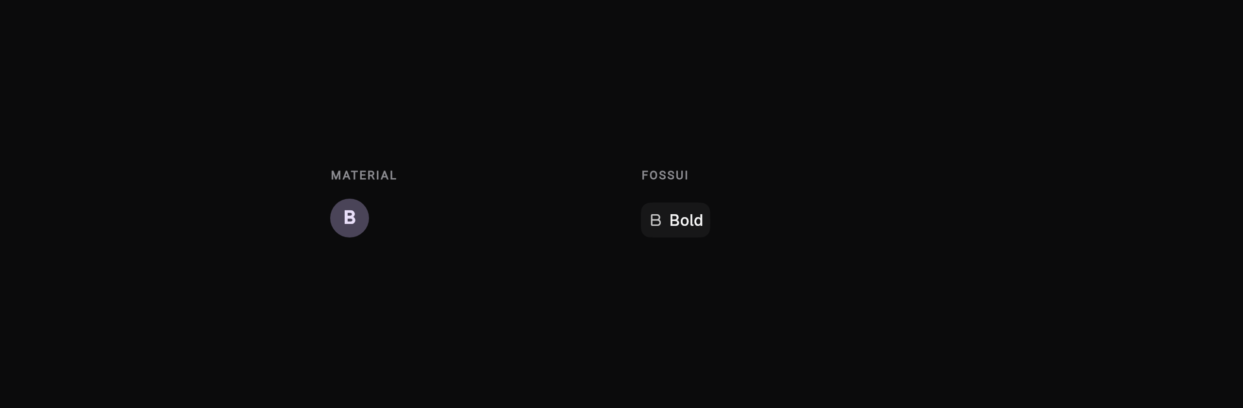
);Toggle. Material has no toggle button, so the nearest is a selectable
IconButton; fossui's FossToggle holds a pressed state and joins into a bar.
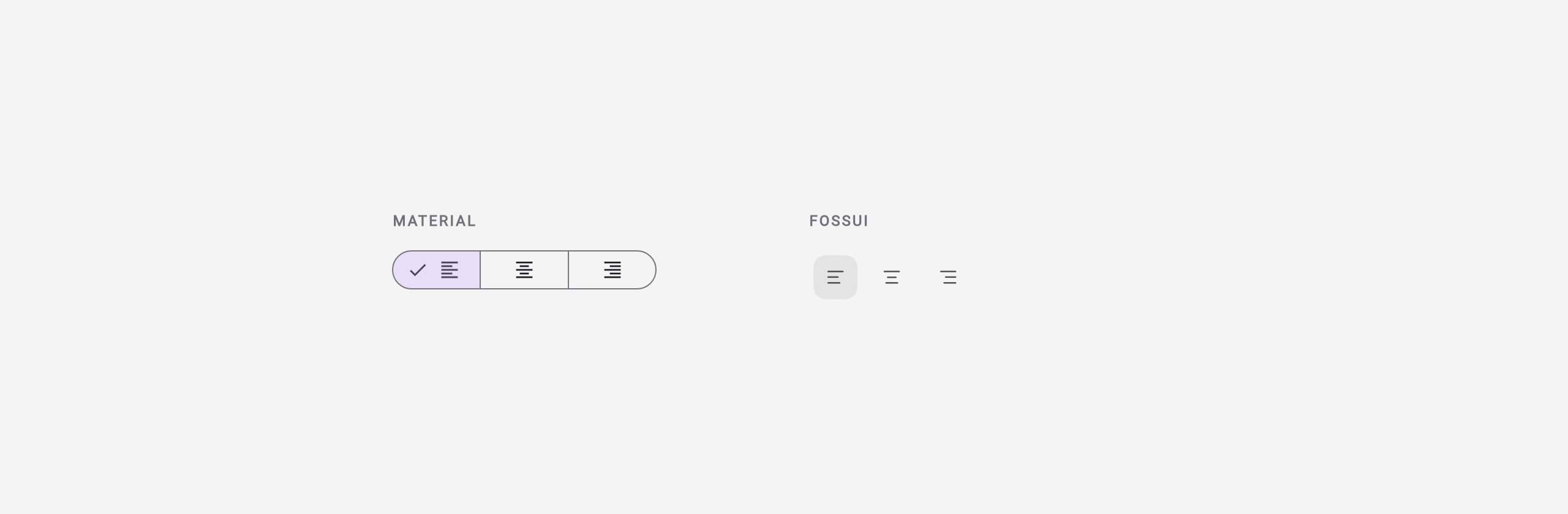
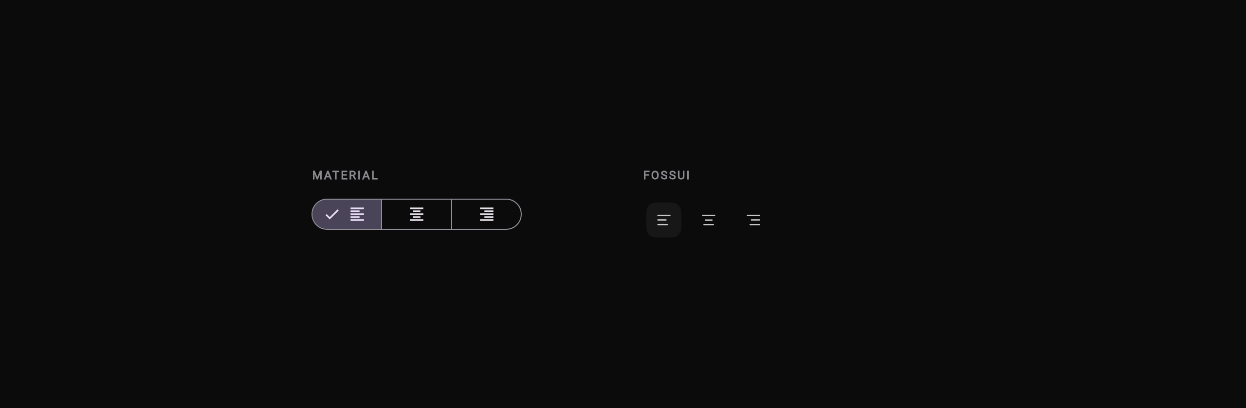
Toggle group. Material's SegmentedButton is fixed-shape; fossui's group is a
set of connectable toggles.
Text and layout
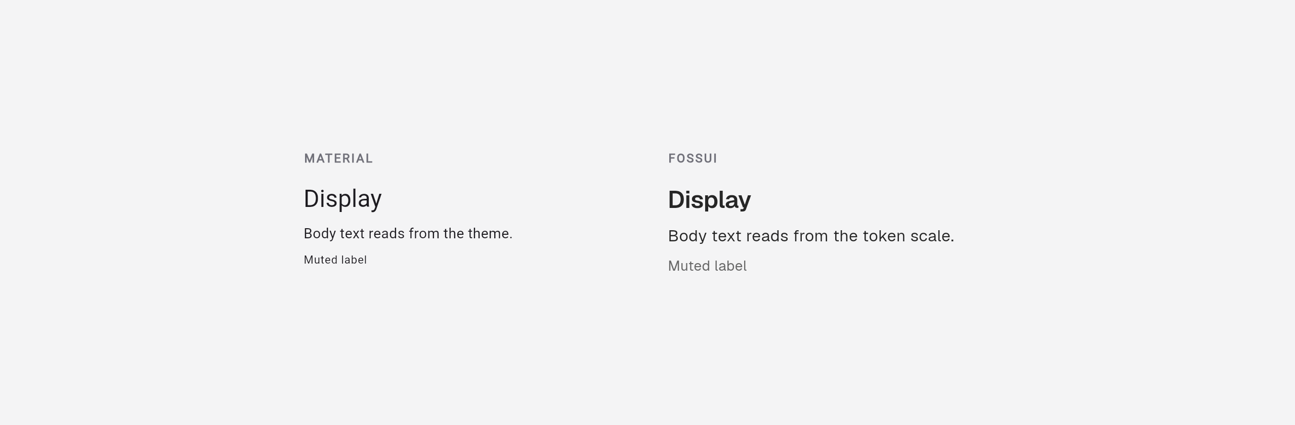
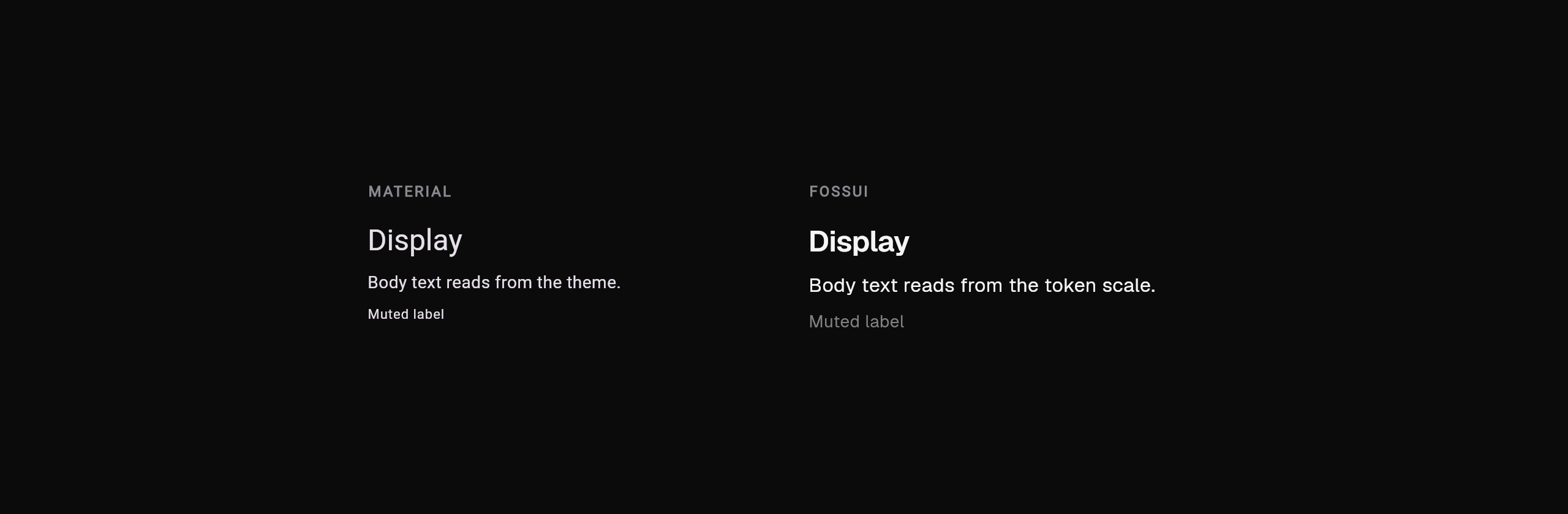
Text. Material reads the type scale from TextTheme; FossText reads named
token sizes and works under any app.
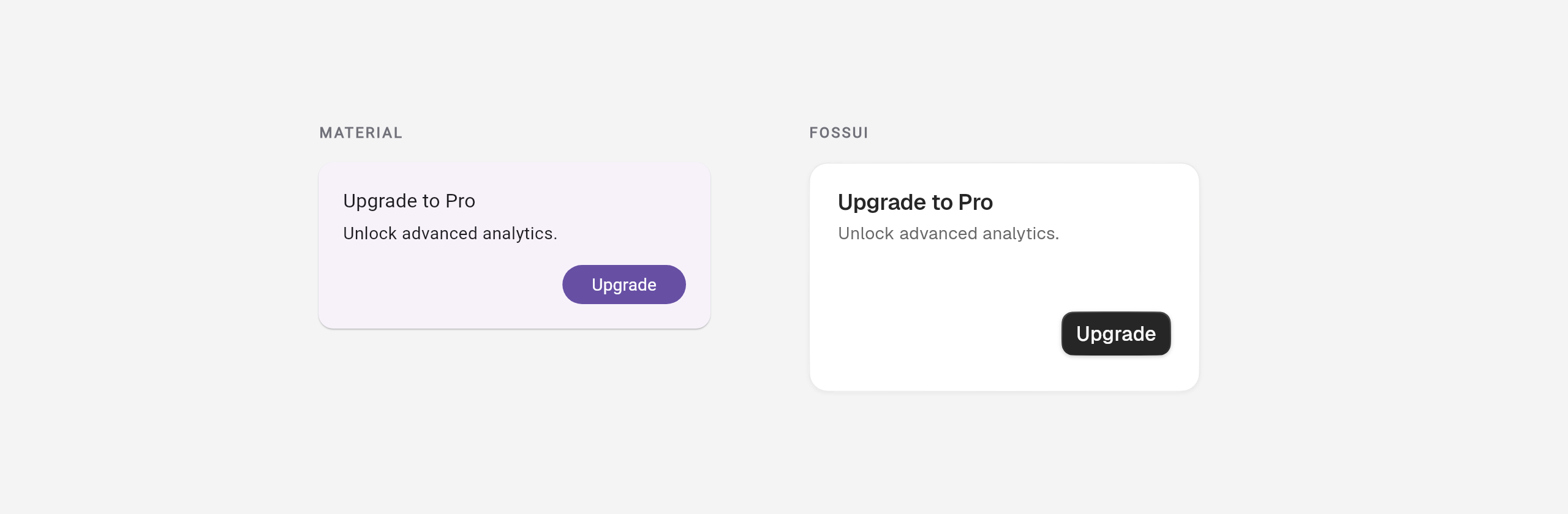
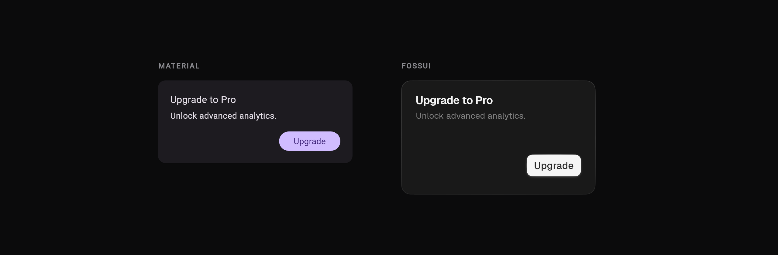
Card. Material's Card is a bare surface you fill; FossCard has
title/description/footer slots.
Separator. Material splits Divider and VerticalDivider; FossSeparator is
one widget for both orientations.
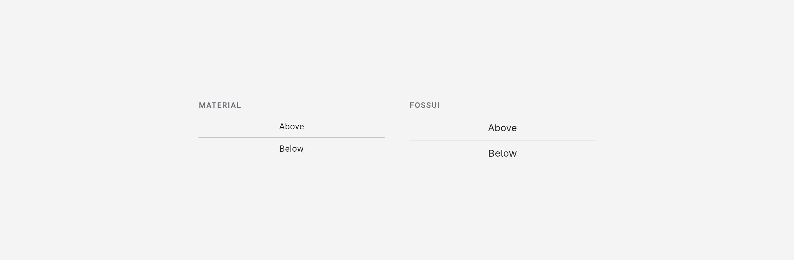
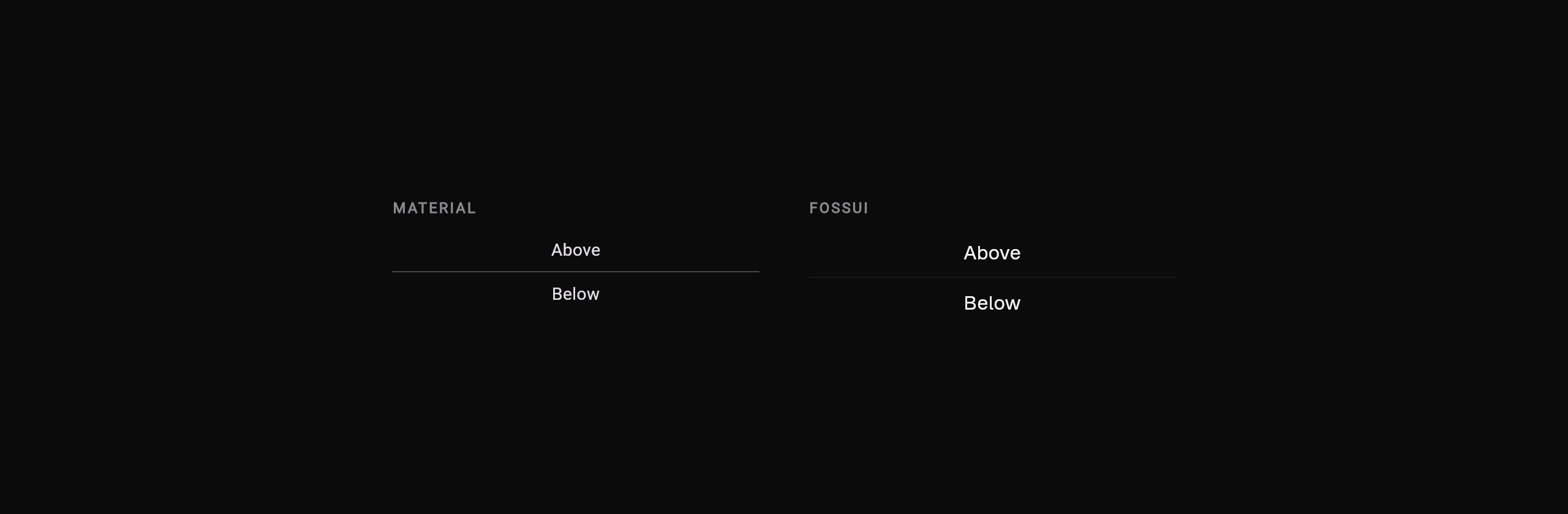
Tabs. Material underlines the active tab and assembles three objects; fossui's segmented tabs sit in one self-contained widget.
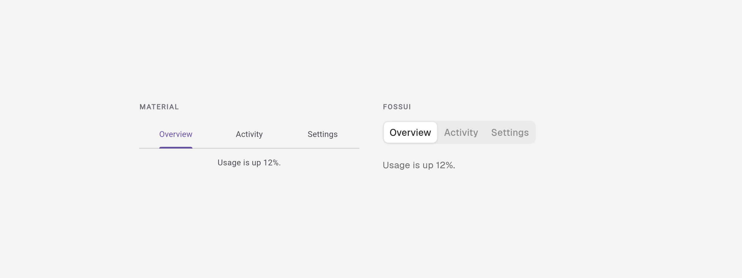
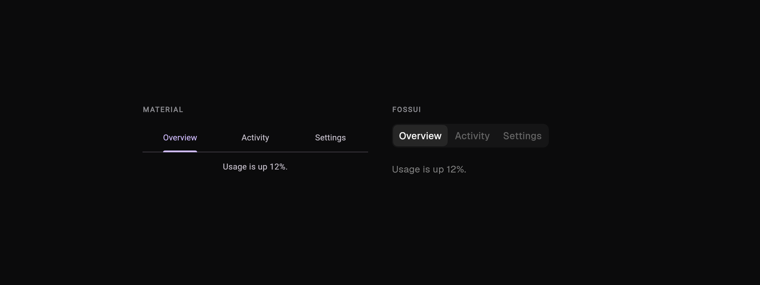
Inputs
Text field. Material fills the field and floats the label into the border; fossui keeps the label above with a lighter outline.
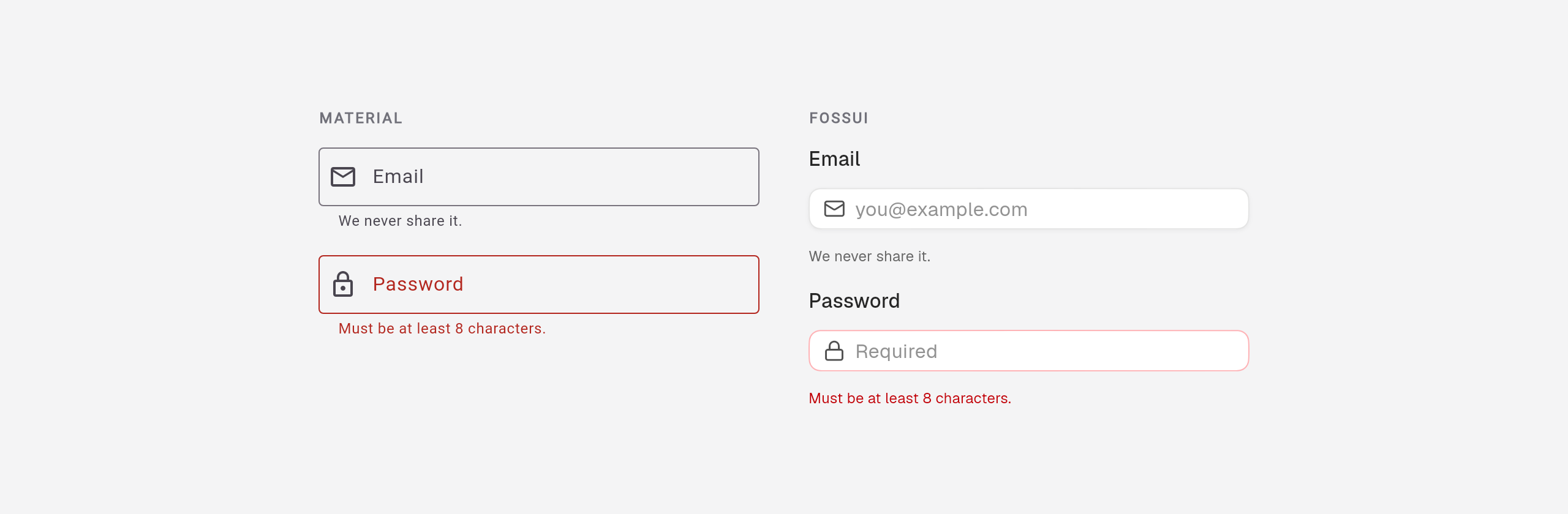
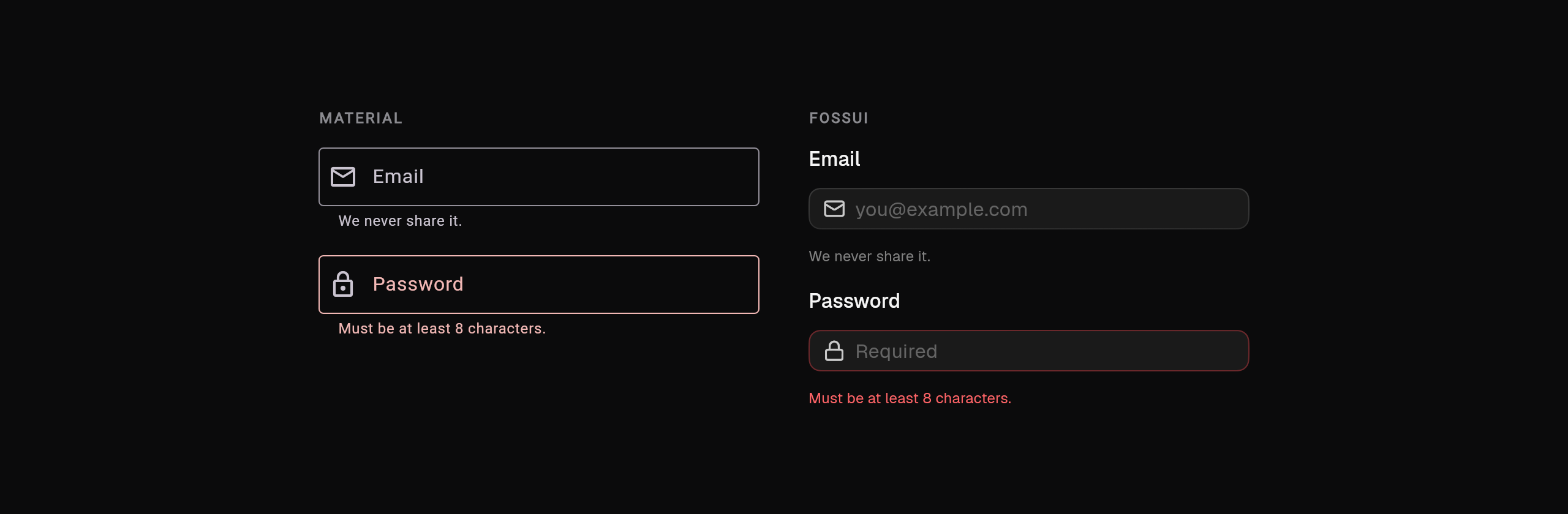
TextField(
  decoration: InputDecoration(
    labelText: 'Email',
    helperText: 'We never share it.',
    prefixIcon: const Icon(Icons.mail_outline),
    errorText: error,
  ),
);FossTextField(
label: 'Email',
helperText: 'We never share it.',
leading: const Icon(LucideIcons.mail),
errorText: error,
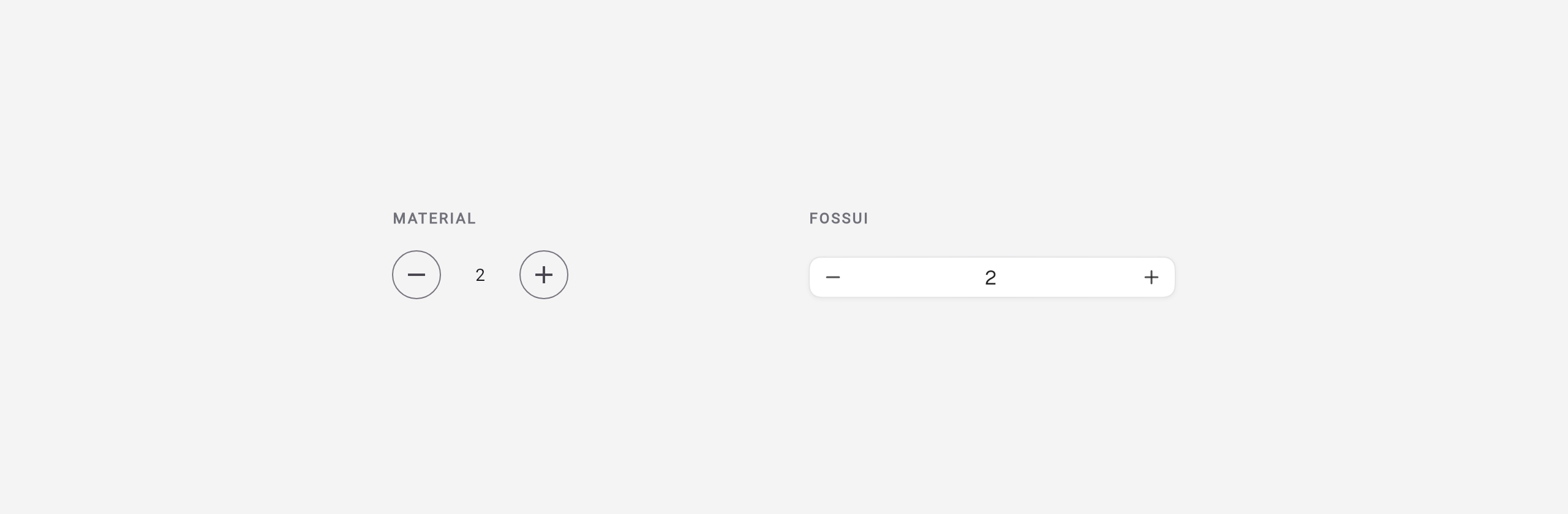
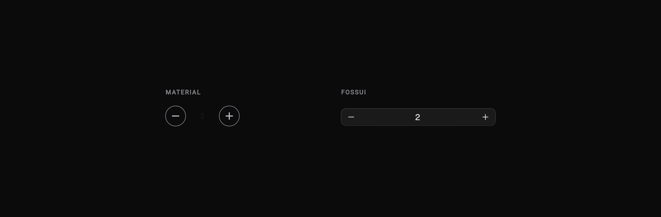
);Number field. Material has no number field, so you assemble a text field and
steppers; fossui ships FossNumberField.
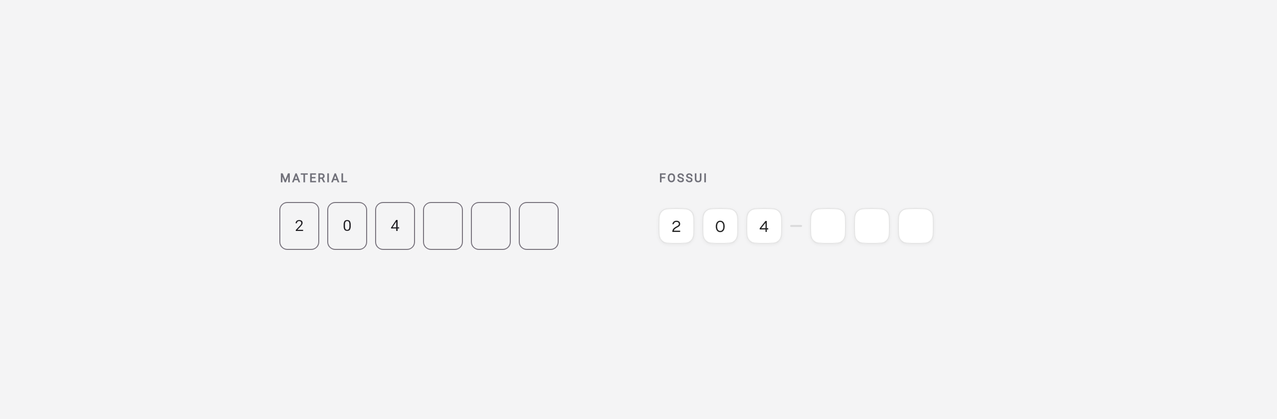
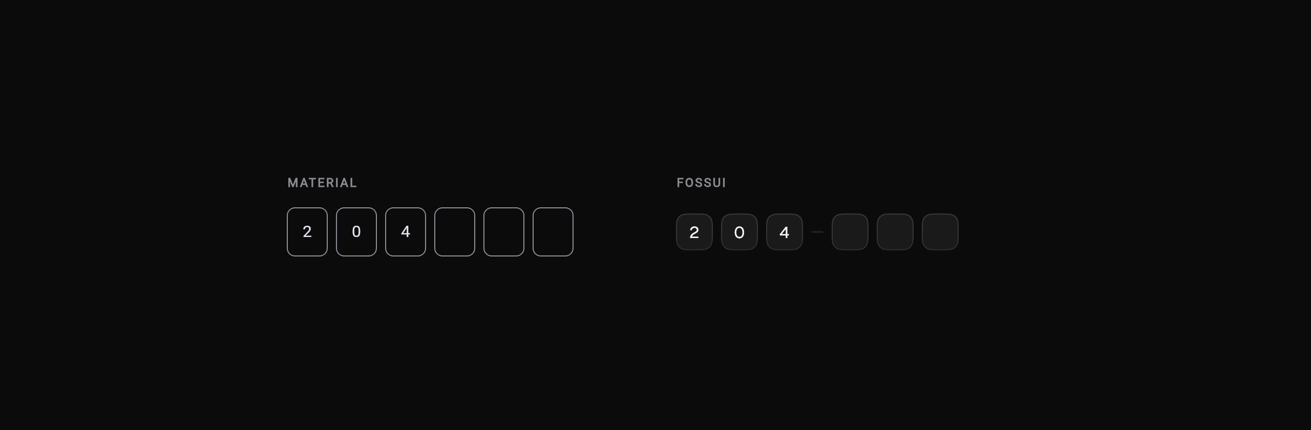
OTP field. Material has no OTP field; fossui ships one with grouping, paste, and validation.
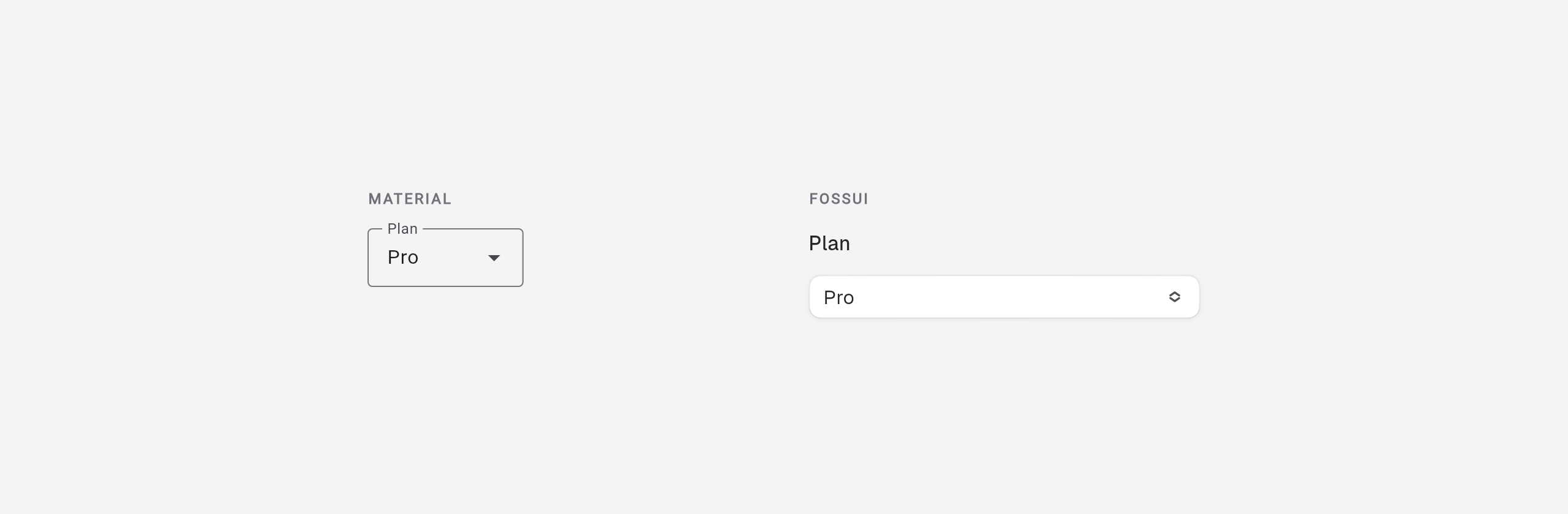
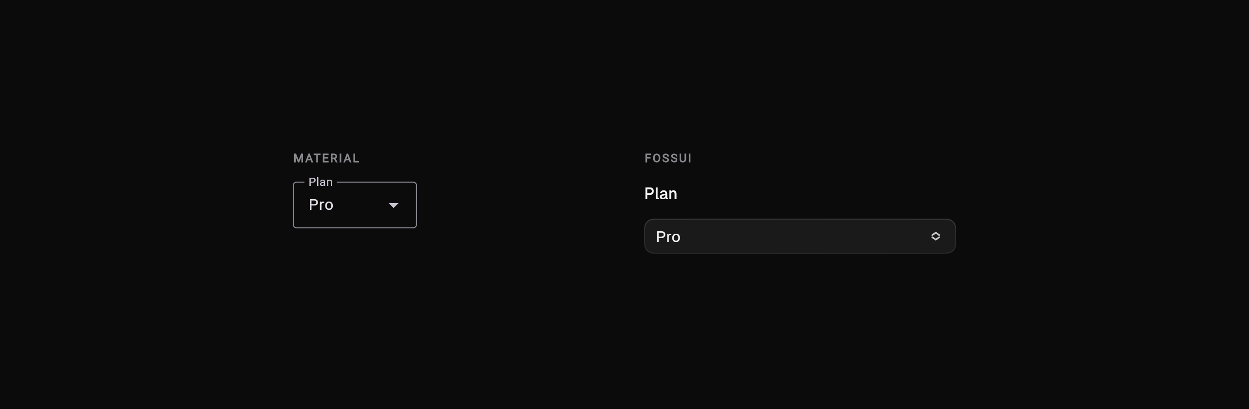
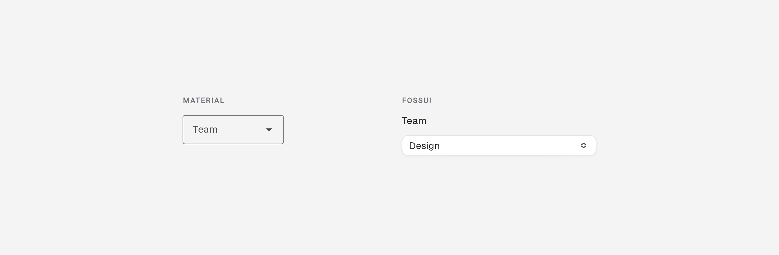
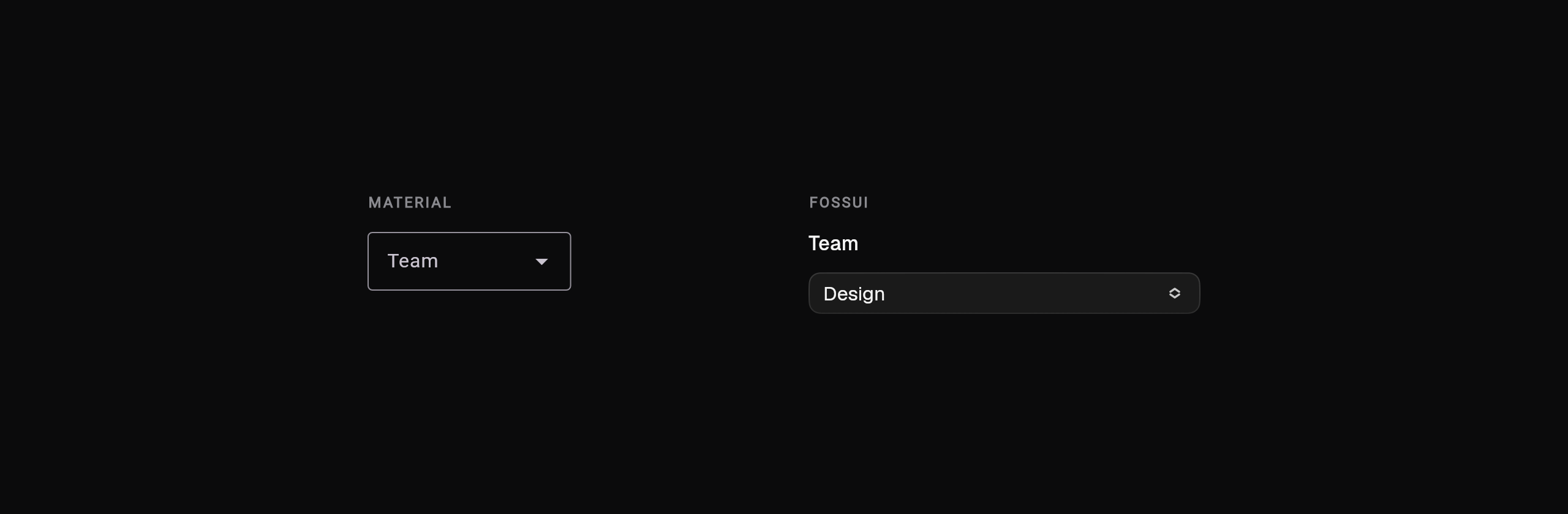
Select. Both look like a field closed; fossui keeps the trigger a button and offers multi-select as a separate widget.
DropdownMenu<String>(
  initialSelection: 'pro',
  label: const Text('Plan'),
  dropdownMenuEntries: const [
    DropdownMenuEntry(value: 'free', label: 'Free'),
    DropdownMenuEntry(value: 'pro', label: 'Pro'),
  ],
);FossSelect<String>(
label: 'Plan',
value: plan,
onChanged: (v) => setState(() => plan = v),
items: const [
FossSelectItem(value: 'free', label: 'Free'),
FossSelectItem(value: 'pro', label: 'Pro'),
],
);Combobox. Material folds search into the dropdown; fossui keeps a dedicated filtered combobox.
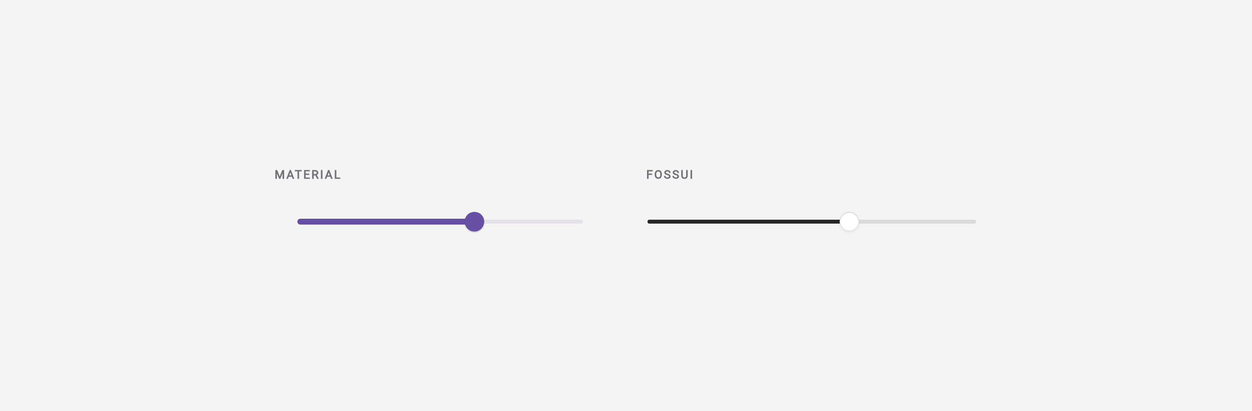
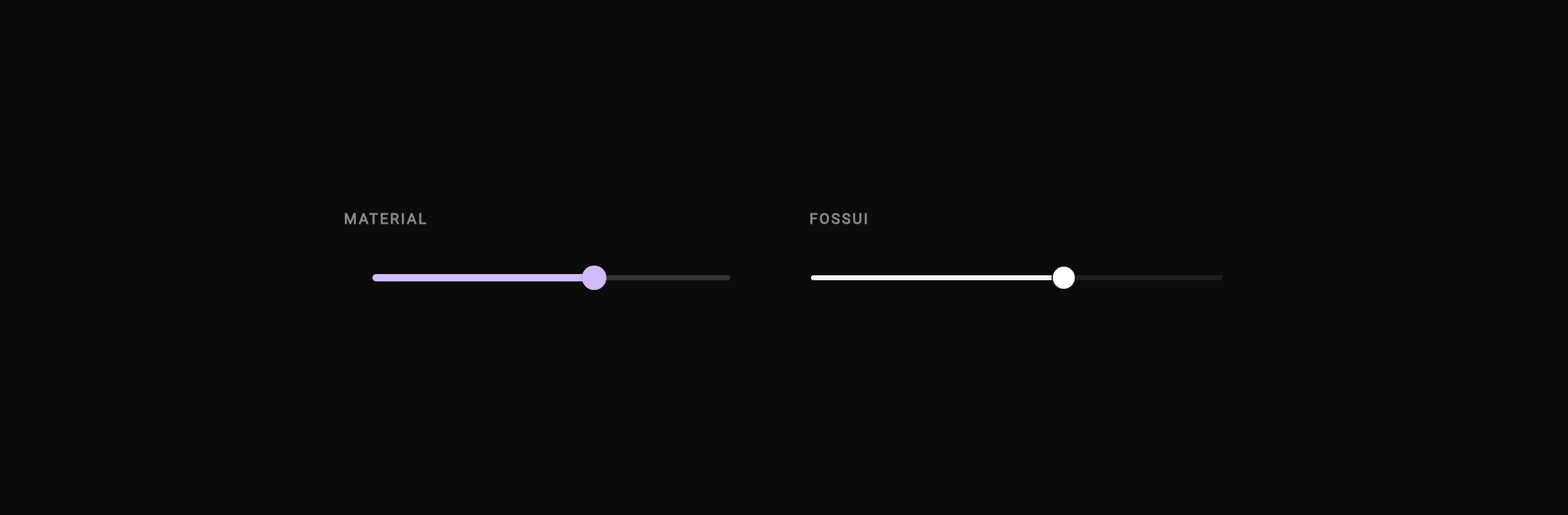
Slider. Material's track is thick with a large knob; fossui uses a thin track and a white knob.
Selection
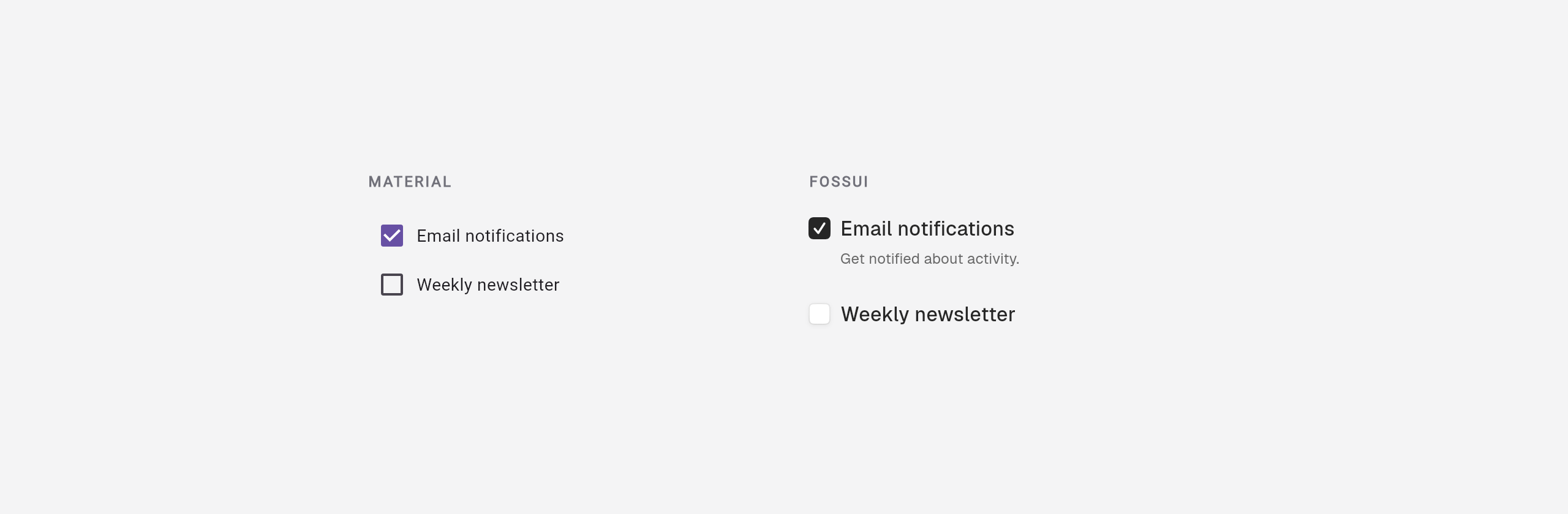
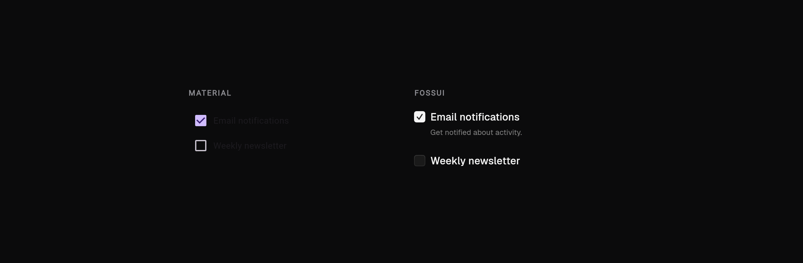
Checkbox. Material tints the box; fossui is monochrome and folds in the label and description.
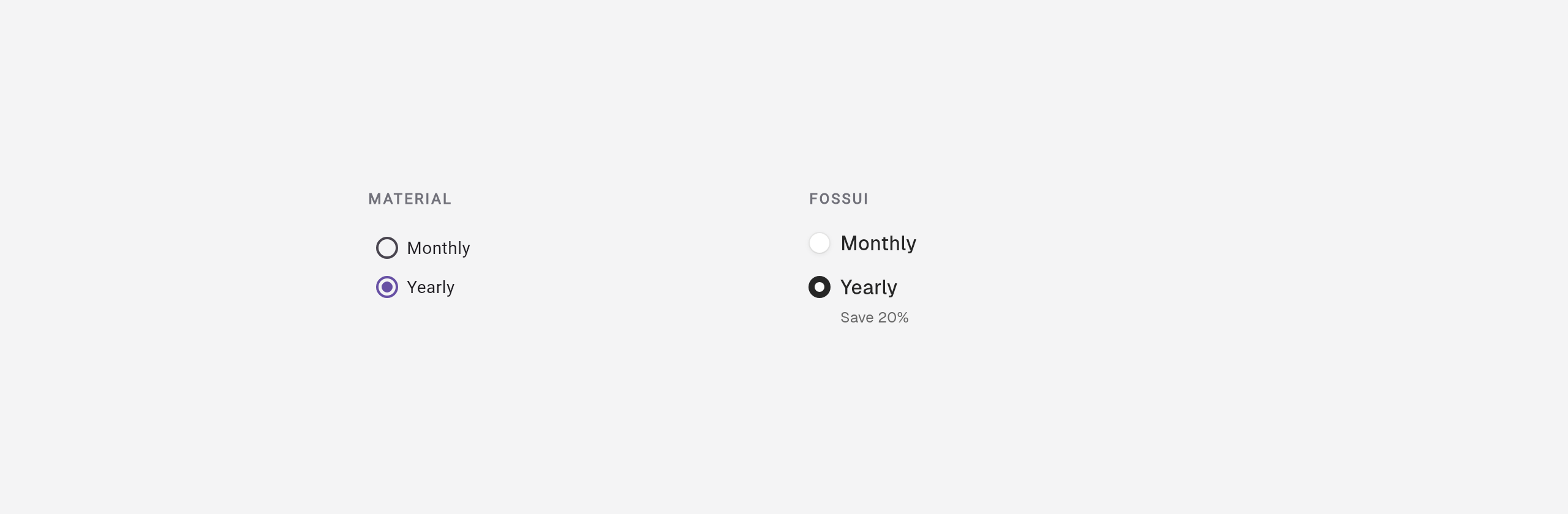
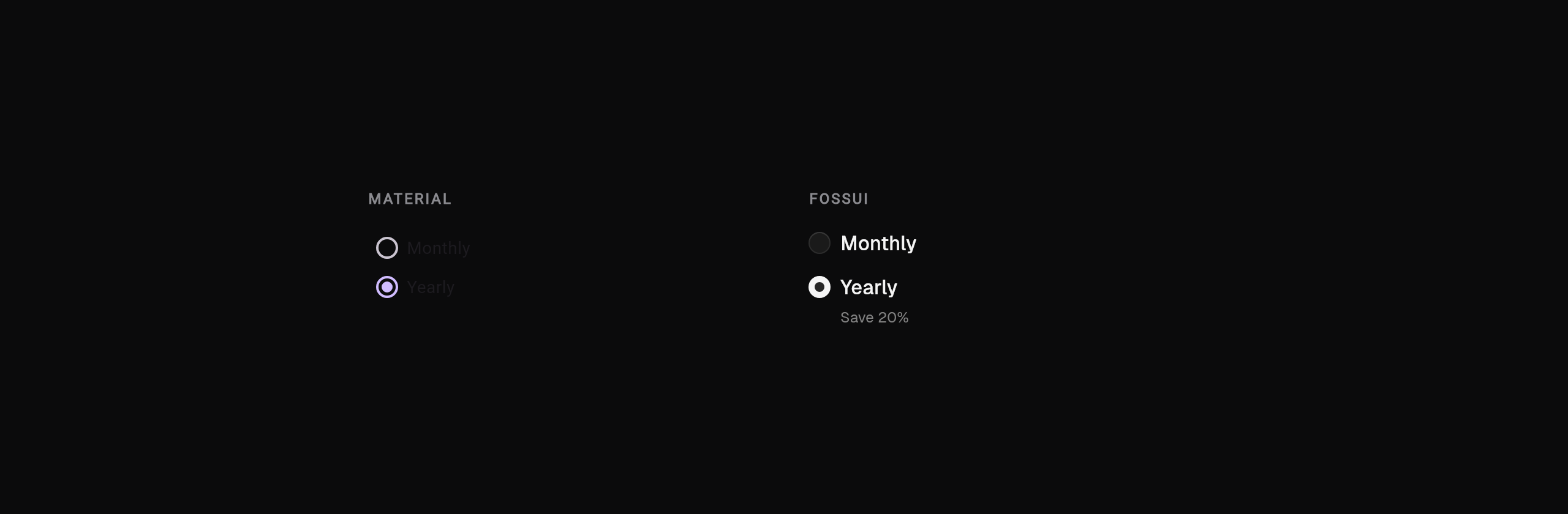
Radio. Material tints the dot; fossui folds label and description into each radio while the group owns the value.
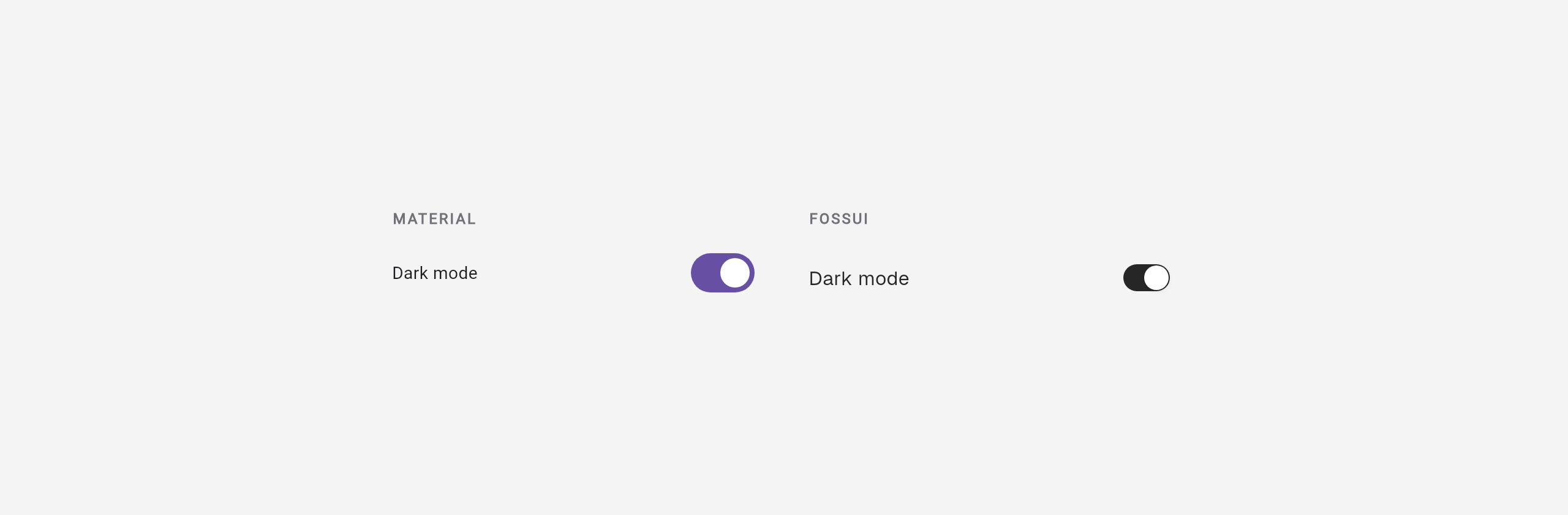
Switch. Material tints the track; fossui is monochrome and adds drag and a press squish.
Dates
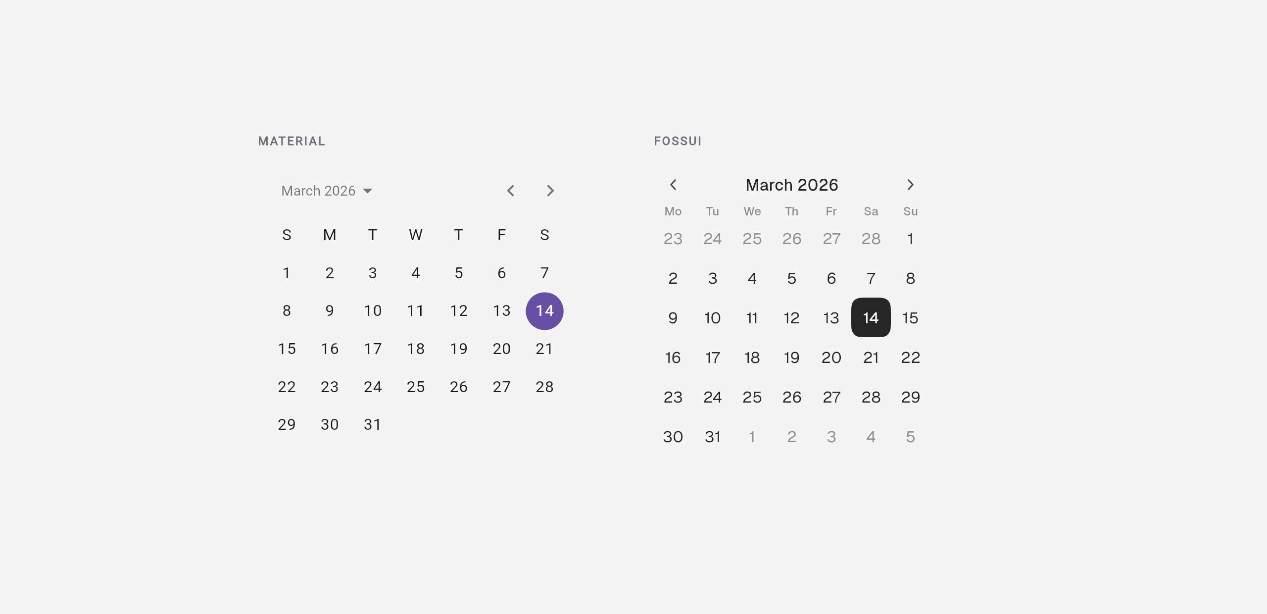
Calendar. Both render a month grid; fossui applies the neutral palette and a squircle selection.
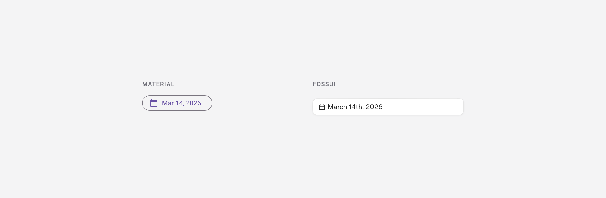
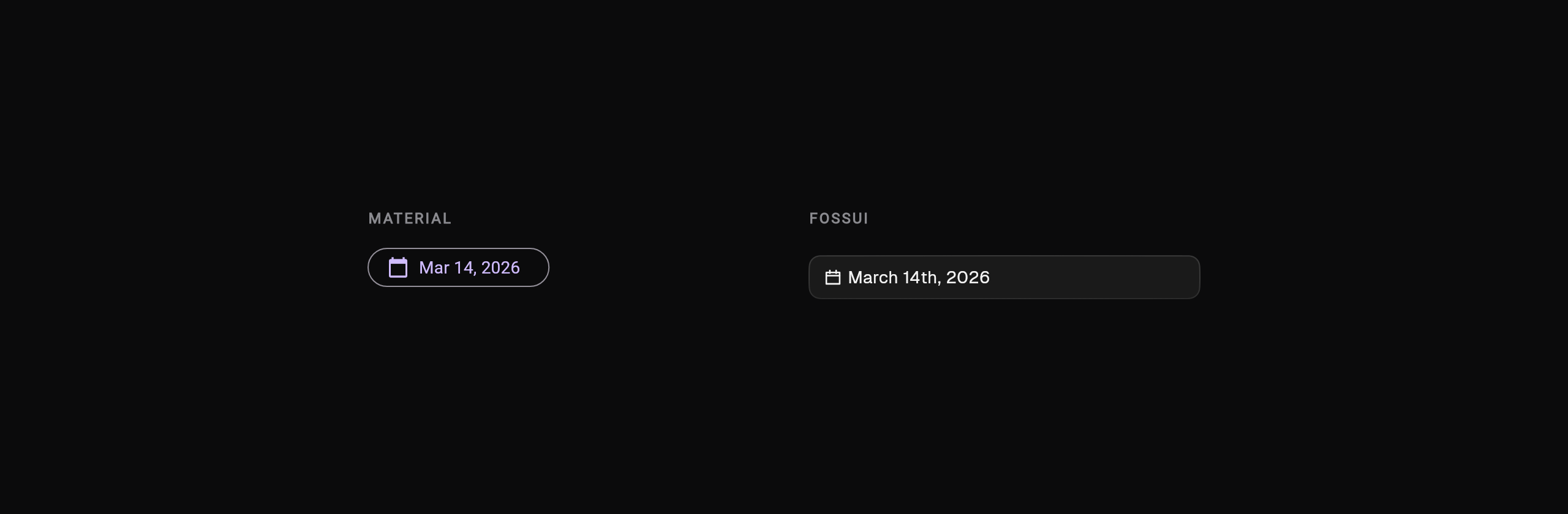
Date picker. Material opens showDatePicker from a button; fossui's trigger is
a field with a controllable open state.
Disclosure and dialogs
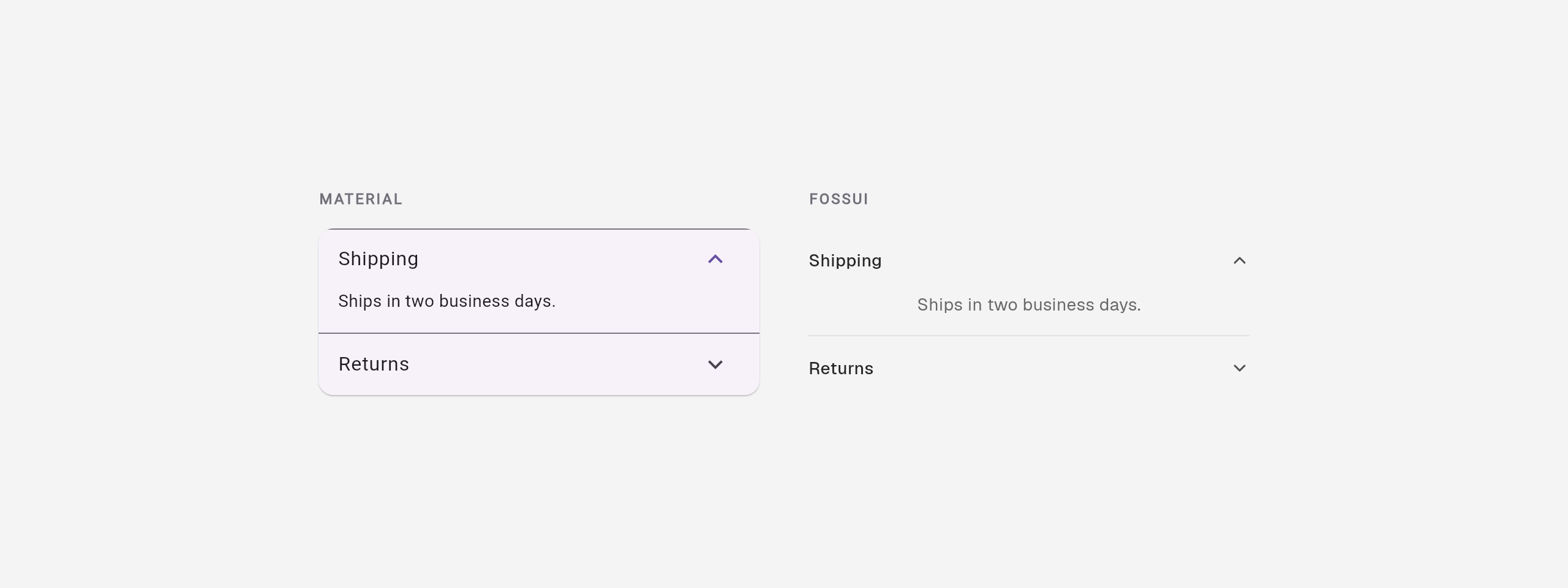
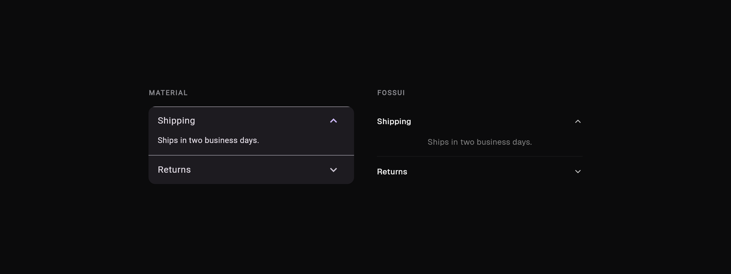
Accordion. Material wraps the panels in a tinted card with a divider; fossui uses a flat hairline and no surface.
Dialog. Material's dialog is tinted and high-elevation; fossui's is flatter with a divided footer bar.
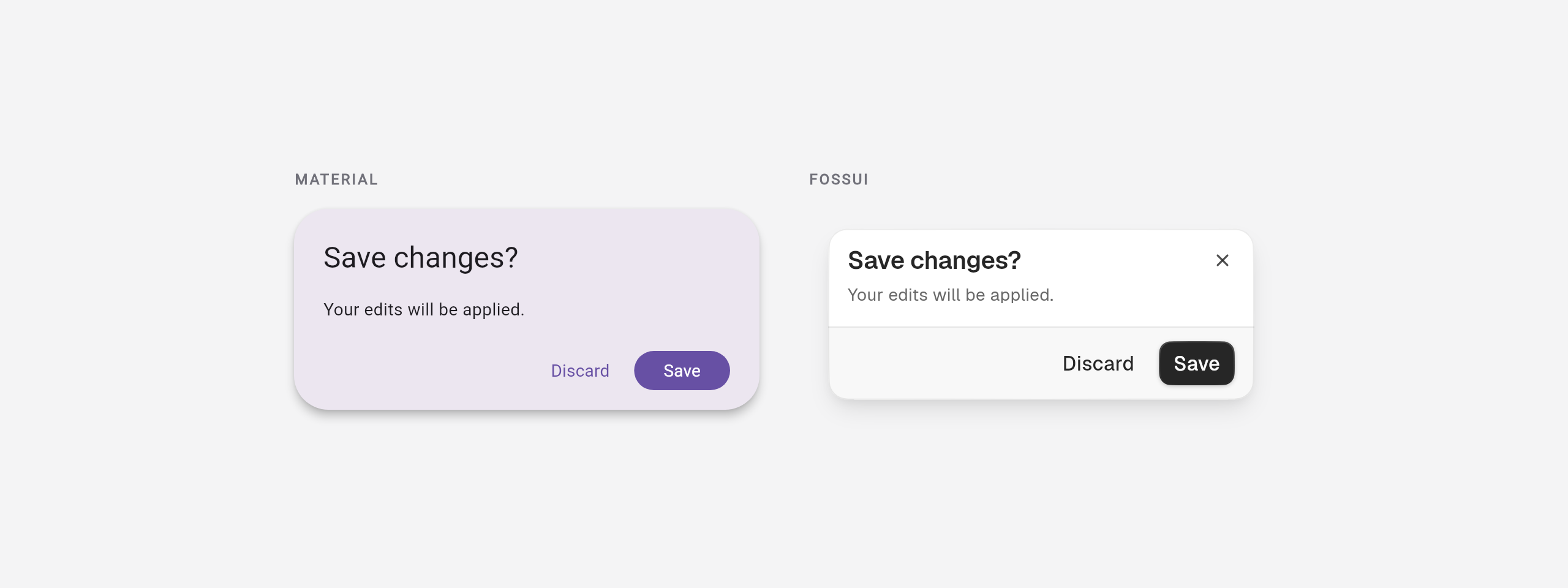
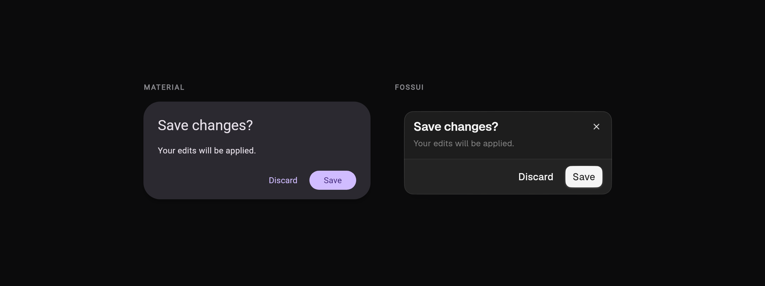
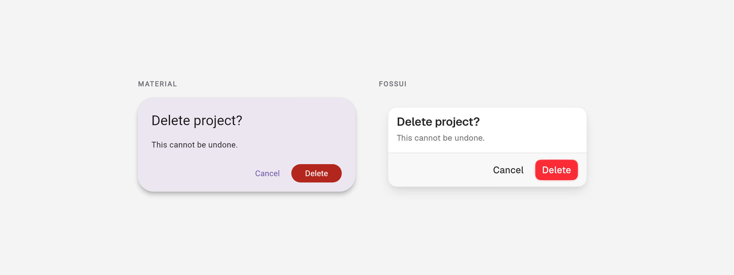
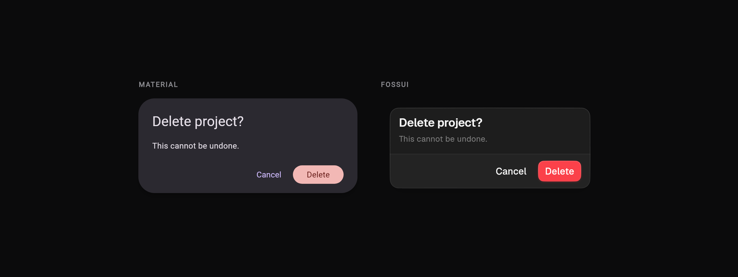
Alert dialog. Same split, sharper intent: Material's AlertDialog is
dismissible, fossui's requires an action to close and puts destructive in red.
Feedback and status
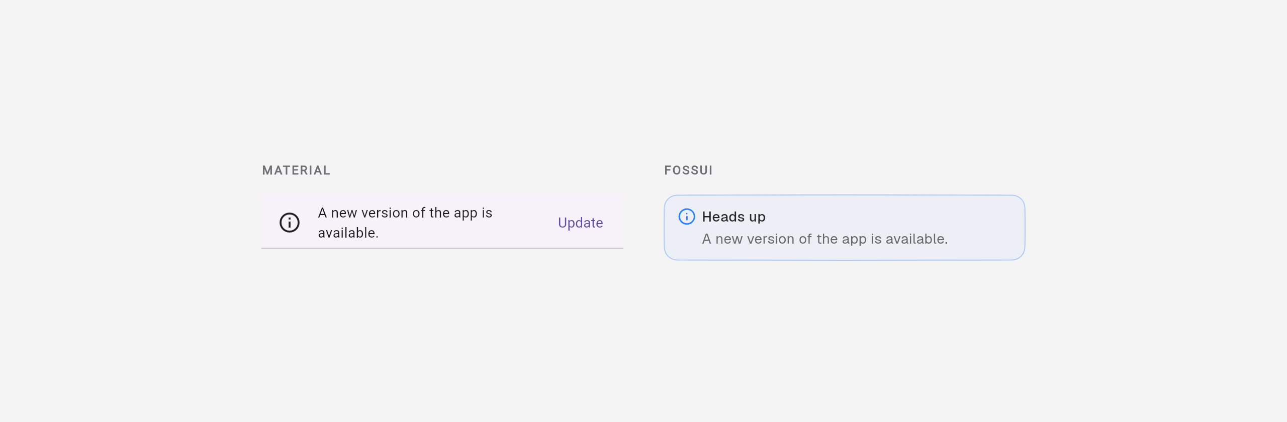
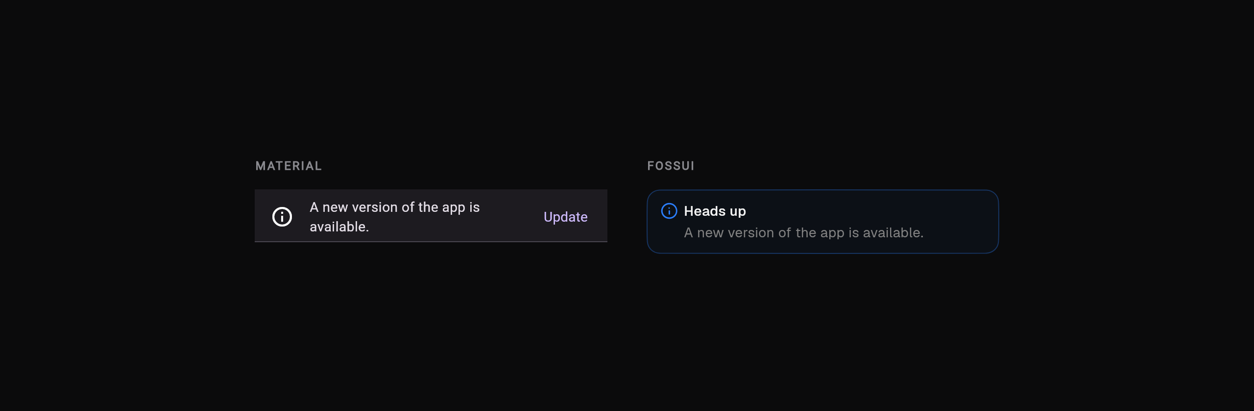
Alert. Material's banner is top-pinned via ScaffoldMessenger; FossAlert is
an inline callout with five status variants.
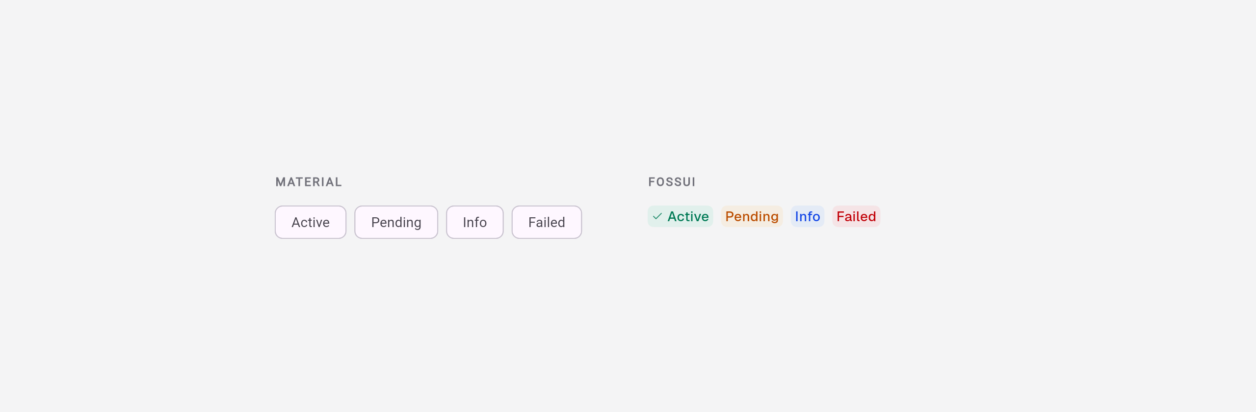
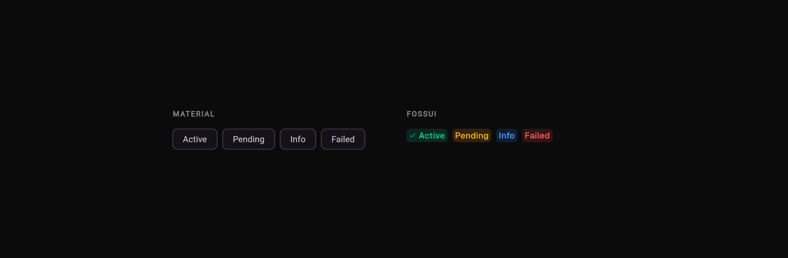
Badge. Material's Badge is a notification dot and Chip is heavier; fossui's badge carries the status in its color.
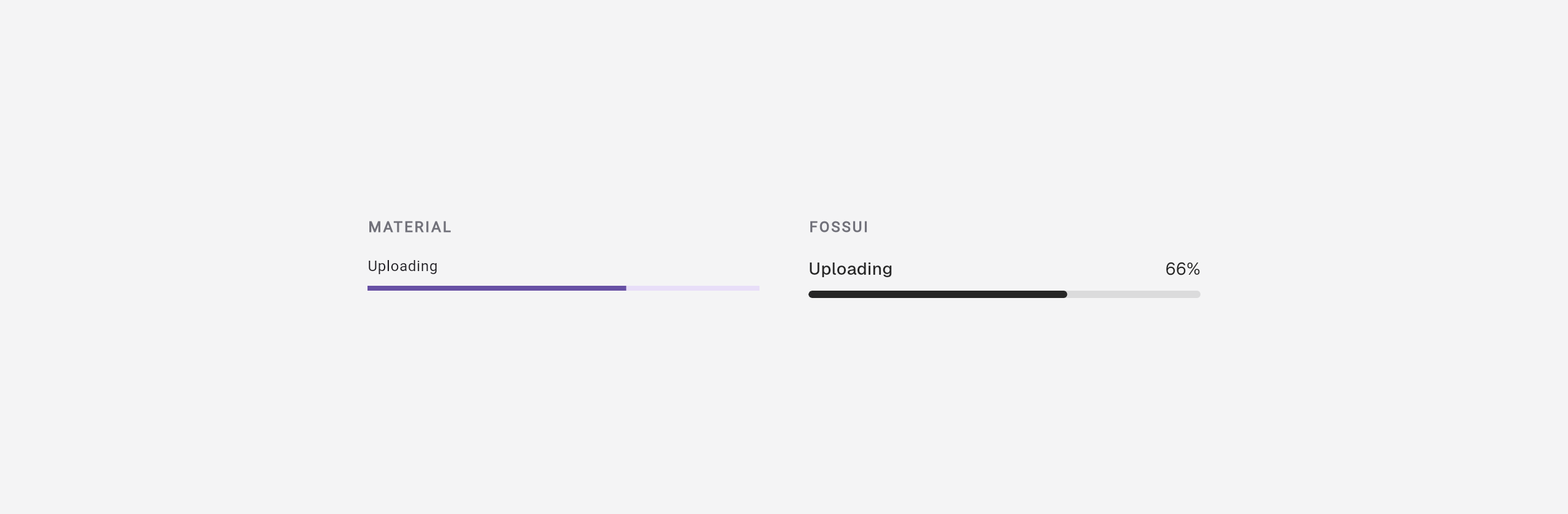
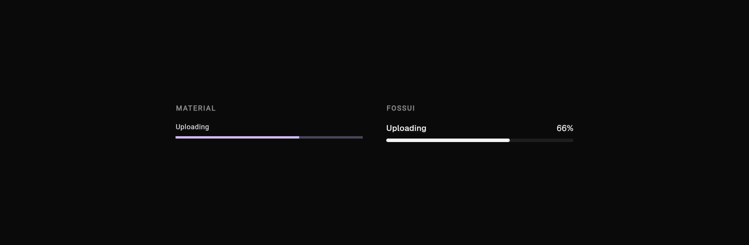
Progress. Material's bar is bare; FossProgress adds a label and value row and
animates changes.
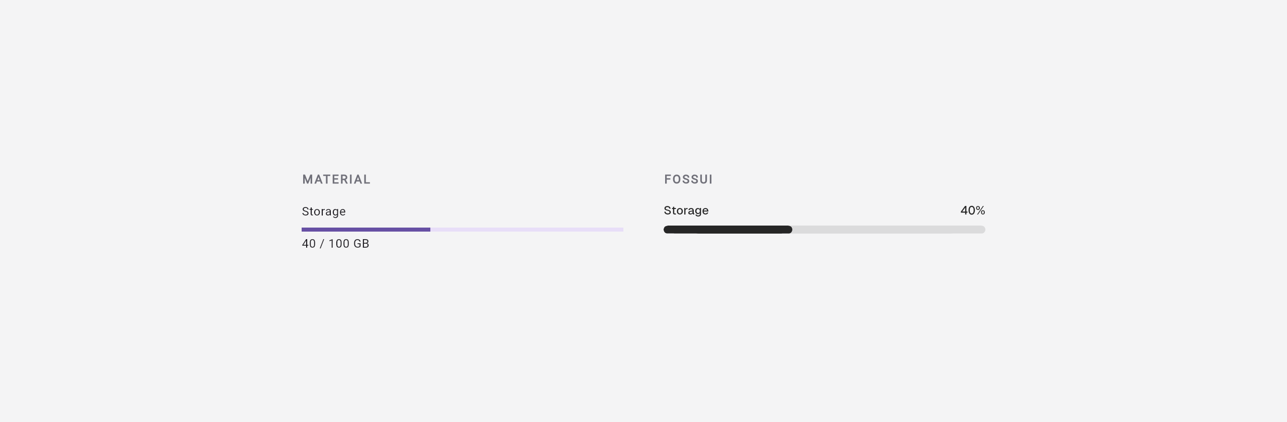
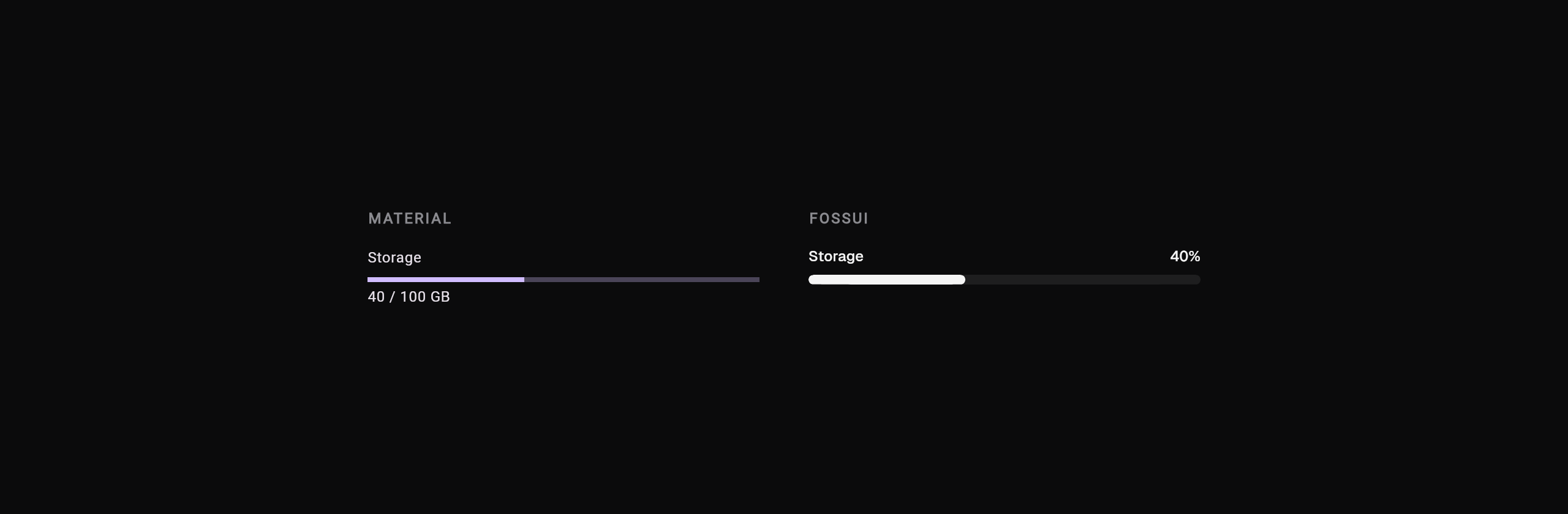
Meter. Material only has a 0..1 bar; FossMeter is a bounded gauge with a
label and value.
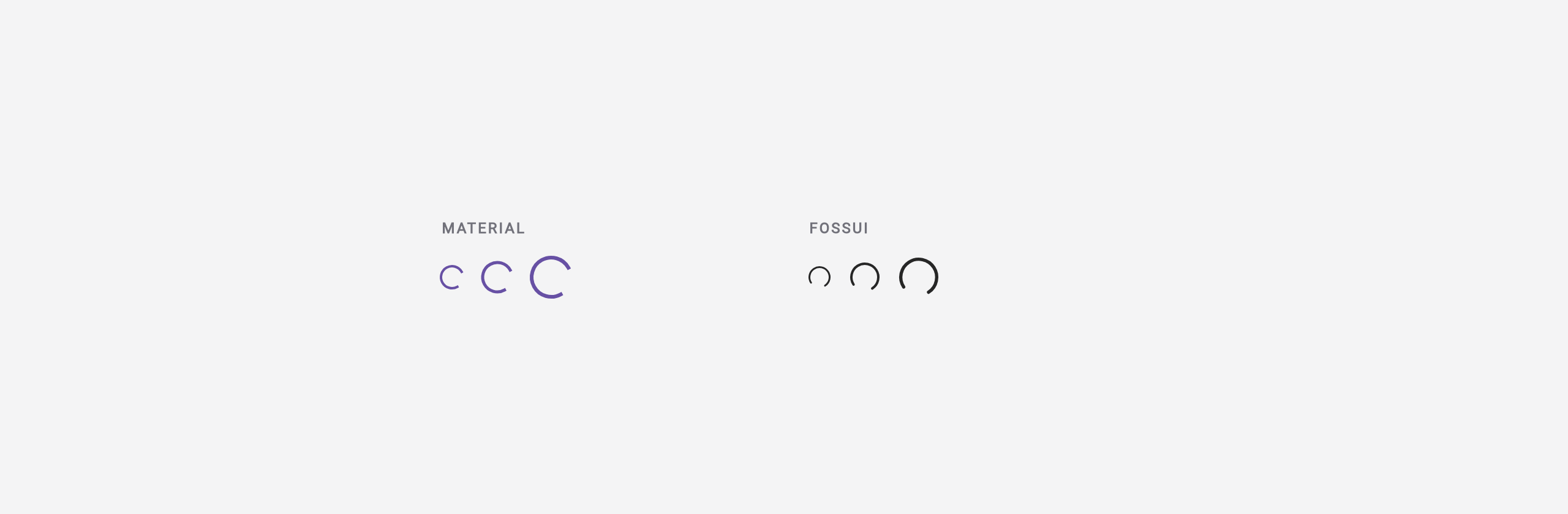
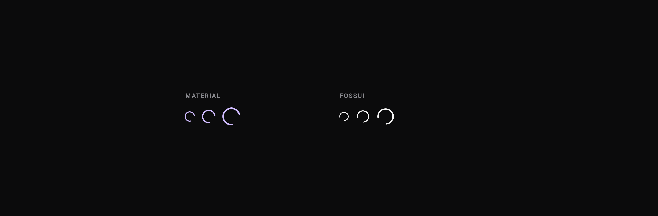
Spinner. Material sweeps a two-phase arc; FossSpinner is a steady
indeterminate spin.
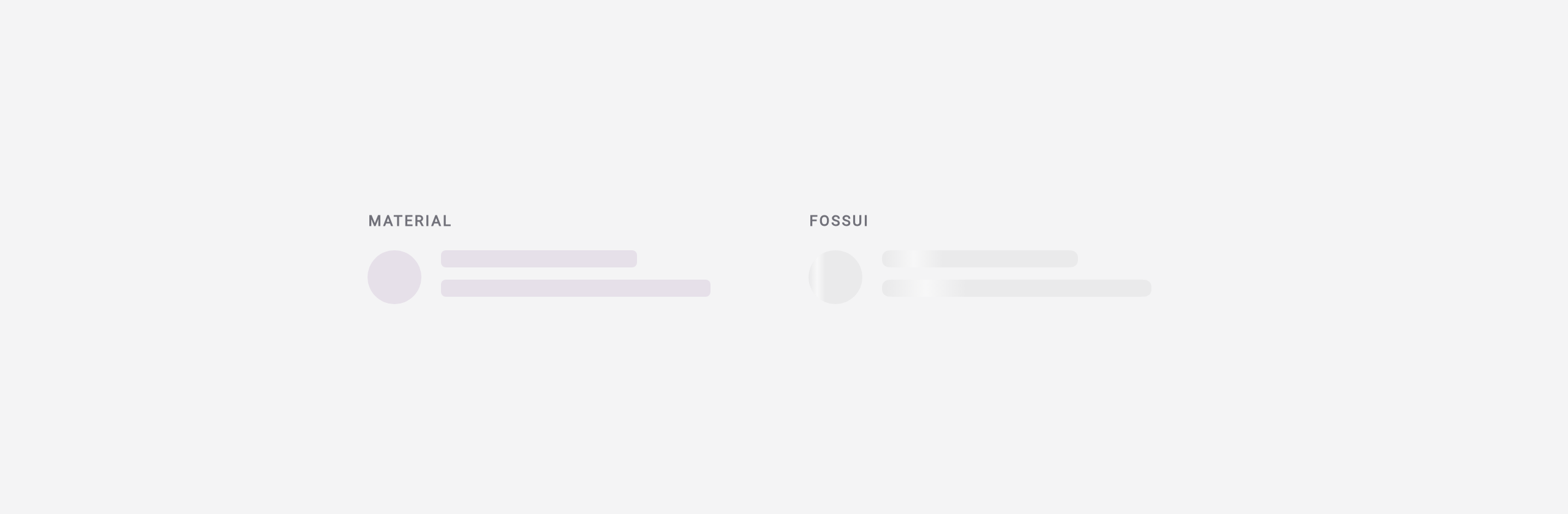
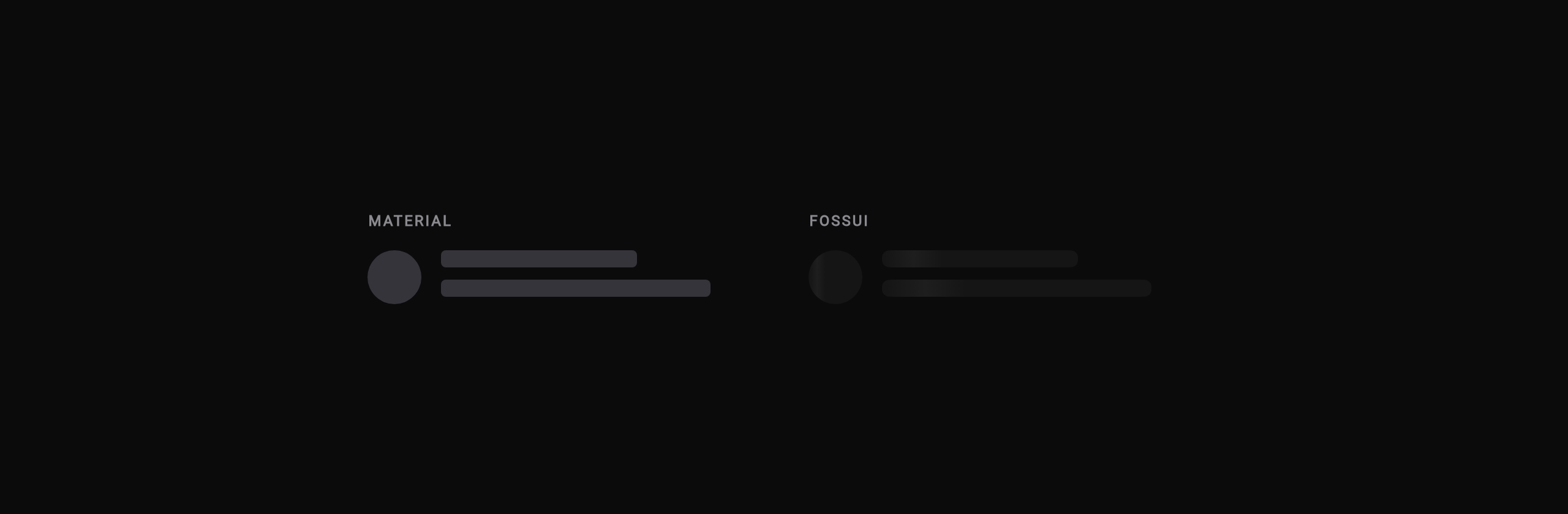
Skeleton. Material has no skeleton, so you hand-roll placeholders or add a
package; fossui ships FossSkeleton.
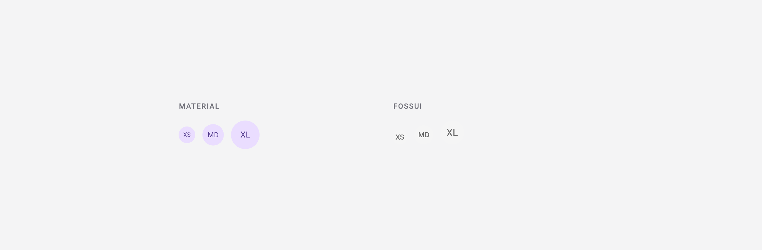
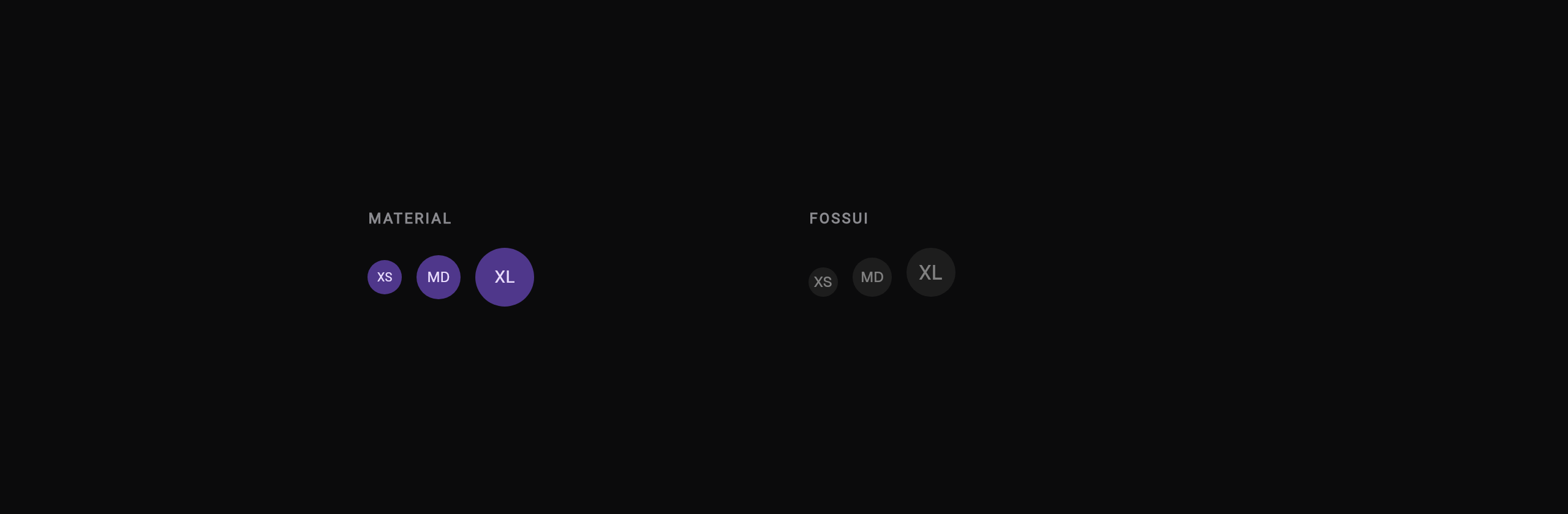
Avatar. Material's CircleAvatar needs manual image and error wiring;
FossAvatar handles absent, loading, and error automatically.
How the API feels
Look is taste. The API is where you live all day. Five differences come up again and again across the component set.
One widget and a variant, not many classes
Material models emphasis as separate types. You pick the class up front:
FilledButton(onPressed: f, child: t);       // high emphasis
FilledButton.tonal(onPressed: f, child: t); // medium
OutlinedButton(onPressed: f, child: t);     // low
TextButton(onPressed: f, child: t);         // lowest
fossui has one button and a variant enum:
FossButton(onPressed: f, child: t);                                  // primary
FossButton(variant: FossButtonVariant.secondary, onPressed: f, ...);
FossButton(variant: FossButtonVariant.outline, onPressed: f, ...);
FossButton(variant: FossButtonVariant.ghost, onPressed: f, ...);
The same pattern repeats: tabs are segmented or underline on one FossTabs,
badges carry their status as a variant, dialogs switch footer treatment with an
enum. Material tends to spread; fossui tends to fold.
Color comes from a token, not a ColorScheme
Material components read ColorScheme and assume a MaterialApp ancestor. fossui
components read semantic roles from context.fossTheme, which resolves under a
MaterialApp, a CupertinoApp, or a bare WidgetsApp:
final c = context.fossTheme.colors;
c.primary;      // role, not a raw color
c.destructive;
c.border;
Light and dark fall out of the same roles. Because nothing reaches into Material, the components drop into a Cupertino or bare app unchanged.
One style object, not scattered props
Material spreads per-instance styling across loose constructor arguments and large theme objects. fossui gives each component a single style bundle with nullable fields that merge over the theme-resolved defaults:
FossButton(
  style: const FossButtonStyle(borderRadius: 4),
  onPressed: f,
  child: const Text('Square'),
)
The trade is deliberate: fewer knobs per instance, because the intended path is to retheme globally, not to restyle at each call site. That keeps a hundred buttons looking like one design.
Controlled or uncontrolled, with an honest value type
Selection widgets (tabs, radio, checkbox, select) all take value + onChanged for
controlled use or an initialValue for uncontrolled, with a value type that says
what it is: T for single, Set<T> for multi.
FossTabs<String>(
  value: _tab,
  onChanged: (v) => setState(() => _tab = v),
  tabs: const [...],
)
Material sometimes splits this across widget types or leaves the wiring to you
(TabBar + TabBarView + TabController, three objects you assemble).
Zero dependencies, glyphs included
fossui takes no icon package and paints the common glyphs itself: the button loading spinner, the checkbox tick, the radio dot, the accordion chevron, the dialog close. The whole kit is one runtime dependency. Material is first-party, so "dependency" is the wrong axis for it, but it does require a Material app and theme; fossui does not.
The scorecard
From our own audit, scored 0 to 10 per dimension, averaged across the 28 components that have a full scorecard. It is our scoring of our own library, so read it as a pointer, not a verdict.
| Dimension | fossui | Material |
|---|---|---|
| Default look | 8.6 | 6.3 |
| API surface | 8.2 | 6.6 |
| Dependencies | 10 | 5.8 |
| Accessibility | 8.2 | 7.3 |
Every component, mapped
fossui ships 32 components. Here is each one against its Material counterpart.
Of the 32, 26 have a Material equivalent (a direct one or a near miss) and 6 have
none. "Parity" is match when Material has a real equivalent, partial when it
has something close but different in purpose or shape, and none when it has
nothing.
| fossui | Material | Parity | Difference |
|---|---|---|---|
FossButton | FilledButton / OutlinedButton / TextButton / ElevatedButton | match | Five classes vs one widget with a variant enum, plus a built-in loading state. |
FossTextField | TextField / TextFormField | match | Label, box, and caption folded into one widget with a size axis; Material splits editing from InputDecoration. |
FossText | Text + TextTheme | match | Reads the token type scale under any app; Material couples to TextTheme. |
FossCard | Card | match | Header/content/footer slots vs a bare surface you fill yourself. |
FossCheckbox / FossCheckboxGroup | Checkbox / CheckboxListTile | match | Standalone, group, and item in one API; Material has no group widget. |
FossRadioGroup | Radio / RadioGroup / RadioListTile | match | Group plus card layout with folded label and error; Material has no card or group. |
FossSwitch | Switch | match | Adds drag/flick and a press squish; Material is tap-only. |
FossSlider | Slider | match | Single-thumb fossui look; Material's two-thumb RangeSlider is a separate widget. |
FossTabs | TabBar + TabBarView + TabController | match | One self-contained widget (segmented or underline); Material assembles three objects. |
FossSelect / FossMultiSelect | DropdownButton / DropdownMenu | match | Multi-select is a real widget (value is a Set<T>); Material has none. |
FossCombobox / FossAutocomplete | Autocomplete / DropdownMenu | match | One filtered-popup core across three faces; Material's Autocomplete is raw builders. |
FossAccordion | ExpansionTile / ExpansionPanelList | match | One group with a shared open Set; Material splits a single tile from a caller-held list. |
FossDialog | showDialog / Dialog / AlertDialog | match | Shared surface with bare/filled footer variants; Material splits across classes. |
FossAlertDialog | AlertDialog | match | Non-dismissible with required actions; Material is dismissible, actions optional. |
FossDrawer | Drawer / showModalBottomSheet | match | Four edges in one API with drag-to-dismiss; Material splits side drawer from bottom sheet. |
FossTooltip | Tooltip | match | Hover, keyboard focus, and long-press on four sides; Material is hover/long-press, top or bottom. |
FossAvatar | CircleAvatar | match | Automatic absent/loading/error fallback; Material needs the wiring by hand. |
FossSeparator | Divider / VerticalDivider | match | One widget for both orientations; Material splits into two. |
FossProgress | LinearProgressIndicator | match | Determinate with a label row and animated value; Material also folds in indeterminate. |
FossCalendar | CalendarDatePicker | match | Single, multiple, and range in one widget; Material splits the APIs. |
FossDatePicker | showDatePicker | match | Modal with a controllable open state (sheet or centered); Material returns a Future. |
FossAlert | MaterialBanner | partial | Inline five-status callout with a live region; Material's banner is top-pinned with no status tints. |
FossBadge | Badge / Chip | partial | A status pill; Material's Badge is a notification dot and Chip is a heavier interactive control. |
FossPopover | PopupMenuButton / Overlay | partial | Controller-driven anchored panel with viewport flip and focus trap; Material has no first-class popover. |
FossSpinner | CircularProgressIndicator | partial | Indeterminate-only constant spin; Material also does a determinate arc. |
FossToast / FossToaster | SnackBar | partial | Queues up to three with status and title/description; SnackBar is one-at-a-time, bottom-pinned. |
FossMeter | LinearProgressIndicator | none | A bounded gauge with arbitrary min/max and a label; Material only has a 0..1 bar. |
FossNumberField | none | none | Material has none; you assemble a TextField, steppers, and clamp logic each time. |
FossOtpField | none | none | No first-party Material OTP field; fossui ships paste, autofill, masking, and validation. |
FossSkeleton | none | none | Not in Material; you reach for a shimmer package or hand-roll an animation loop. |
FossToggle | none | none | Material has no toggle button that holds a pressed boolean. |
FossToggleGroup | none | none | Material's SegmentedButton is a different, fixed-shape control. |
Six components have no Material counterpart at all: FossMeter, FossNumberField,
FossOtpField, FossSkeleton, FossToggle, and FossToggleGroup. In Material
you build these by hand or add a third-party package.
Going the other way, some Material widgets are deliberately not in fossui: the
two-thumb RangeSlider, the interactive Chip, SegmentedButton, Stepper,
DataTable, and FloatingActionButton, plus app-shell pieces like Scaffold and
AppBar. fossui is components only; the app shell stays yours.
Where Material wins
This is not a clean sweep, and pretending it is would be dishonest.
- First-party and mature. Material ships with Flutter. Its accessibility, keyboard handling, and animation tuning have had years of real-world feedback. On the raw accessibility depth of dialogs, selects, sliders, and checkboxes, Material still leads.
- Breadth. RangeSlider, fullscreen dialogs, the floating-label animation, a multi-line text field, richer slider and button theming: Material has them today. fossui defers many of these on purpose until someone needs them, which means it does not have them yet.
- Ecosystem. Every Flutter tutorial, Stack Overflow answer, and package assumes Material. That gravity is real and worth something.
When to pick which
Pick Material if you want the first-party default, the widest set of built-in variants, the most hardened accessibility, and the largest ecosystem behind you. For a lot of apps that is the right call.
Pick fossui if you want a distinct, neutral look out of the box, theming that is
not welded to MaterialApp, a tiny footprint, and an API that folds instead of
spreads. It is young and mobile-first: web and desktop compile and should work but
are less exercised, and it covers the common ground rather than everything Material
has. If that fits, it stops your app from looking like every other Flutter app.