Introducing fossui: a minimal Flutter component library
July 23, 2026
Pick up Flutter and your app looks like Material by default. fossui is a small component set for the apps that would rather not.
It is 32 components behind one import, built on package:flutter/widgets.dart
with no platform channels. It reads its own theme, drops into a MaterialApp,
CupertinoApp, or a bare WidgetsApp, and carries a single runtime dependency. There is no icon package
to install and no app wrapper to buy into.
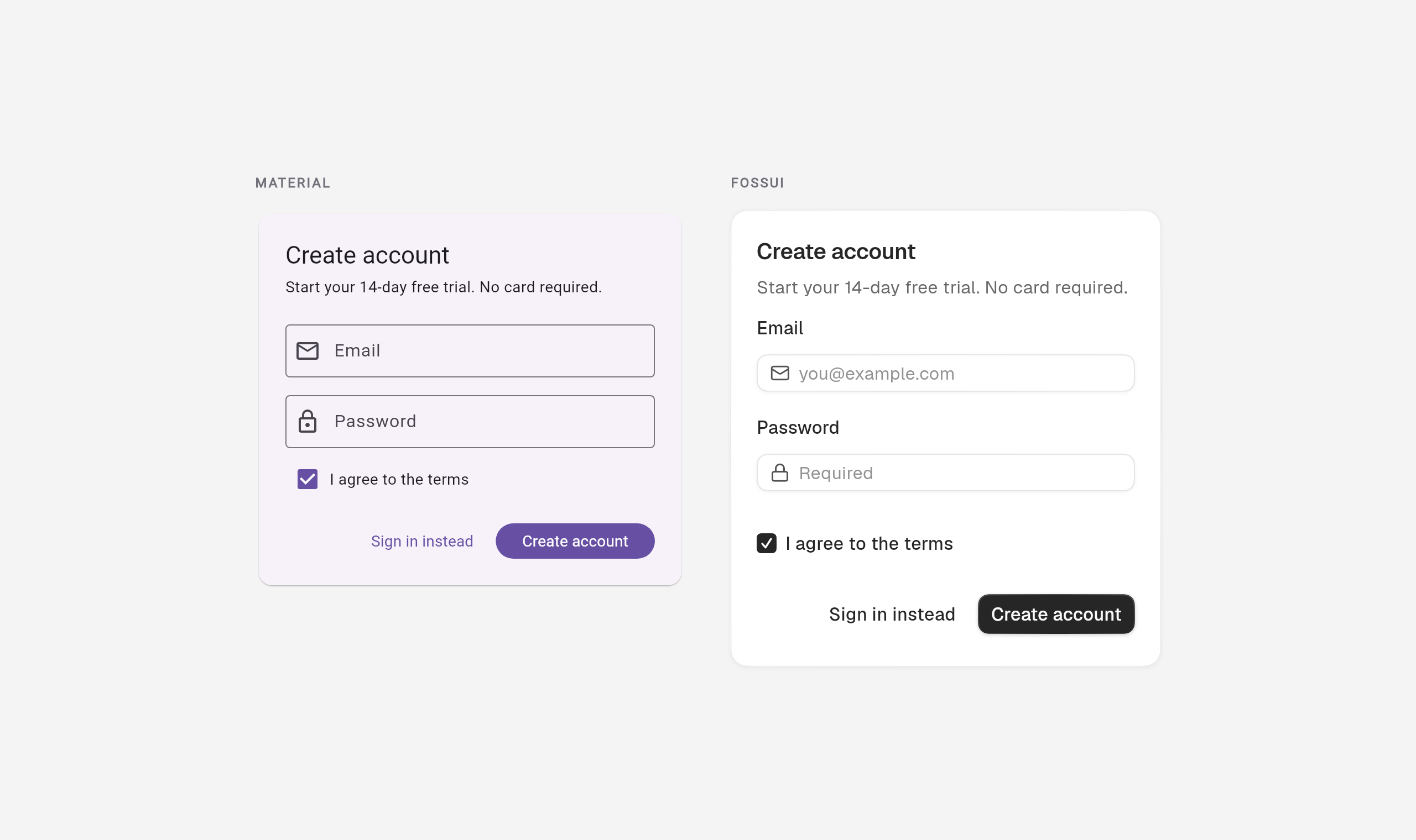
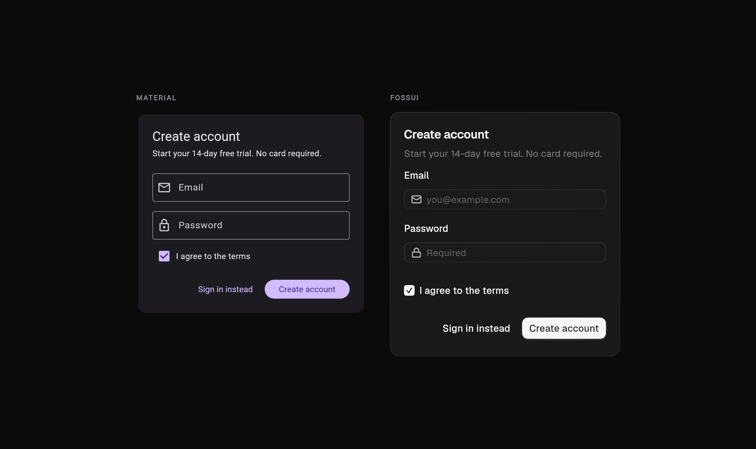
Same screen, same content. The only thing that changed is the design system.
Getting it
flutter pub add fossuiimport 'package:flutter/material.dart';
import 'package:fossui/fossui.dart';
void main() => runApp(const MyApp());
class MyApp extends StatelessWidget {
const MyApp({super.key});
@override
Widget build(BuildContext context) {
return MaterialApp(
theme: FossThemeData.light.toThemeData(),
darkTheme: FossThemeData.dark.toThemeData(),
home: const HomePage(),
);
}
}That is the whole setup. Every fossui widget below finds the theme, and your existing Material widgets keep working, so you can adopt one screen at a time.
Three things that make it different
It reads its own theme. fossui does not depend on MaterialApp. Components
resolve their tokens through context.fossTheme, which works under a Material,
Cupertino, or bare app. Not on Material? Wrap a subtree in FossTheme and the
same components render unchanged. Theming is not welded to one app shell.
It is small. One runtime dependency and no icon package. Icon slots take any
Widget, so Lucide, Material Icons, Cupertino, or an SVG all work; fossui
ships none of them and paints its own glyphs for the button spinner, the checkbox
tick, the accordion chevron. You bring the icons you already use. Even a worst
case that pulls in nearly every component adds about 384 KB, most of it Dart that
tree-shakes down to what you actually reference, with the bundled Geist font
making up the rest.
It has a live ecosystem, including for agents. Rendered light and dark previews in the docs that also show on hover in your editor, a playground at play.fossui.org, a theme builder, and an MCP server so any coding assistant scaffolds and themes it correctly instead of guessing.
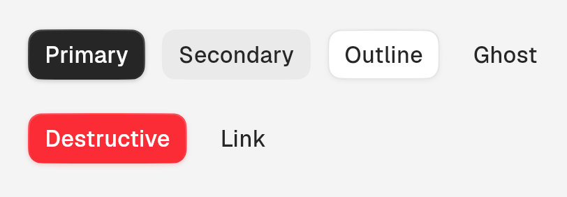
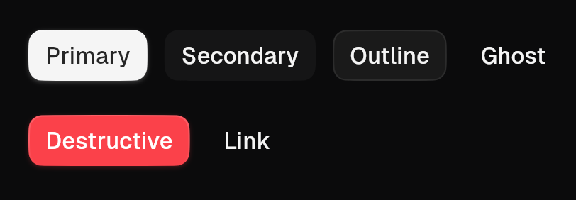
One FossButton, six variants. The same fold shows up across the set: tabs are
segmented or underline, badges carry their status in a variant, dialogs
switch footer treatment with an enum.
Styling lives in the theme
The one habit that carries over from most kits and does not apply here: fossui
components do not take color:, borderRadius:, or padding: at the call site.
That is deliberate. Per-instance overrides are how a design system drifts into
forty slightly different buttons. You change the look in one place:
final theme = FossThemeData.light.retheme(
  const FossThemeSpec(
    primary: Color(0xFF16A34A),
    radius: 22,
    fontFamily: 'Plus Jakarta Sans',
  ),
);

MaterialApp(theme: theme.toThemeData());
For a genuine one-off, every component takes a single style object as the
escape hatch. Two levers, in order: retheme for everything, style for the
exception.
Both read one bundle. A single FossThemeData holds every semantic token:
color, type, radius, spacing, shadow, and motion. Light and dark come out of the
same roles, so the retheme above moves the whole app in both modes at once.
The default look is its own house: a neutral palette and superellipse (squircle) corners rather than circular radii, so a rounded button reads as fossui and not as Material with the tint changed.
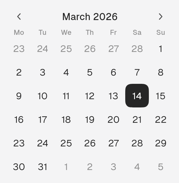
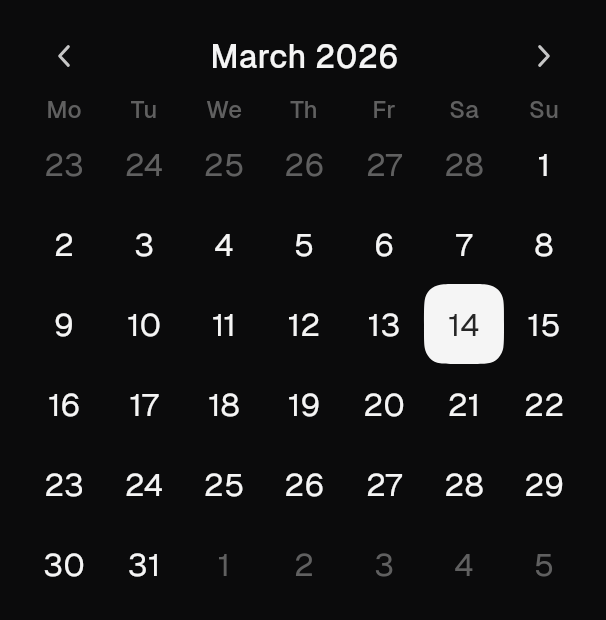
Look closely at the selected day: the corner is a squircle, not a circle. That shape runs through every rounded surface in the set.
Build your own, keep the look
Need a widget fossui does not ship? Read the same tokens and it blends in. One
accessor, context.fossTheme, hands you all six families:
final t = context.fossTheme;

t.colors.primary  // Color
t.radii.lg        // double          (10)
t.spacing(2)      // double          (8)
t.typography.sm   // TextStyle
t.shadows.md      // List<BoxShadow>
t.motion.overlay  // Duration
Compose those and a hand-rolled widget matches the built-ins. The corner is
Flutter's own RoundedSuperellipseBorder, so the geometry lines up too, and the
whole thing follows a retheme for free:
class PriceTag extends StatelessWidget {
  const PriceTag({required this.label, super.key});

  final String label;

  @override
  Widget build(BuildContext context) {
    final theme = context.fossTheme;
    return Container(
      padding: EdgeInsets.symmetric(
        horizontal: theme.spacing(3),
        vertical: theme.spacing(1.5),
      ),
      decoration: ShapeDecoration(
        color: theme.colors.card,
        shape: RoundedSuperellipseBorder(
          borderRadius: BorderRadius.circular(theme.radii.md),
          side: BorderSide(color: theme.colors.border),
        ),
      ),
      child: Text(
        label,
        style: theme.typography.sm.copyWith(color: theme.colors.cardForeground),
      ),
    );
  }
}
Same palette, same radius, same corner geometry as the rest of the set, and it
moves when the theme changes. The MCP server exposes this as a tool,
build_custom_component, so an agent can generate token-correct widgets the same
way.
Built for coding agents
A lot of Flutter screens are now written with an AI assistant in the loop. Point one at a library it half-knows and it guesses: props that do not exist, the wrong variant, a forgotten theme registration. fossui ships a layer that closes that gap. It speaks the Model Context Protocol, so any MCP-compatible assistant can read the exact API. The server is generated straight from the package, so it stays in step with the code instead of drifting from it.
Point your assistant's MCP client at the endpoint:
https://mcp.fossui.orgConnected, it gets seven tools. Among them: list every component, pull one
component's full API, search by keyword, read the theme tokens, check the setup
steps, or fetch the recipe for a custom widget. If your setup reads a project
rules file instead, a drop-in snippet carries the same idioms into an AGENTS.md
or the equivalent. Either way the payoff is code that compiles on the first try,
with the right variants and the theme wired up.
Where it is
fossui is on pub.dev under MIT, with full docs at fossui.org. It is young and mobile-first: it sizes for touch and targets mobile, and while web and desktop compile and should work, they are less exercised, so test the platforms you ship. The set covers the common ground, not everything Material has. Semantics, focus handling, and touch-target sizing are built into each component rather than bolted on later.
If you are moving an existing app, the migration guide walks the widget swaps one at a time. If you are still deciding, the side-by-side comparison renders every component both ways with an honest scorecard.
That is fossui: a smaller surface, one dependency, and an app that stops looking like every other Flutter app.