Accordion
A vertical stack of headers that expand to reveal content, one or many at a time.
An accordion stacks disclosure panels. Each item has a header and a body; tapping the header expands or collapses its panel with an animated height. It follows the disclosure pattern and is fully operable from the keyboard, with arrow keys moving between headers and Home and End jumping to the ends.
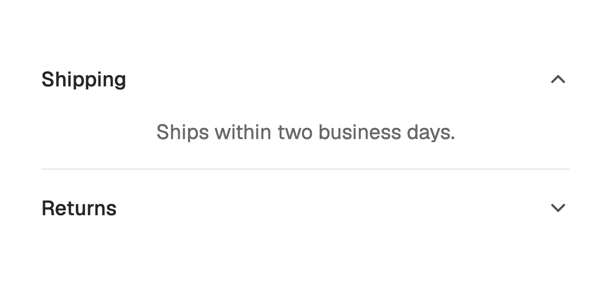

import 'package:fossui/fossui.dart';

FossAccordion(
  children: [
    FossAccordionItem(
      value: 'shipping',
      title: Text('Shipping'),
      child: Text('Ships within two business days.'),
    ),
    FossAccordionItem(
      value: 'returns',
      title: Text('Returns'),
      child: Text('Free returns within 30 days.'),
    ),
  ],
);
Each item carries a stable value, which identifies it in the open set.
Single or multiple
By default only one panel stays open at a time, and opening another closes the
last. Set multiple to let panels open independently.
FossAccordion(
  multiple: true,
  children: items,
);
Collapsible
In single mode, collapsible is true by default, so the open panel can be closed
by tapping its header. Set it to false to keep exactly one panel open at all
times.
FossAccordion(
  collapsible: false,
  initialValue: const {'shipping'},
  children: items,
);
Controlled and uncontrolled
Pass initialValue for an uncontrolled accordion that tracks its own open set.
For a controlled accordion, pass value and update it from onValueChanged.
FossAccordion(
  value: _open,
  onValueChanged: (open) => setState(() => _open = open),
  children: items,
);
Disabled items
Set enabled: false on an item to make its header inert. The rest of the
accordion stays interactive.
FossAccordionItem(
  value: 'archived',
  title: Text('Archived'),
  enabled: false,
  child: Text('Unavailable.'),
);
One-off styling
Global retheming is the first choice, but a single accordion can override its
resolved text, chevron, dividers, and padding with a FossAccordionStyle. Every
field is optional and falls back to the theme.
FossAccordion(
  style: const FossAccordionStyle(
    dividerColor: Color(0x11000000),
  ),
  children: items,
);
API
FossAccordion
| Prop | Type | Default | Description |
|---|---|---|---|
children | List<FossAccordionItem> | required | The stacked items, in order. |
multiple | bool | false | Whether more than one panel can stay open. |
collapsible | bool | true | In single mode, whether the open panel can be closed. |
initialValue | Set<String>? | null | Open set for an uncontrolled accordion. |
value | Set<String>? | null | Open set for a controlled accordion. |
onValueChanged | ValueChanged<Set<String>>? | null | Fires with the next open set. |
style | FossAccordionStyle? | null | Per-instance overrides on the theme. |
FossAccordionItem
| Prop | Type | Default | Description |
|---|---|---|---|
value | String | required | Stable identity of the item in the open set. |
title | Widget | required | Header content. |
child | Widget | required | Panel content, revealed when open. |
enabled | bool | true | Whether the header responds to input. |
FossAccordionStyle
| Field | Type | Default | Description |
|---|---|---|---|
titleTextStyle | TextStyle? | null | Text style of the header title. |
panelTextStyle | TextStyle? | null | Text style of the panel content. |
chevronColor | Color? | null | Color of the header chevron. |
dividerColor | Color? | null | Color of the hairline under each item. |
headerPadding | EdgeInsetsGeometry? | null | Padding around the header row. |
panelPadding | EdgeInsetsGeometry? | null | Padding around the panel content. |
Live demo
Open the interactive gallery to try single and multiple modes with live knobs.