Toggle
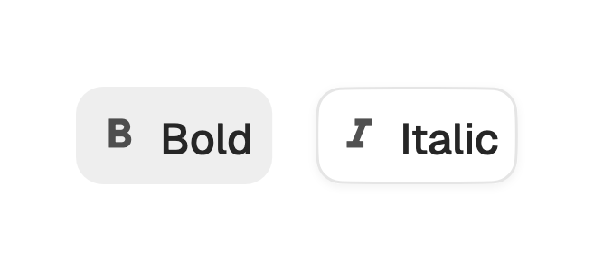
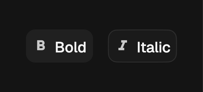
A two-state button that holds a pressed look until you tap it again.
A toggle is a button that stays pressed. Tap it to turn it on, tap again to
release. It is the control behind a formatting button such as bold or italic in
a toolbar: sized and shaped like a button, but carrying a binary on and off
state. It is controlled, so render the current state through pressed and
commit the new one in onPressedChanged. A tap, Space, or Enter all flip it.
import 'package:fossui/fossui.dart';

FossToggle(
  pressed: isBold,
  leading: const Icon(LucideIcons.bold),
  semanticLabel: 'Bold',
  onPressedChanged: (on) => setState(() => isBold = on),
  child: const Text('Bold'),
);
Variants
Two variants match the button family. standard is borderless and fills on
hover and when pressed; outline sits on the background with a border and a
small shadow that drops when pressed.
FossToggle(
  pressed: on,
  variant: FossToggleVariant.outline,
  onPressedChanged: (v) => setState(() => on = v),
  child: const Text('Outline'),
);
Sizes
Three sizes share the button metrics: sm (32), md (36, the default), and
lg (40).
FossToggle(
  pressed: on,
  size: FossToggleSize.sm,
  onPressedChanged: (v) => setState(() => on = v),
  child: const Text('Compact'),
);
Icon only
Leave child null and pass a leading icon for a square icon-only toggle. Name
it for assistive tech with semanticLabel, since there is no visible label.
FossToggle(
  pressed: isBold,
  leading: const Icon(LucideIcons.bold),
  semanticLabel: 'Bold',
  onPressedChanged: (on) => setState(() => isBold = on),
);
Disabled
Pass a null onPressedChanged to disable the toggle. It dims and stops
responding to the pointer. There is no separate enabled flag.
const FossToggle(
  pressed: true,
  semanticLabel: 'Bold',
);
One-off styling
Global retheming is the first choice, but a single toggle can override the
theme-resolved look with a FossToggleStyle. Every field is optional and falls
back to the theme.
FossToggle(
  pressed: on,
  onPressedChanged: (v) => setState(() => on = v),
  style: FossToggleStyle(
    backgroundColor: WidgetStateProperty.resolveWith((states) {
      if (states.contains(WidgetState.selected)) {
        return const Color(0xFF16A34A);
      }
      return const Color(0x00000000);
    }),
  ),
  child: const Text('Live'),
);
API
FossToggle
| Prop | Type | Default | Description |
|---|---|---|---|
pressed | bool | required | The current state: true on, false off. |
onPressedChanged | ValueChanged<bool>? | null | Called with the flipped value. Null disables the toggle. |
variant | FossToggleVariant | standard | The visual treatment: standard or outline. |
size | FossToggleSize | md | The size: sm, md, or lg. |
leading | Widget? | null | Icon before the label, or the sole content when icon-only. |
child | Widget? | null | The label. Null makes a square icon-only toggle. |
semanticLabel | String? | null | Accessibility name, required in spirit for icon-only. |
style | FossToggleStyle? | null | Per-instance overrides on the theme. |
Live demo
Open the interactive gallery to try every variant, size, and state with live knobs.