Number Field
A numeric input with stepper buttons, min and max bounds, and keyboard increment.
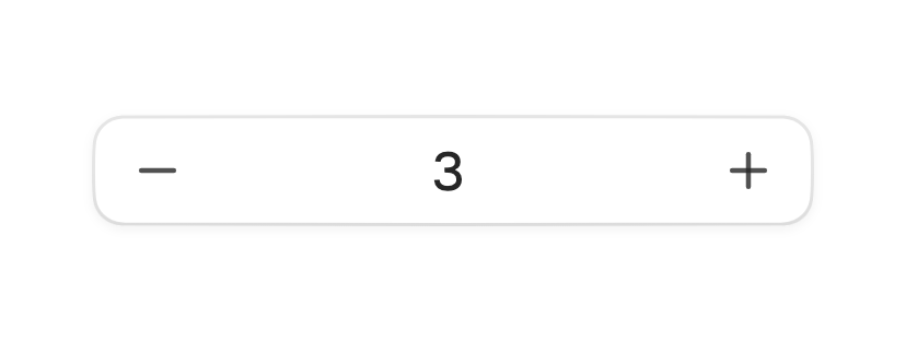
A number field edits a single number. It pairs a text box with plus and minus
steppers, holds the value inside optional min and max bounds, and steps by a
fixed amount. Typing, the arrow keys, and the steppers all resolve to the same
onChanged value.

import 'package:fossui/fossui.dart';

FossNumberField(
  value: _quantity,
  onChanged: (value) => setState(() => _quantity = value),
);
The value can be null when the box is empty, so onChanged reports num?.
Pass initialValue instead of value to let the field manage its own state.
Bounds and step
min and max clamp the value; the matching stepper dims at each end. step
sets the increment for the steppers and the arrow keys, and largeStep sets a
coarser jump for Page Up and Page Down.
FossNumberField(
  value: _volume,
  min: 0,
  max: 11,
  step: 1,
  largeStep: 5,
  onChanged: (value) => setState(() => _volume = value),
);
Format and parse
format renders the stored number as display text, and parse reads typed text
back into a number. Together they support currency, units, or grouped digits.
FossNumberField(
  value: _price,
  format: (value) => '\$${value.toStringAsFixed(2)}',
  parse: (text) => num.tryParse(text.replaceAll(RegExp(r'[^0-9.]'), '')),
  onChanged: (value) => setState(() => _price = value),
);
Size
size matches the text field scale. Use sm in dense forms and md as the
default.
FossNumberField(
  value: _count,
  size: FossTextFieldSize.sm,
  onChanged: (value) => setState(() => _count = value),
);
States
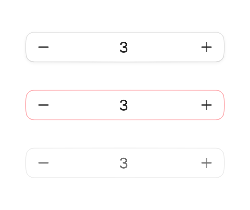
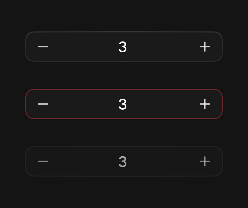
Set error to mark the field invalid, and enabled: false to disable it. A
disabled field skips its steppers and keyboard handling.
FossNumberField(
  value: _amount,
  error: _amount == null,
  onChanged: (value) => setState(() => _amount = value),
);
Accessibility name
When there is no visible label, pass semanticsLabel to name the field for
assistive technology.
FossNumberField(
  value: _guests,
  semanticsLabel: 'Number of guests',
  onChanged: (value) => setState(() => _guests = value),
);
One-off styling
Global retheming is the first choice, but a single field can override its
resolved box with a FossNumberFieldStyle. Every field is optional and falls
back to the theme.
FossNumberField(
  value: _quantity,
  style: const FossNumberFieldStyle(
    borderRadius: 12,
  ),
  onChanged: (value) => setState(() => _quantity = value),
);
API
FossNumberField
| Prop | Type | Default | Description |
|---|---|---|---|
value | num? | null | Controlled value; null when the box is empty. |
onChanged | ValueChanged<num?>? | null | Fires with each committed value. |
initialValue | num? | null | Starting value when the field is uncontrolled. |
min | num? | null | Lower bound; the value clamps to it. |
max | num? | null | Upper bound; the value clamps to it. |
step | num | 1 | Increment for the steppers and arrow keys. |
largeStep | num? | null | Coarser jump for Page Up and Page Down. |
size | FossTextFieldSize | FossTextFieldSize.md | Field height, matching the text field scale. |
format | String Function(num value)? | null | Renders the value as display text. |
parse | num? Function(String text)? | null | Reads typed text back into a number. |
placeholder | String? | null | Hint shown when the box is empty. |
error | bool | false | Marks the field invalid. |
enabled | bool | true | Whether the field accepts input. |
semanticsLabel | String? | null | Accessibility name for the field. |
style | FossNumberFieldStyle? | null | Per-instance overrides on the theme. |
FossNumberFieldStyle
| Field | Type | Default | Description |
|---|---|---|---|
backgroundColor | Color? | null | Fill color of the field box. |
borderColor | Color? | null | Resting border color. |
borderRadius | double? | null | Corner radius in logical pixels. |
minHeight | double? | null | Minimum box height; grows with text scale. |
textStyle | TextStyle? | null | Style of the value and placeholder; color stays token-driven. |
iconSize | double? | null | Painted stepper glyph size in logical pixels. |
stepperHoverColor | Color? | null | Fill painted under a hovered stepper. |
shadow | List<BoxShadow>? | null | Drop shadow layers at rest. |
Live demo
Open the interactive gallery to try every size and state with live knobs.