Pagination
A row that walks through pages with a previous control, a windowed run of page numbers, an ellipsis wherever the run is cut, and a next control.
Pagination is controlled. page is the current page and pageCount the total,
both 1-based, and onPageChanged reports the page the user asked for. The first
and last page are always shown; an ellipsis marks wherever the run is cut.


import 'package:fossui/fossui.dart';

FossPagination(
  page: page,
  pageCount: 12,
  onPageChanged: (p) => setState(() => page = p),
);
Siblings
siblingCount is how many pages sit either side of the current one. It defaults
to 1 and behaves as a ceiling, not a promise.
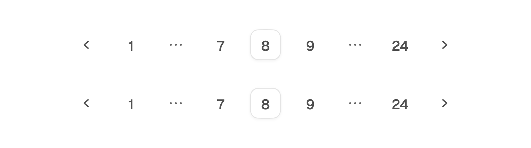
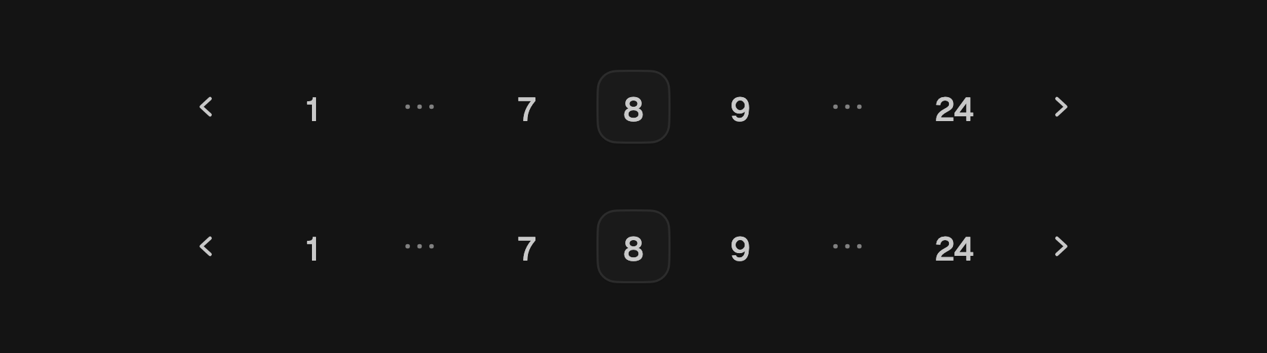
FossPagination(
  page: page,
  pageCount: 24,
  siblingCount: 2,
  onPageChanged: (p) => setState(() => page = p),
);
Fitting the width
The row measures the width it is given and uses the largest sibling count that
fits, so it does not overflow a phone. That figure ignores page, so the row
keeps its width while the user pages rather than jumping as the numbers get
wider. Seven slots is the floor: a narrower row would have to drop the first or
last page, so give the row at least about 360 logical pixels at the default
button size.
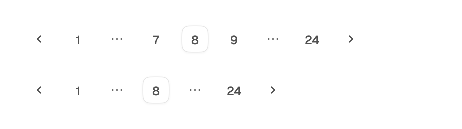
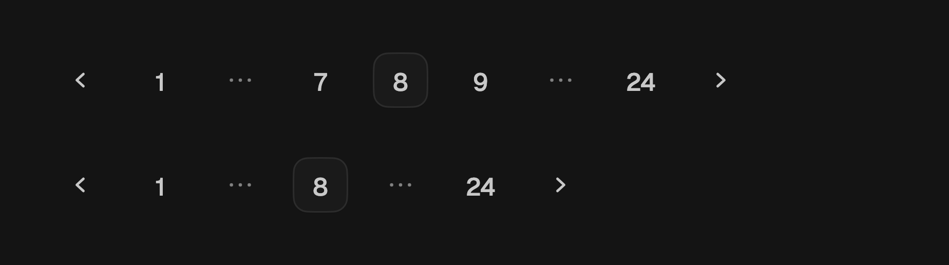
Because the row reads the width it is given, it cannot report an intrinsic size.
Give it a width instead of placing it in a Table cell or an IntrinsicWidth.
SizedBox(
  width: 360,
  child: FossPagination(
    page: page,
    pageCount: 24,
    siblingCount: 2,
    onPageChanged: (p) => setState(() => page = p),
  ),
);
Disabled
A null onPageChanged makes the whole row inert and dimmed, which is the state
to show while a page is loading.


FossPagination(
  page: page,
  pageCount: 6,
  onPageChanged: loading ? null : (p) => setState(() => page = p),
);
Accessibility names
The row names itself Pagination. Override label when a screen carries more
than one, and pageLabel to build each page button's name. previousLabel,
nextLabel, and moreLabel name the chevrons and the ellipsis, which announces
the pages it hides.
FossPagination(
  page: page,
  pageCount: 12,
  label: 'Search results pages',
  pageLabel: (n) => 'Results page $n',
  onPageChanged: (p) => setState(() => page = p),
);
One-off styling
Every control is a square FossButton, so hover, pressed, focus, and disabled
behave the way buttons do elsewhere. A FossPaginationStyle swaps the button
size or the two variants for a single row.
FossPagination(
  page: page,
  pageCount: 12,
  onPageChanged: (p) => setState(() => page = p),
  style: const FossPaginationStyle(
    gap: 2,
    buttonSize: FossButtonSize.sm,
    activeVariant: FossButtonVariant.secondary,
  ),
);
API
FossPagination
| Prop | Type | Default | Description |
|---|---|---|---|
page | int | required | Current page, 1-based and within pageCount. |
pageCount | int | required | Total number of pages, at least 1. |
onPageChanged | ValueChanged<int>? | required | Called with the requested page; null disables the row. |
siblingCount | int | 1 | Pages either side of the current one, as a ceiling. |
label | String | 'Pagination' | Names the row for assistive technology. |
pageLabel | String Function(int page)? | null | Builds each page button's name; defaults to 'Page n'. |
previousLabel | String | 'Go to previous page' | Name of the previous control. |
nextLabel | String | 'Go to next page' | Name of the next control. |
moreLabel | String | 'More pages' | Name of an ellipsis. |
style | FossPaginationStyle? | null | Per-instance overrides on the theme. |
FossPaginationStyle
| Field | Type | Default | Description |
|---|---|---|---|
gap | double? | null | Gap between controls, in logical pixels. |
buttonSize | FossButtonSize? | null | Size of every control in the row. |
activeVariant | FossButtonVariant? | null | Treatment of the current page button. |
inactiveVariant | FossButtonVariant? | null | Treatment of the other page, previous, and next buttons. |
ellipsisColor | Color? | null | Color of the ellipsis glyph. |
ellipsisWidth | double? | null | Width of an ellipsis slot; defaults to a page button's width. |
Live demo
Open the interactive gallery to page through a live row and watch the window narrow with the width.