Dialog
A modal surface with a title, description, body, and stacked actions, as a bottom sheet or centered card.
A dialog interrupts the flow to confirm an action or show a short message. Open
it with showFossDialog, which resolves to the value you pass to
Navigator.pop. The scrim, focus trap, and focus restoration come from the
framework, and colors, type, radius, and shadow come from the theme.
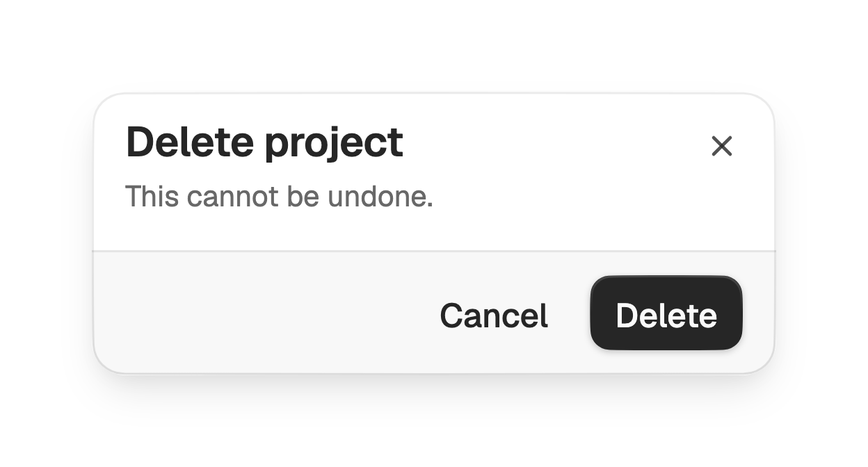
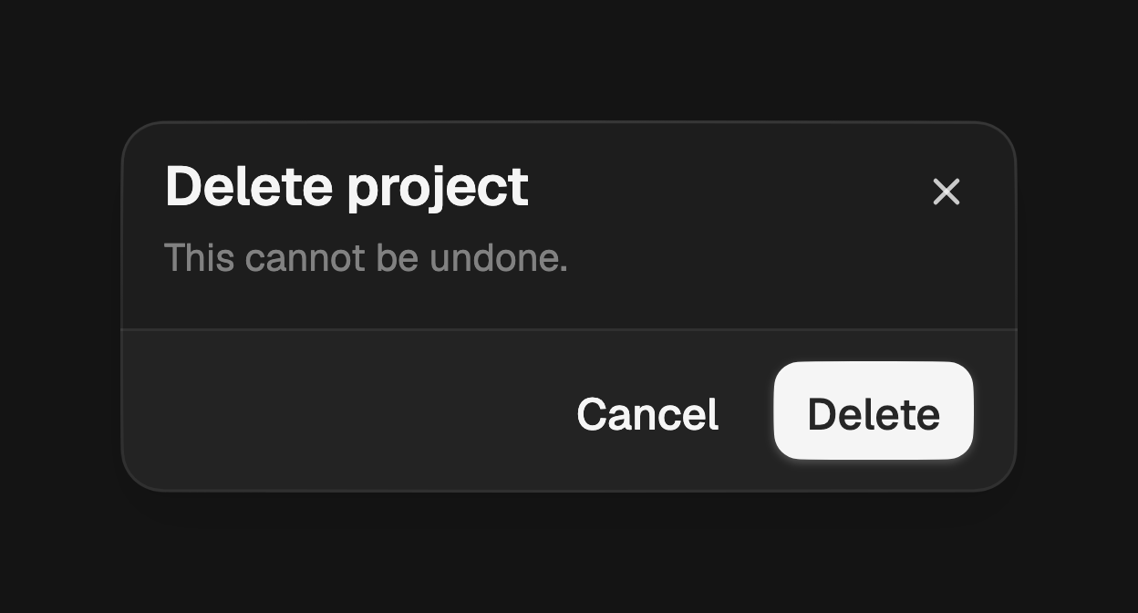
import 'package:fossui/fossui.dart';

final ok = await showFossDialog<bool>(
  context: context,
  builder: (context) => FossDialog(
    title: const Text('Delete project'),
    description: const Text('This cannot be undone.'),
    actions: [
      FossButton(
        variant: FossButtonVariant.ghost,
        onPressed: () => Navigator.pop(context, false),
        child: const Text('Cancel'),
      ),
      FossButton(
        onPressed: () => Navigator.pop(context, true),
        child: const Text('Delete'),
      ),
    ],
  ),
);
Slots
title and description form the header, content is the scrollable body, and
actions fill the footer. Each is optional: a dialog can be a header alone, or a
header with a body and no footer.
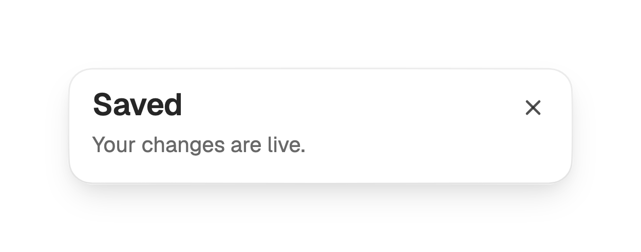
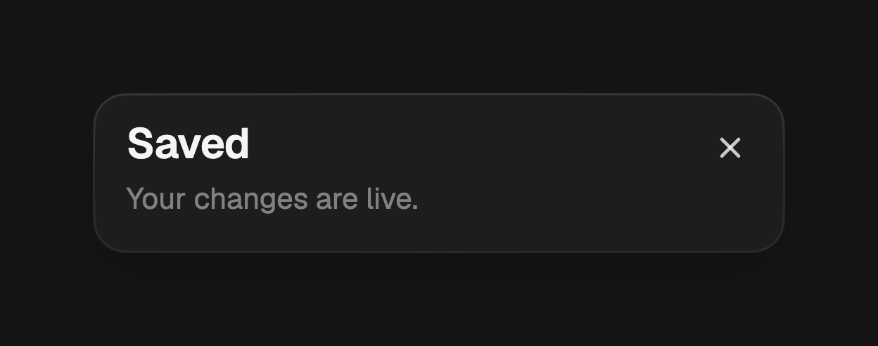
showFossDialog<void>(
  context: context,
  builder: (context) => const FossDialog(
    title: Text('Saved'),
    description: Text('Your changes are live.'),
  ),
);
Actions
actions reuse FossButton and sit in a trailing-aligned row on the footer.
An empty list hides the footer entirely.
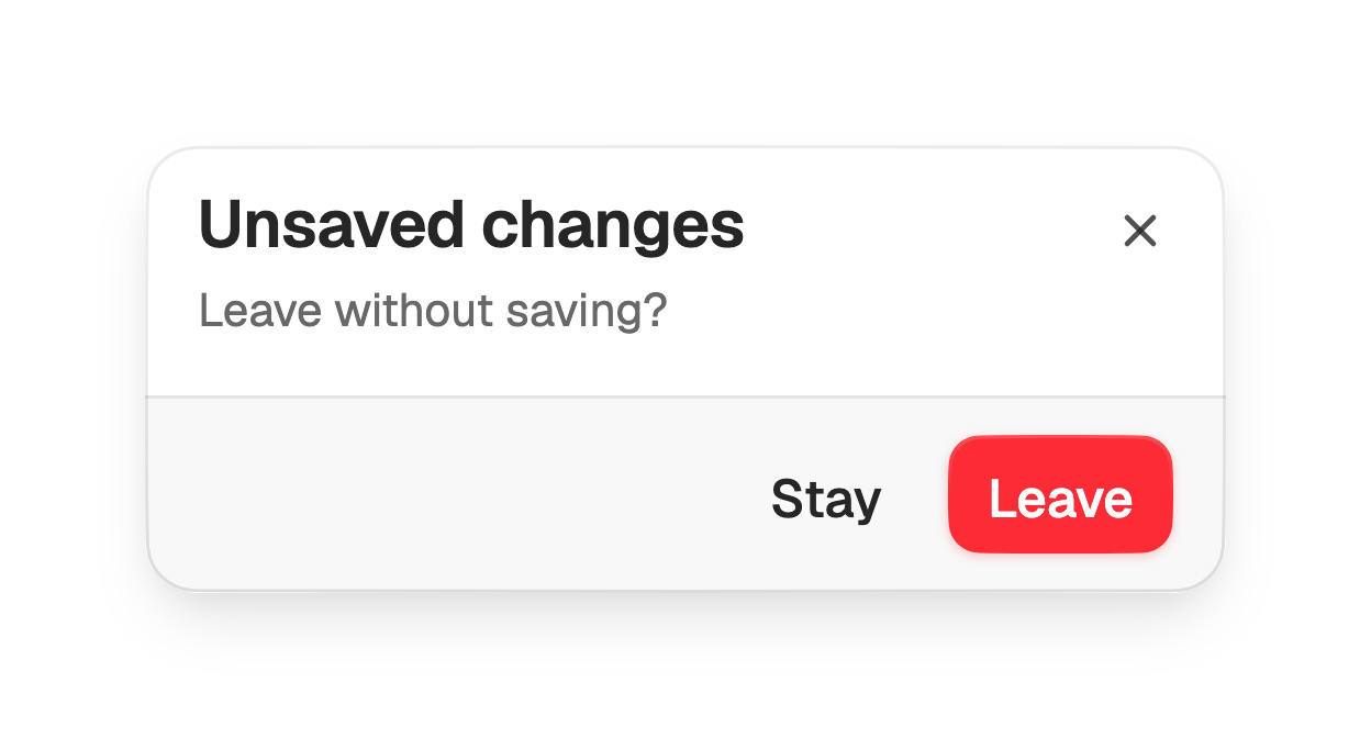
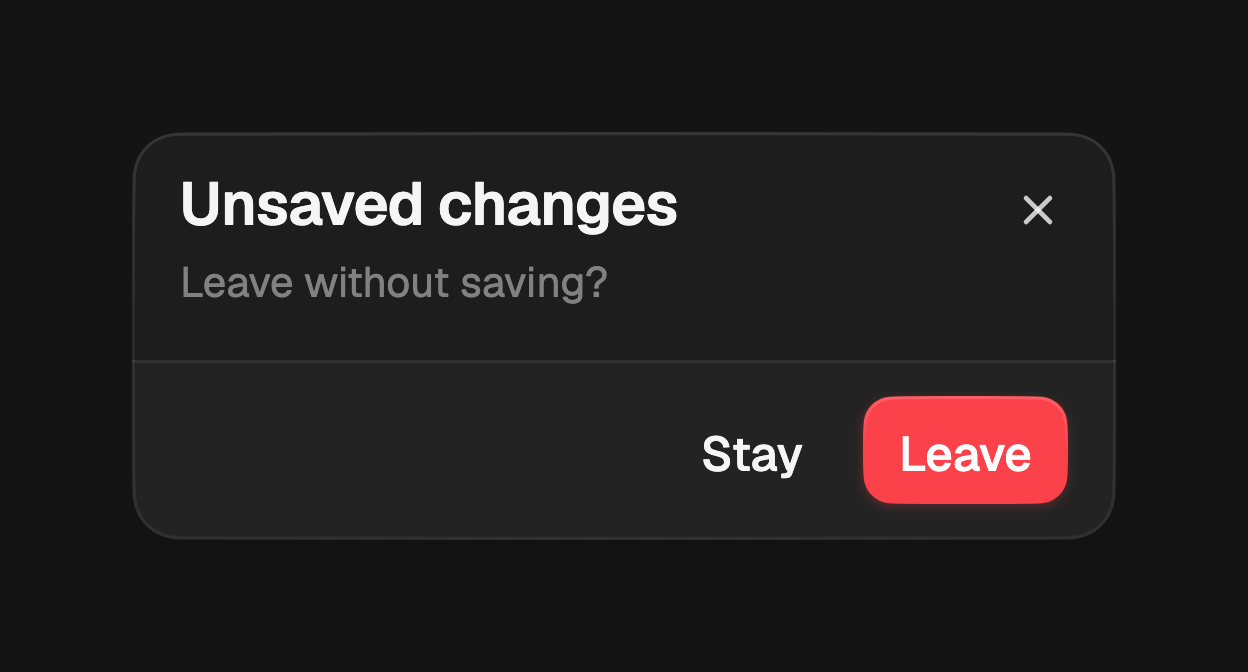
FossDialog(
  title: const Text('Unsaved changes'),
  description: const Text('Leave without saving?'),
  actions: [
    FossButton(
      variant: FossButtonVariant.ghost,
      onPressed: () => Navigator.pop(context),
      child: const Text('Stay'),
    ),
    FossButton(
      variant: FossButtonVariant.destructive,
      onPressed: () => Navigator.pop(context, true),
      child: const Text('Leave'),
    ),
  ],
);
Footer variant
footerVariant sets the footer treatment. The default bare places the actions
on the plain surface; filled draws a bordered bar tinted with the muted role
behind them.
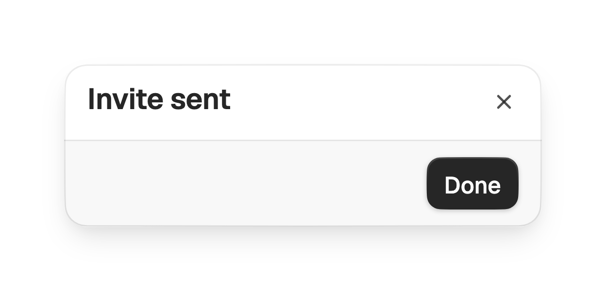
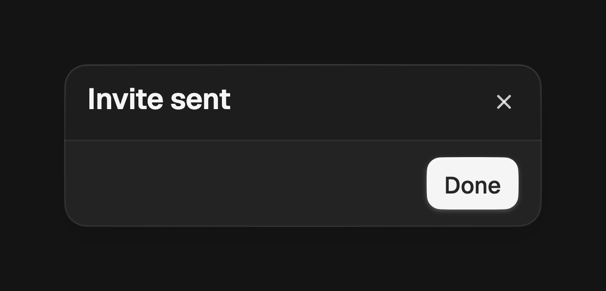
FossDialog(
  title: const Text('Invite sent'),
  footerVariant: FossDialogFooterVariant.filled,
  actions: [
    FossButton(
      onPressed: () => Navigator.pop(context),
      child: const Text('Done'),
    ),
  ],
);
Close affordance
A ghost close button sits in the top corner by default. Set
showCloseButton: false to remove it, or pass closeIcon to replace the painted
glyph with your own widget.
FossDialog(
  title: const Text('Terms'),
  showCloseButton: false,
  content: const TermsBody(),
);
Required action
Pass barrierDismissible: false to showFossDialog so a tap outside the surface
does not close it, forcing the user to choose an action.
showFossDialog<bool>(
  context: context,
  barrierDismissible: false,
  builder: (context) => FossDialog(
    title: const Text('Confirm payment'),
    actions: [
      FossButton(
        onPressed: () => Navigator.pop(context, true),
        child: const Text('Pay'),
      ),
    ],
  ),
);
Presentation
By default the dialog opens as a full-width bottom sheet, the mobile-first
choice. Pass presentation: FossDialogPresentation.centered to show a centered
card clamped to a max width instead.
showFossDialog<bool>(
  context: context,
  presentation: FossDialogPresentation.centered,
  builder: (context) => FossDialog(
    title: const Text('Rename file'),
    content: const RenameForm(),
  ),
);
API
showFossDialog
| Prop | Type | Default | Description |
|---|---|---|---|
context | BuildContext | required | The context used to find the navigator. |
builder | WidgetBuilder | required | Builds the dialog, typically a FossDialog. |
presentation | FossDialogPresentation | bottomSheet | Whether the dialog rides up as a bottom sheet or opens as a centered card. |
barrierDismissible | bool | true | Whether a tap outside the surface dismisses it. |
barrierLabel | String? | null | Accessibility label for the scrim. |
useRootNavigator | bool | true | Whether to push onto the root navigator. |
Returns a Future<T?> that resolves to the value passed to Navigator.pop.
FossDialog
| Prop | Type | Default | Description |
|---|---|---|---|
title | Widget? | null | The title, rendered at the top of the header. |
description | Widget? | null | The description, rendered below the title. |
content | Widget? | null | The scrollable body between the header and the footer. |
actions | List<Widget> | [] | The footer actions; empty hides the footer. |
footerVariant | FossDialogFooterVariant | filled | The footer treatment. |
showCloseButton | bool | true | Whether to show the close affordance in the top corner. |
closeIcon | Widget? | null | Overrides the default painted close glyph. |
closeLabel | String | 'Close' | Accessibility label for the close affordance. |
semanticLabel | String? | null | Names the route for assistive tech. Defaults to the title text. |
presentation | FossDialogPresentation? | null | Overrides the presentation set by the show function. |
style | FossDialogStyle? | null | Per-instance overrides on the theme. |
FossDialogFooterVariant
bare, filled.
FossDialogPresentation
bottomSheet, centered.
Live demo
Open the interactive gallery to try slots, actions, and footer variant with live knobs.