Toggle group
A row or column of toggles bound to one shared selection.
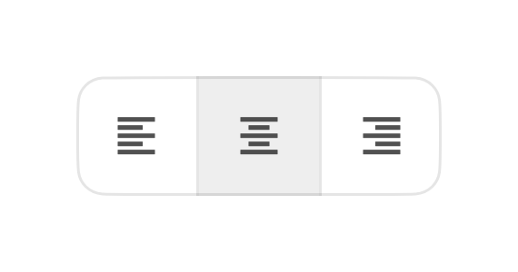
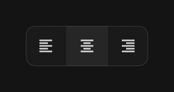
A toggle group binds a set of toggles to one selection. Each item's pressed
state is its membership in the group value, and the variant and size set on
the group propagate to every item. Use FossToggleGroup.single for a
one-of-many choice or FossToggleGroup.multiple for independent toggles. In the
outline variant the items join into one segmented bar with a shared border and
rounded outer ends; in standard they sit as separate buttons with a small gap.
import 'package:fossui/fossui.dart';

FossToggleGroup.single(
  value: alignment,
  variant: FossToggleVariant.outline,
  onChanged: (v) => setState(() => alignment = v),
  children: const [
    FossToggleGroupItem(value: 'left', child: Text('Left')),
    FossToggleGroupItem(value: 'center', child: Text('Center')),
    FossToggleGroupItem(value: 'right', child: Text('Right')),
  ],
);
Single selection
One item is on at a time. Selecting another swaps it, and tapping the active item again clears the value to null, so the group can be empty.
FossToggleGroup.single(
  value: view,
  onChanged: (v) => setState(() => view = v),
  children: const [
    FossToggleGroupItem(value: 'list', child: Text('List')),
    FossToggleGroupItem(value: 'grid', child: Text('Grid')),
  ],
);
Multiple selection
Items toggle independently in and out of a set.
FossToggleGroup.multiple(
  value: marks,
  onChanged: (v) => setState(() => marks = v),
  children: const [
    FossToggleGroupItem(value: 'bold', child: Text('Bold')),
    FossToggleGroupItem(value: 'italic', child: Text('Italic')),
  ],
);
Orientation
Set orientation to Axis.vertical to stack the items into a column. The
outline bar joins top to bottom, and a horizontal bar mirrors under RTL.
FossToggleGroup.single(
  value: view,
  orientation: Axis.vertical,
  variant: FossToggleVariant.outline,
  onChanged: (v) => setState(() => view = v),
  children: const [
    FossToggleGroupItem(value: 'day', child: Text('Day')),
    FossToggleGroupItem(value: 'week', child: Text('Week')),
    FossToggleGroupItem(value: 'month', child: Text('Month')),
  ],
);
Disabled
A null onChanged or enabled: false disables the whole group; an item's own
enabled: false disables just that one.
FossToggleGroup.single(
  value: view,
  enabled: false,
  onChanged: (v) => setState(() => view = v),
  children: const [
    FossToggleGroupItem(value: 'list', child: Text('List')),
    FossToggleGroupItem(value: 'grid', child: Text('Grid')),
  ],
);
API
FossToggleGroup.single
| Prop | Type | Default | Description |
|---|---|---|---|
value | String? | required | The selected item, or null when empty. |
onChanged | ValueChanged<String?> | required | Called with the new selection, null when cleared. |
variant | FossToggleVariant | standard | Propagated to every item. |
size | FossToggleSize | md | Propagated to every item. |
orientation | Axis | horizontal | The layout axis. |
enabled | bool | true | When false, every item is disabled. |
children | List<FossToggleGroupItem> | required | The entries. |
style | FossToggleGroupStyle? | null | Per-instance overrides on the theme. |
FossToggleGroup.multiple
The same, with value typed Set<String> and onChanged typed
ValueChanged<Set<String>>.
FossToggleGroupItem
| Prop | Type | Default | Description |
|---|---|---|---|
value | String | required | The id, unique within the group. |
leading | Widget? | null | Icon before the label, or the sole content when icon-only. |
child | Widget? | null | The label. Null makes a square icon-only entry. |
semanticLabel | String? | null | Accessibility name, required in spirit for icon-only. |
enabled | bool | true | When false, this entry is disabled. |
Live demo
Open the interactive gallery to try both variants, orientations, and selection modes with live knobs.