Date Picker
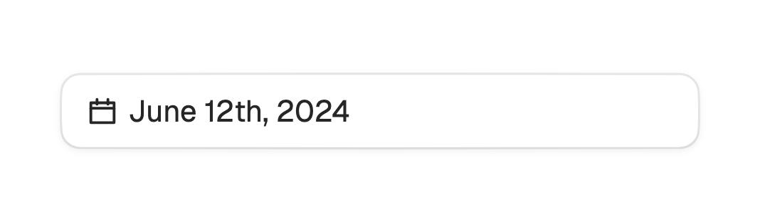
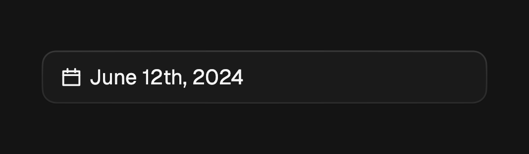
A field that opens a calendar in a dialog and shows the chosen date back in the trigger.
A date picker is a field that opens a calendar in a modal dialog and reads the
chosen date back in its trigger. It comes in two shapes, one per named
constructor: single for one day and range for a start-to-end span. Tapping
the field (or pressing Enter, Space, or the down arrow) opens the calendar as a
bottom sheet by default, or a centered card via presentation; a scrim tap or
Escape dismisses it.
import 'package:fossui/fossui.dart';

FossDatePicker.single(
  selected: _day,
  onSelected: (day) => setState(() => _day = day),
);
Date range
FossDatePicker.range selects a span over two taps. The first tap sets the
start, the second sets the end, and onSelected fires with a FossDateRange.
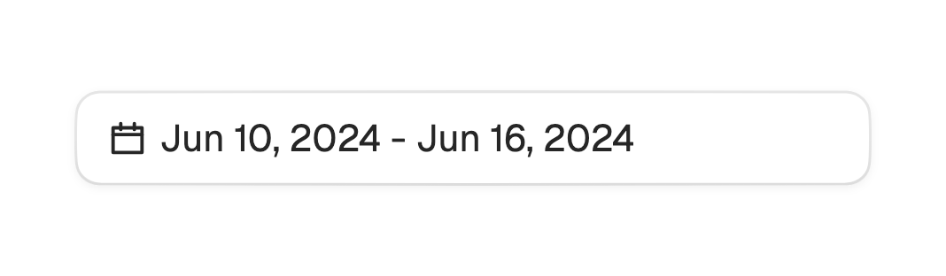
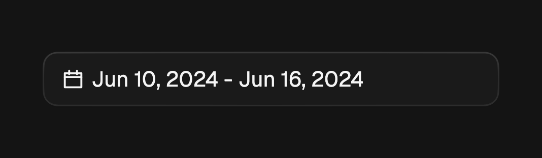
The trigger shows both ends once the range is complete.
FossDatePicker.range(
  selected: _range,
  onSelected: (range) => setState(() => _range = range),
);
Label format
The trigger label uses a built-in format (March 6th, 2026 for a single date,
Jul 09, 2026 - Jul 16, 2026 for a range) with no date-library dependency. Pass
a format callback for locale-aware output, and placeholder for the empty
state.
FossDatePicker.single(
  selected: _day,
  placeholder: 'Select a date',
  format: (day) => DateFormat.yMMMMd().format(day),
  onSelected: (day) => setState(() => _day = day),
);
Bounds
minDate and maxDate cap the selectable span, and isDateEnabled disables
individual days such as weekends or holidays. All three pass through to the
embedded calendar.
FossDatePicker.single(
  selected: _day,
  minDate: DateTime.now(),
  isDateEnabled: (day) => day.weekday <= DateTime.friday,
  onSelected: (day) => setState(() => _day = day),
);
Presentation
The calendar opens as a bottom sheet by default. Pass
FossDialogPresentation.centered for a centered card instead.
FossDatePicker.single(
  selected: _day,
  presentation: FossDialogPresentation.centered,
  onSelected: (day) => setState(() => _day = day),
);
Open state
Leave the open state to the picker, or control it with open and
onOpenChange. By default the dialog closes on a pick (closeOnSelect), a single
date on its tap and a range once both ends are set. Set closeOnSelect: false to
keep it open.
FossDatePicker.single(
  selected: _day,
  open: _open,
  onOpenChange: (open) => setState(() => _open = open),
  closeOnSelect: false,
  onSelected: (day) => setState(() => _day = day),
);
One-off styling
Global retheming is the first choice, but a single picker can override its
trigger with a FossDatePickerStyle. Every field is optional and falls back to
the theme.
FossDatePicker.single(
  selected: _day,
  style: const FossDatePickerStyle(
    gap: 10,
  ),
  onSelected: (day) => setState(() => _day = day),
);
API
FossDatePicker.single
| Prop | Type | Default | Description |
|---|---|---|---|
selected | DateTime? | required | The chosen day, or null for none. |
onSelected | ValueChanged<DateTime> | required | Fires with the picked day. |
format | String Function(DateTime)? | null | Overrides the built-in label. |
FossDatePicker.range
| Prop | Type | Default | Description |
|---|---|---|---|
selected | FossDateRange? | required | The chosen span, or null for none. |
onSelected | ValueChanged<FossDateRange> | required | Fires as the range is set over two taps. |
format | String Function(FossDateRange)? | null | Overrides the built-in label. |
Shared props
| Prop | Type | Default | Description |
|---|---|---|---|
placeholder | String | 'Pick a date' | Shown while nothing is selected. |
open | bool? | null | Controlled open state; pair with onOpenChange. |
onOpenChange | ValueChanged<bool>? | null | Fires on every open or close request. |
closeOnSelect | bool | true | Close the dialog on a completed pick. |
presentation | FossDialogPresentation | bottomSheet | Bottom sheet or centered card. |
firstDayOfWeek | int | DateTime.monday | Leading column of the week (1 to 7). |
minDate | DateTime? | null | Earliest selectable day. |
maxDate | DateTime? | null | Latest selectable day. |
isDateEnabled | bool Function(DateTime)? | null | Disables individual days. |
enabled | bool | true | Whether the trigger accepts input. |
semanticsLabel | String? | null | Accessibility name for the trigger. |
style | FossDatePickerStyle? | null | Per-instance overrides on the theme. |
Live demo
Open the interactive gallery to try single and range modes with live knobs.