Chip
A compact pill carrying a value the user can pick or drop, for filter bars, tag lists, and multi-select fields.
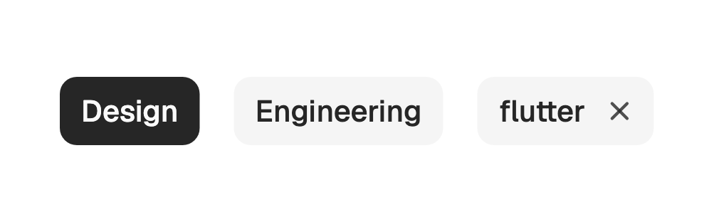
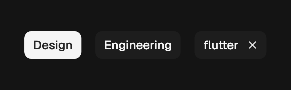
A chip holds one small value: a filter in a bar, a tag on a record, an entry
inside a multi-select field. The callbacks decide what it is. With neither it is
a static pill. With onSelected the body toggles selected. With onRemove it
grows a close affordance at the end. Both together give a filter chip that can
also be dropped.
import 'package:fossui/fossui.dart';

FossChip(
  label: const Text('Design'),
);
Variants
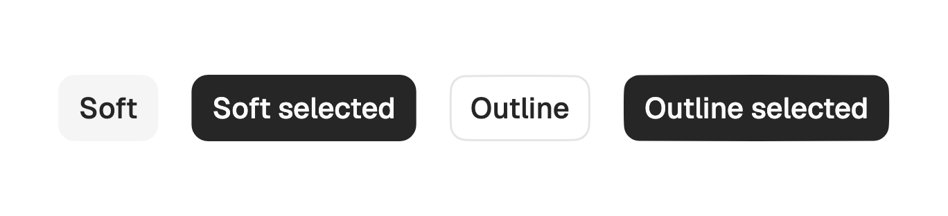
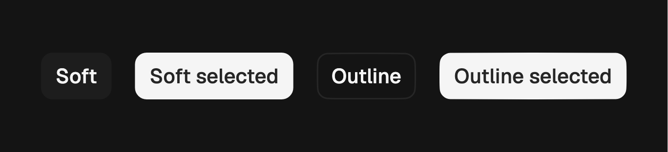
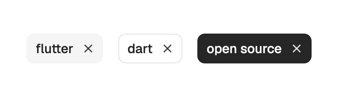
soft is the default: a tinted fill with no border. outline sits flat on the
background behind a border. A selected chip of either variant fills with the
primary color, so selection reads the same across a mixed row.
FossChip(
  label: const Text('Outline'),
  variant: FossChipVariant.outline,
);
Sizes
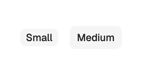
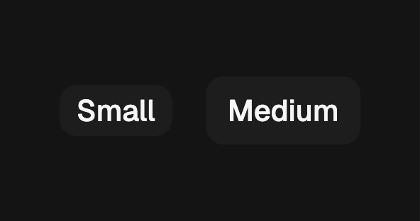
md is 32 tall and the default, matching a small button. sm is 24 and sized to
sit inside a field, which is what the multi-select combobox uses for its values.
FossChip(
  label: const Text('Small'),
  size: FossChipSize.sm,
);
Selection
Selection is controlled. The chip renders whatever selected says and reports
the flipped value through onSelected on a tap or on Space and Enter; hold the
value yourself and pass it back down.
FossChip(
  label: const Text('Design'),
  selected: filters.contains('Design'),
  onSelected: (on) => setState(() {
    if (on) {
      filters.add('Design');
    } else {
      filters.remove('Design');
    }
  }),
);
Leading icon
leading takes any widget and themes it as an icon, sized and colored with the
label. Use it for a category mark or a checked state.


FossChip(
  label: const Text('Verified'),
  leading: const Icon(LucideIcons.check),
);
Removable
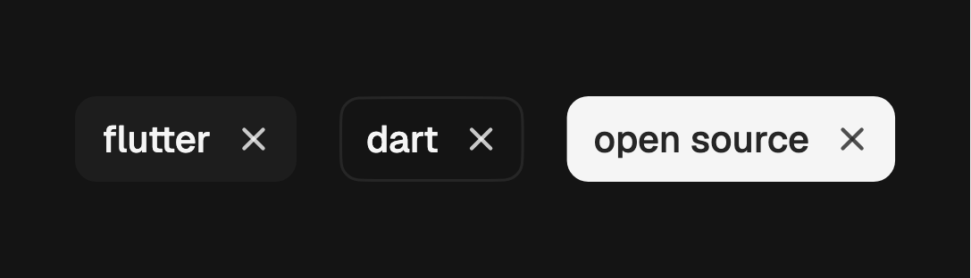
onRemove adds a close affordance at the end of the pill with its own tap
target, separate from the body. Name it with removeLabel when "Remove" is not
specific enough for assistive technology.
FossChip(
  label: const Text('flutter'),
  removeLabel: 'Remove flutter tag',
  onRemove: () => setState(() => tags.remove('flutter')),
);
Disabled
enabled: false dims the whole pill and blocks the body and the close
affordance alike, whatever the callbacks say.


FossChip(
  label: const Text('Unavailable'),
  enabled: false,
  onSelected: (on) {},
);
Accessibility name
When the label does not carry the whole meaning, pass semanticLabel. It
replaces the label in the semantics tree rather than adding to it, so assistive
technology announces one name.
FossChip(
  label: const Text('3d'),
  semanticLabel: 'Last three days',
  selected: true,
  onSelected: (on) => setState(() => range = on),
);
One-off styling
Retheming globally is the first choice, but a single chip can override its
resolved visuals with a FossChipStyle. The color fields are
WidgetStatePropertys resolved against the chip's state set, so selection
resolves as WidgetState.selected.
FossChip(
  label: const Text('Design'),
  selected: on,
  onSelected: (v) => setState(() => on = v),
  style: FossChipStyle(
    backgroundColor: WidgetStateProperty.resolveWith((states) {
      if (states.contains(WidgetState.selected)) {
        return const Color(0xFF16A34A);
      }
      return const Color(0x0A000000);
    }),
  ),
);
API
FossChip
| Prop | Type | Default | Description |
|---|---|---|---|
label | Widget | required | The pill content, typically a Text. |
variant | FossChipVariant | soft | Visual treatment: soft or outline. |
size | FossChipSize | md | Size step: sm (24) or md (32). |
leading | Widget? | null | Widget before the label, themed as an icon. |
selected | bool | false | Whether the chip reads as chosen. |
onSelected | ValueChanged<bool>? | null | Called with the flipped value; null leaves the body inert. |
onRemove | VoidCallback? | null | Called from the close affordance; null hides it. |
removeLabel | String | 'Remove' | Accessibility name for the close affordance. |
enabled | bool | true | Whether the chip responds to input. |
semanticLabel | String? | null | Accessibility name replacing the label. |
style | FossChipStyle? | null | Per-instance overrides on the theme. |
FossChipStyle
| Field | Type | Default | Description |
|---|---|---|---|
backgroundColor | WidgetStateProperty<Color>? | null | Fill per interactive state. |
foregroundColor | WidgetStateProperty<Color>? | null | Label, icon, and close mark color per state. |
side | BorderSide? | null | Border drawn in every state, or BorderSide.none. |
borderRadius | double? | null | Uniform corner radius in logical pixels. |
padding | double? | null | Horizontal inset between the pill edge and its content. |
minHeight | double? | null | Minimum pill height; content and text scale grow it. |
textStyle | TextStyle? | null | Label text style; color comes from foregroundColor. |
iconSize | double? | null | Leading icon size in logical pixels. |
gap | double? | null | Gap between the leading icon and the label. |
disabledOpacity | double? | null | Opacity applied to the whole chip when disabled. |
Live demo
Open the interactive gallery to try both variants, selection, and removal with live knobs.