List Tile
A list row with an optional leading widget, a title over an optional subtitle, and an optional trailing widget.
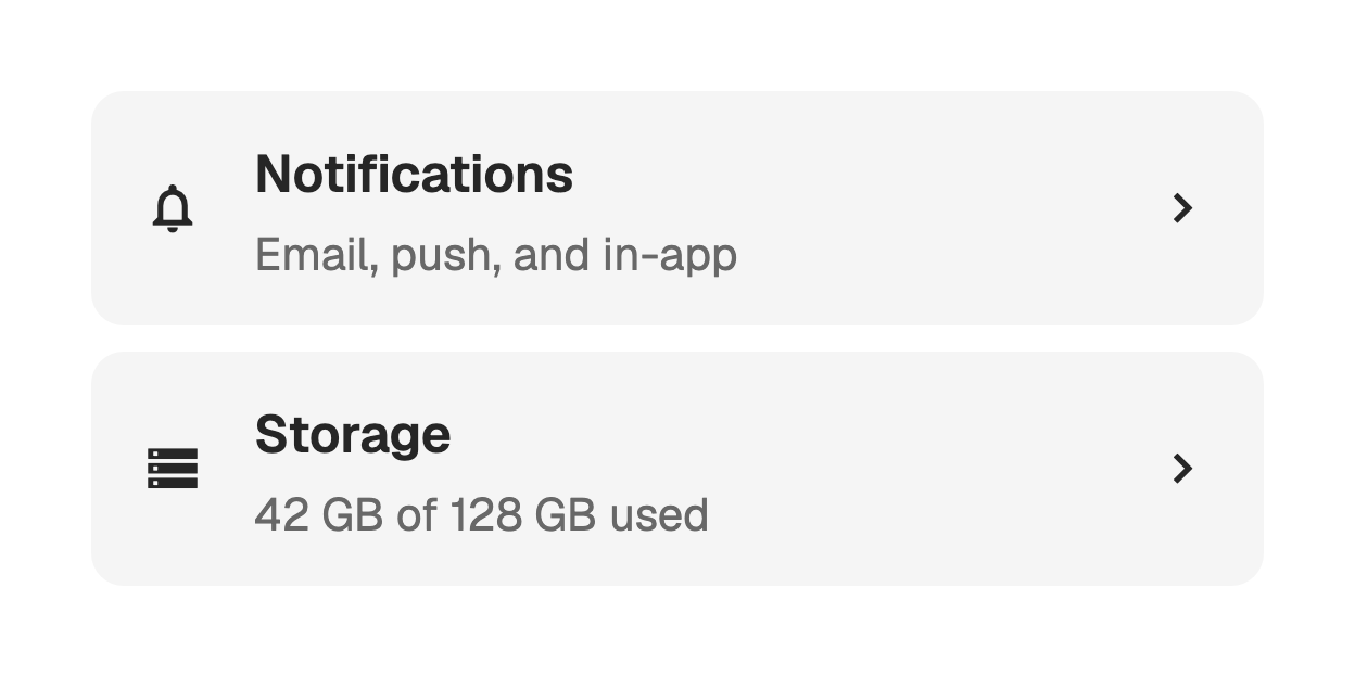
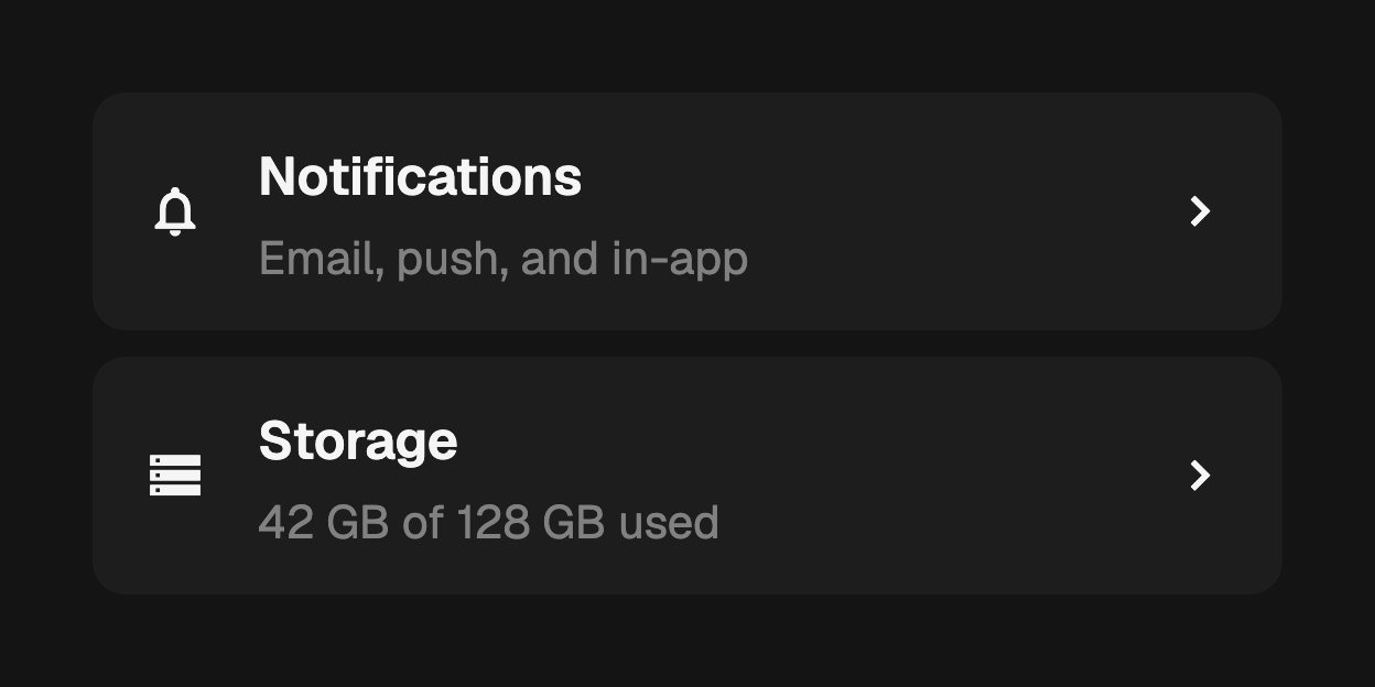
A settings screen or an account list is mostly one row repeated. FossListTile
is that row: an optional leading widget, a title over an optional
subtitle, and an optional trailing widget. Only the title is required, and
every gap collapses with the slot it belongs to.
import 'package:fossui/fossui.dart';

FossListTile(
  title: const Text('Notifications'),
  subtitle: const Text('Email, push, and in-app'),
  leading: const Icon(LucideIcons.bell),
  trailing: const Icon(LucideIcons.chevronRight),
  onTap: openNotificationSettings,
);
Slots
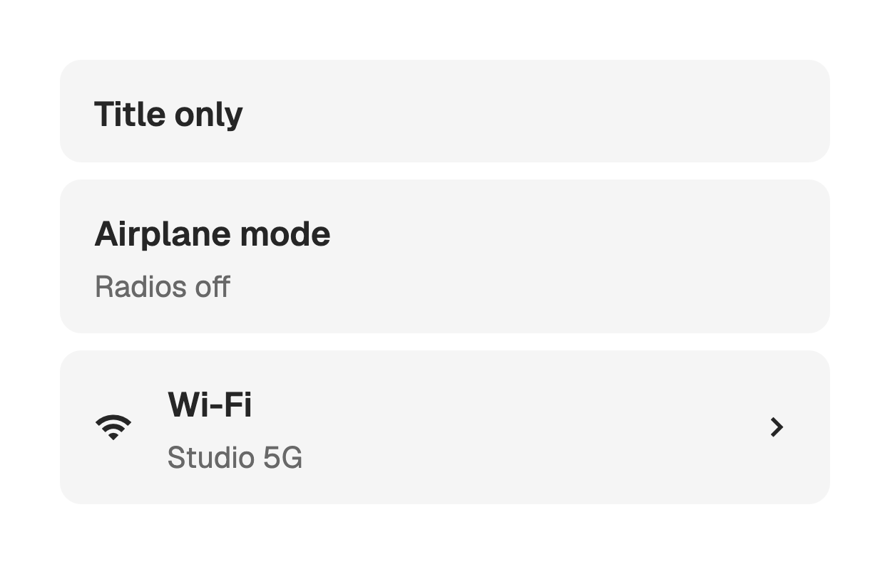
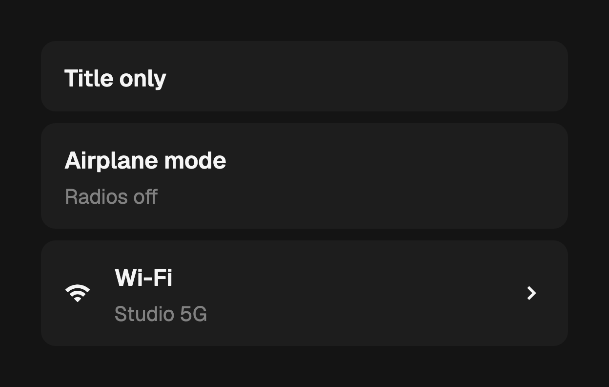
The title is clamped to one line and the subtitle to two. leading is themed as
an icon and rendered at its own size; trailing takes anything, and an
interactive widget there keeps its own gestures and its own focus stop, so a tap
on a trailing switch never reaches onTap.
FossListTile(
  title: const Text('Wi-Fi'),
  subtitle: const Text('Studio 5G'),
  leading: const Icon(LucideIcons.wifi),
  trailing: FossSwitch(value: wifi, onChanged: (v) => setState(() => wifi = v)),
);
Variants
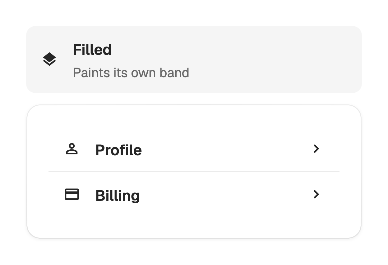
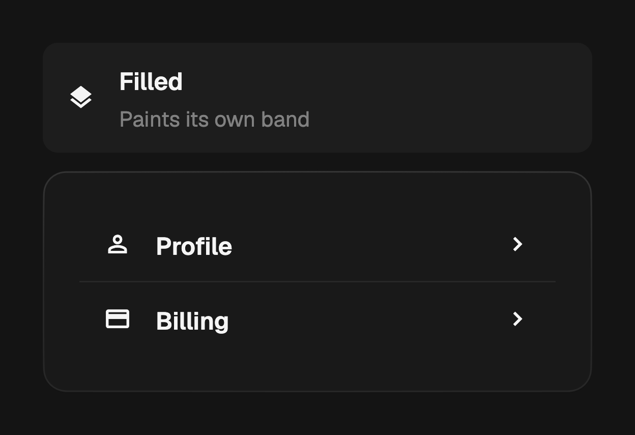
filled is the default: the row paints its own tinted, rounded surface, so a
plain list reads as a stack of bands. Use plain inside a FossCard or any
container that already paints, where a second rectangle would double-draw.
FossCard(
  content: Column(
    mainAxisSize: MainAxisSize.min,
    children: [
      FossListTile(
        title: const Text('Profile'),
        variant: FossListTileVariant.plain,
        trailing: const Icon(LucideIcons.chevronRight),
        onTap: openProfile,
      ),
      const FossSeparator(),
      FossListTile(
        title: const Text('Billing'),
        variant: FossListTileVariant.plain,
        trailing: const Icon(LucideIcons.chevronRight),
        onTap: openBilling,
      ),
    ],
  ),
);
Tapping
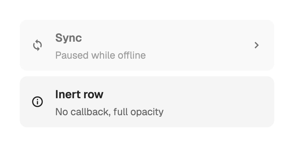
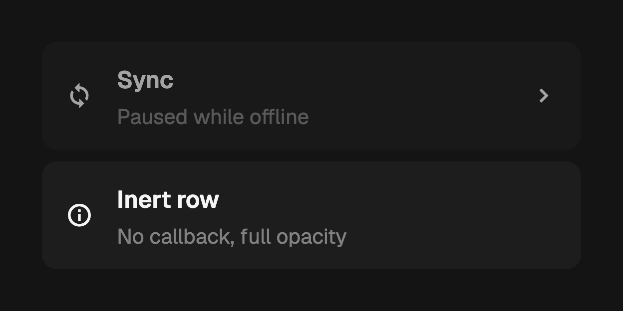
onTap turns the whole row into one target and adds hover, pressed, and
keyboard activation. Leaving it null keeps the row inert at full opacity, which
is a different state from disabled: a read-only row still reads as available
content.
FossListTile(
  title: const Text('Storage'),
  subtitle: const Text('42 GB of 128 GB used'),
  onTap: openStorage,
);
Disabled
enabled: false dims the row to 64% and blocks both the pointer and the
keyboard, whether or not onTap is set.
FossListTile(
  title: const Text('Sync'),
  subtitle: const Text('Paused while offline'),
  leading: const Icon(LucideIcons.refreshCw),
  enabled: false,
  onTap: startSync,
);
Accessibility name
Pass semanticLabel for a row whose visible text does not read well on its own.
It is announced instead of the title and subtitle, not in addition to them.
FossListTile(
  title: const Text('2 of 5'),
  subtitle: const Text('Steps done'),
  semanticLabel: 'Onboarding, two of five steps done',
);
One-off styling
Retheming globally is the first choice, but a single row can override its
resolved visuals with a FossListTileStyle. backgroundColor is a
WidgetStateProperty resolved against the row's state set.
FossListTile(
  title: const Text('Compact'),
  style: const FossListTileStyle(
    minHeight: 44,
    gap: 12,
    padding: EdgeInsets.symmetric(horizontal: 12, vertical: 6),
  ),
);
API
FossListTile
| Prop | Type | Default | Description |
|---|---|---|---|
title | Widget | required | The primary line, clamped to one line. |
subtitle | Widget? | null | Secondary line below the title, clamped to two lines. |
variant | FossListTileVariant | filled | Resting surface: filled or plain. |
leading | Widget? | null | Widget at the start of the row, themed as an icon. |
trailing | Widget? | null | Widget at the end of the row; an interactive one keeps its own gestures. |
onTap | VoidCallback? | null | Called on tap, Enter, or Space; null leaves the row inert. |
enabled | bool | true | Whether the row is interactive. False dims it to 64%. |
semanticLabel | String? | null | Accessibility name announced instead of the title and subtitle. |
style | FossListTileStyle? | null | Per-instance overrides on the theme. |
FossListTileStyle
| Field | Type | Default | Description |
|---|---|---|---|
backgroundColor | WidgetStateProperty<Color>? | null | Fill per interactive state. |
padding | EdgeInsetsGeometry? | null | Inner padding around the slots. |
gap | double? | null | Gap between the leading slot, the text column, and the trailing slot. |
minHeight | double? | null | Minimum row height; a two-line subtitle or a taller slot grows it. |
borderRadius | double? | null | Uniform corner radius of the fill, in logical pixels. |
titleStyle | TextStyle? | null | Merged over the resolved title style. |
subtitleStyle | TextStyle? | null | Merged over the resolved subtitle style. |
iconSize | double? | null | Icon size for the leading and trailing slots. |
Live demo
Open the interactive gallery to try every slot combination and both variants with live knobs.