Spinner
A circular loading indicator that spins an open arc continuously.
A spinner signals that work is in progress. It paints an open arc that rotates in
a continuous loop, sized by size and colored by color, which defaults to the
theme foreground token. The rotation stops under reduced motion.
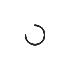

import 'package:fossui/fossui.dart';

const FossSpinner();
Size
size sets both the width and the height in logical pixels. It defaults to 24.
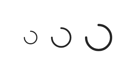
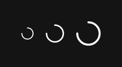
const FossSpinner(size: 18);Color
color overrides the arc color for a one-off, for example a spinner sitting on a
filled surface. Left null, it follows the theme foreground token.
const FossSpinner(color: Color(0xFFFFFFFF));Accessibility
The spinner announces itself while loading with semanticLabel, which defaults to
Loading. Pass a more specific label when the context calls for it.
const FossSpinner(semanticLabel: 'Fetching results');When to use it
Reach for a spinner when work is in progress but you can't yet render a
skeleton of the result, typically a short action like a button press or a
form submit. Prefer FossProgress instead when you know how far along the
work is (a percentage or step count) so the user gets a determinate signal
rather than an open-ended one. Prefer a skeleton placeholder instead when
you're loading a whole screen or list and want to preserve layout instead of
centering a single indicator.
API
FossSpinner
| Prop | Type | Default | Description |
|---|---|---|---|
size | double | 24 | The width and height of the indicator, in logical pixels. |
color | Color? | null | The arc color. Falls back to the theme foreground token. |
semanticLabel | String | 'Loading' | The accessibility label announced while loading. |
Live demo
Open the interactive gallery to try size and color with live knobs.