Popover
An interactive floating panel anchored to a trigger, dismissed by an outside tap or Escape.
Wrap a trigger in a FossPopover to float a panel of arbitrary content beside
it. Tapping the trigger opens the surface on the side you pick; it flips and
clamps to stay on screen, and an outside tap or Escape dismisses it. Unlike a
FossTooltip, the content is interactive and can hold focusable widgets.
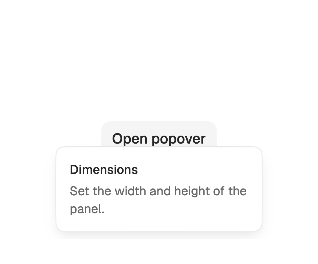
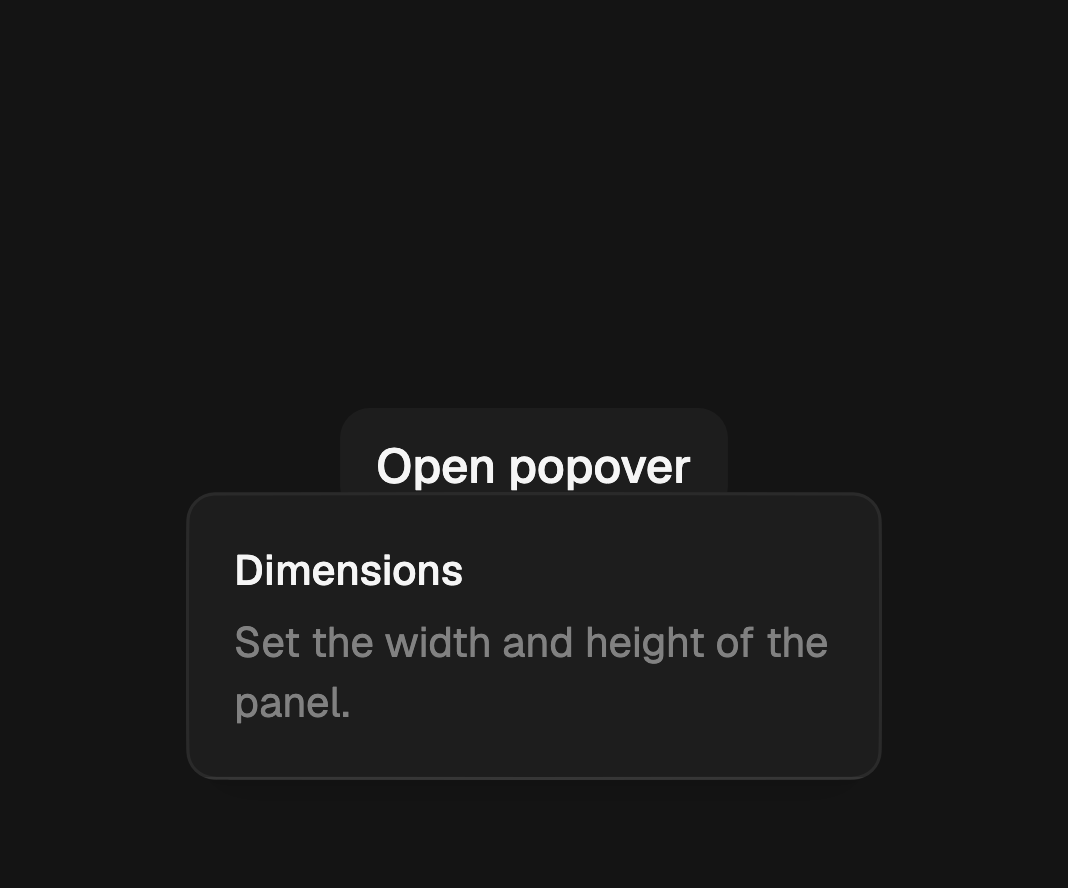
import 'package:fossui/fossui.dart';

FossPopover(
  builder: (context) => const _Panel(),
  child: const Text('Open popover'),
);
Side and align
side sets the preferred edge to open on (bottom by default); it flips to the
opposite side when the surface will not fit. align positions the surface along
the cross axis (center by default). sideOffset and alignOffset nudge it.
FossPopover(
  side: FossPopoverSide.top,
  align: FossPopoverAlign.start,
  builder: (context) => const _Panel(),
  child: const Text('Open'),
);
Controlling it
Leave it uncontrolled and it manages its own open state. To drive it, pass
open with onOpenChange, or use a FossPopoverController for imperative
open, close, and toggle. The controller works in either mode, so content
inside the surface can close it.
final controller = FossPopoverController();

FossPopover(
  controller: controller,
  builder: (context) => FossButton(
    onPressed: controller.close,
    child: const Text('Done'),
  ),
  child: FossButton(
    onPressed: controller.toggle,
    child: const Text('Open popover'),
  ),
);
An interactive trigger such as a FossButton consumes its own tap, so wire it to
the controller (onPressed: controller.toggle). A plain widget trigger opens
through the popover's own gesture without a controller.
Modal
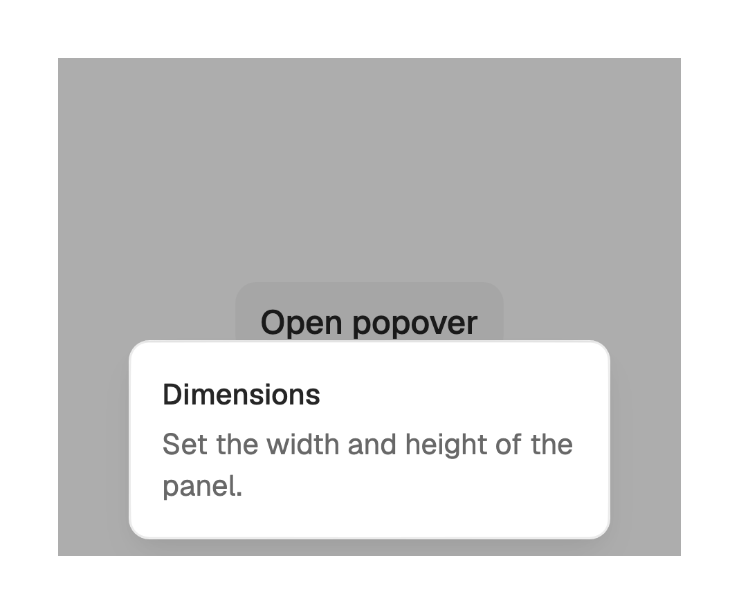
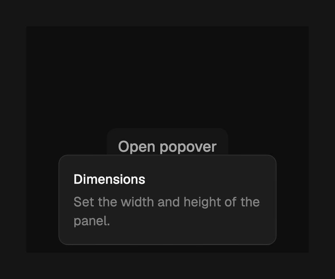
By default the popover is non-modal: focus moves into the surface and the
background stays interactive. Set modal to draw a scrim behind the surface and
trap focus inside it.
FossPopover(
  modal: true,
  builder: (context) => const _Panel(),
  child: const Text('Open'),
);
Dismiss
An outside tap or Escape closes the popover, and it also closes when an
ancestor scrolls or the system back gesture fires. Set dismissible: false to
keep it open until you close it through the controller; a non-dismissible
popover repositions on scroll rather than detaching.
FossPopover(
  dismissible: false,
  controller: controller,
  builder: (context) => const _Panel(),
  child: const Text('Open'),
);
One-off styling
Global retheming comes first, but a single popover can override the resolved
surface with a FossPopoverStyle. Every field is optional and falls back to the
theme. This is the escape hatch a calendar child uses to widen the corner and
tighten the padding.
FossPopover(
  style: const FossPopoverStyle(borderRadius: 14, padding: EdgeInsets.all(8)),
  builder: (context) => const _Panel(),
  child: const Text('Open'),
);
API
FossPopover
| Prop | Type | Default | Description |
|---|---|---|---|
builder | WidgetBuilder | required | Builds the surface content, lazily when open. |
child | Widget | required | The trigger, used as the anchor. |
controller | FossPopoverController? | null | Imperative open, close, and toggle. |
open | bool? | null | Controlled open state; pair with onOpenChange. |
onOpenChange | ValueChanged<bool>? | null | Called on every open or close request. |
side | FossPopoverSide | bottom | The preferred side to open on. |
align | FossPopoverAlign | center | Cross-axis alignment to the trigger. |
sideOffset | double | 4 | Gap from the trigger along the main axis. |
alignOffset | double | 0 | Shift along the cross axis. |
modal | bool | false | Draw a scrim and trap focus. |
dismissible | bool | true | Outside tap or Escape closes it. |
semanticsLabel | String? | null | Accessible name for the surface. |
style | FossPopoverStyle? | null | Per-instance surface overrides. |
FossPopoverController
| Member | Type | Description |
|---|---|---|
open() | void | Opens the popover. |
close() | void | Closes the popover. |
toggle() | void | Toggles between open and closed. |
isOpen | bool | Whether the popover is currently open. |
FossPopoverStyle
| Prop | Type | Default | Description |
|---|---|---|---|
backgroundColor | Color? | null | Fill of the surface. |
borderColor | Color? | null | Color of the 1px surface border. |
foregroundColor | Color? | null | Default text color of the content. |
borderRadius | double? | null | Corner radius of the surface. |
padding | EdgeInsetsGeometry? | null | Padding around the content. |
shadows | List<BoxShadow>? | null | Drop shadow of the surface. |
FossPopoverSide
top, bottom, left, right. The left and right sides mirror under RTL.
FossPopoverAlign
start, center, end. The cross-axis alignment mirrors under RTL.
Live demo
Open the interactive gallery to try every side, align, modal, and style with live knobs.