Time Picker
A field that opens hour, minute, and period wheels in a bottom sheet or a centered card, and commits the time only when the footer confirms.
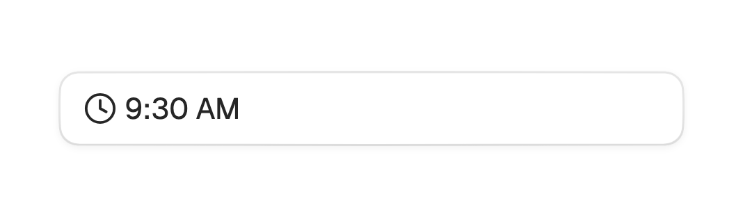
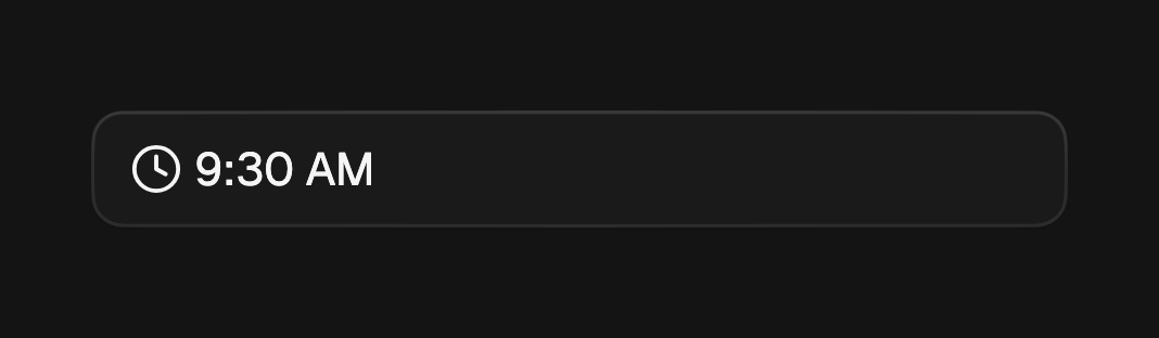
The time picker's trigger is the one FossDatePicker uses, so the two line up
in a form. Tapping it opens hour, minute, and period wheels. Unlike the date
picker it keeps a draft and fires onChanged only when the footer confirms,
since where a wheel happens to stop is not a choice.
import 'package:fossui/fossui.dart';

FossTimePicker(
  value: time,
  onChanged: (picked) => setState(() => time = picked),
);
The wheels
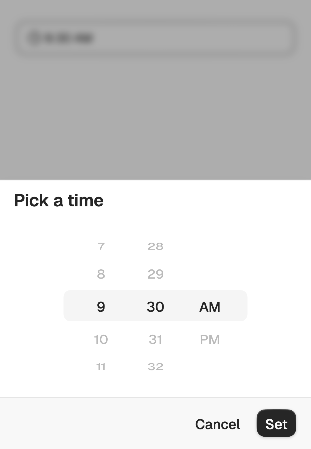
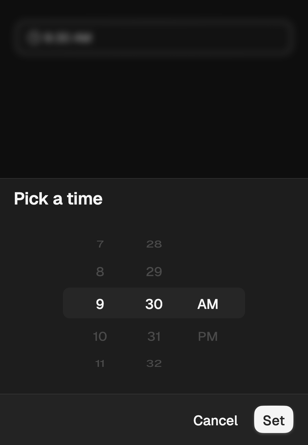
Each column is a labelled adjustable: drag it, or focus it and step with the
arrow keys. The centre band marks the draft. Nothing reaches onChanged until
the confirm action fires, and dismissing the sheet discards the draft.
FossTimePicker(
  value: time,
  confirmLabel: 'Set time',
  cancelLabel: 'Discard',
  onChanged: (picked) => setState(() => time = picked),
);
Hour format
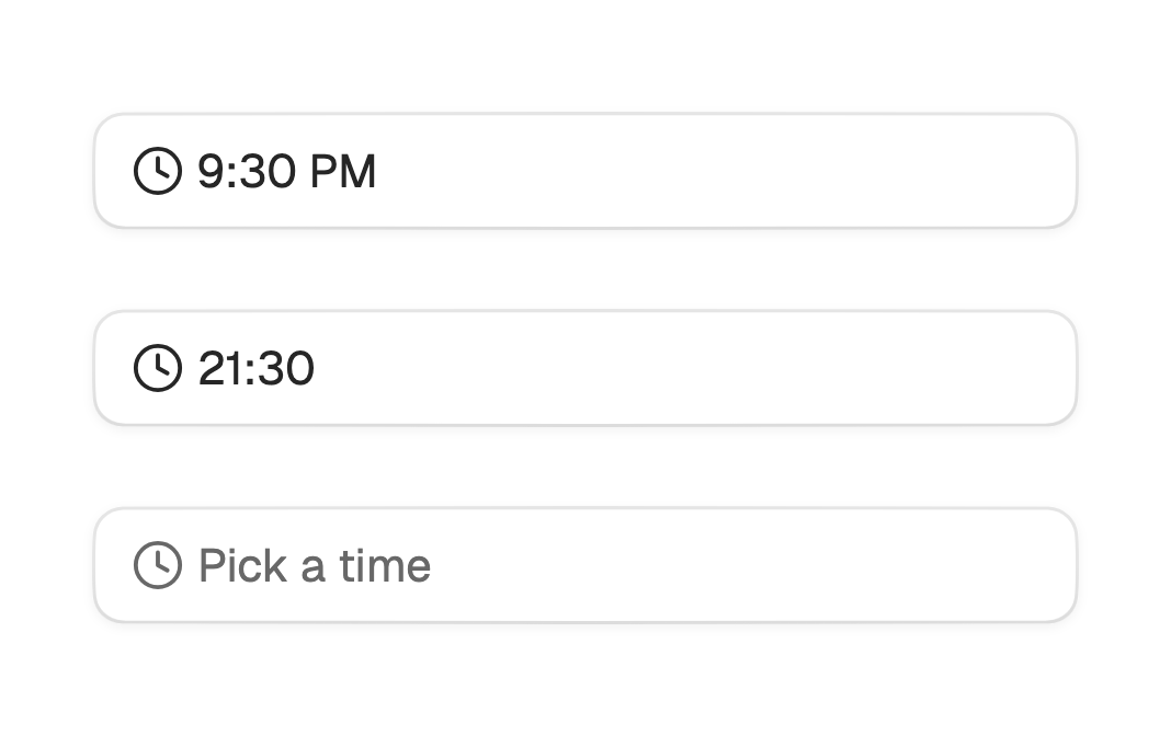
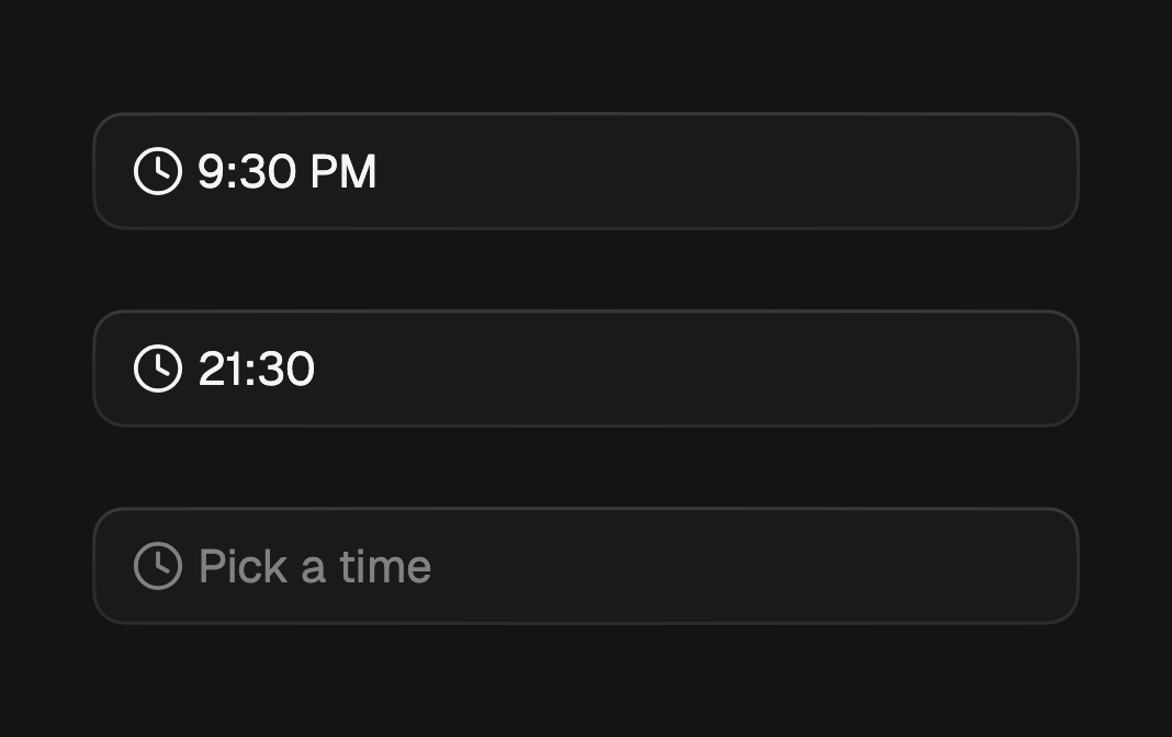
use24HourFormat reads and picks on a 24-hour clock, which drops the period
column. Leave it null to follow the device setting, which falls back to
12-hour. format overrides the trigger label without touching the wheels, and
placeholder is what the trigger shows while nothing is selected.
FossTimePicker(
  value: time,
  use24HourFormat: true,
  placeholder: 'Start time',
  onChanged: (picked) => setState(() => time = picked),
);
Minute step
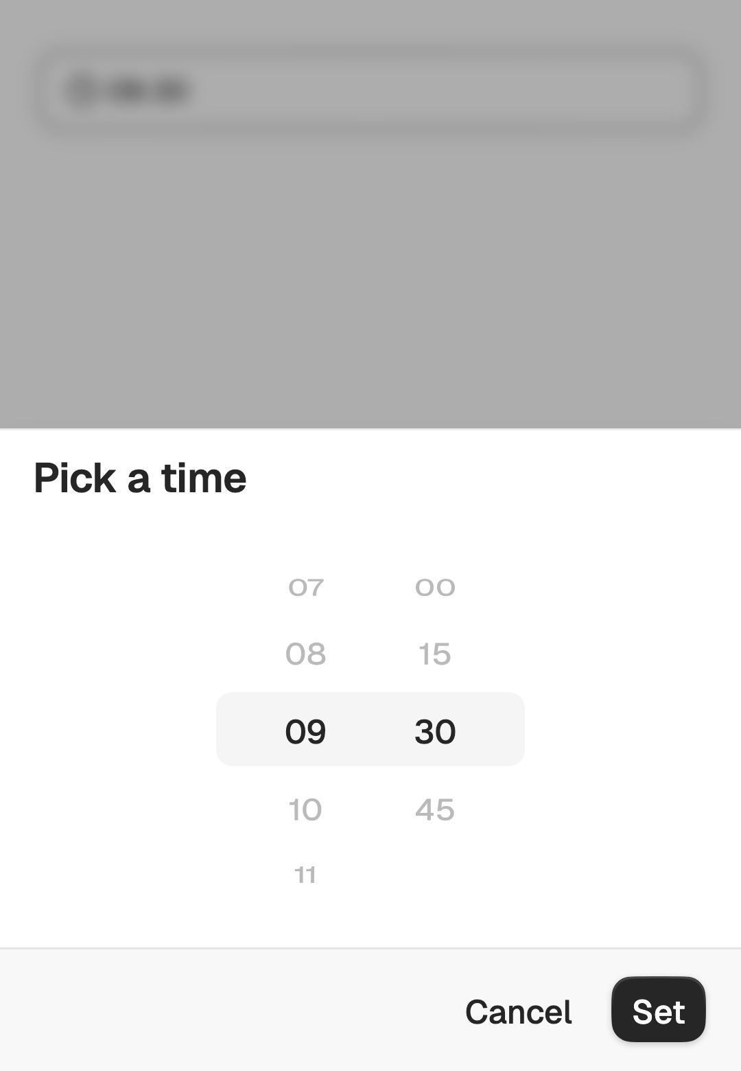
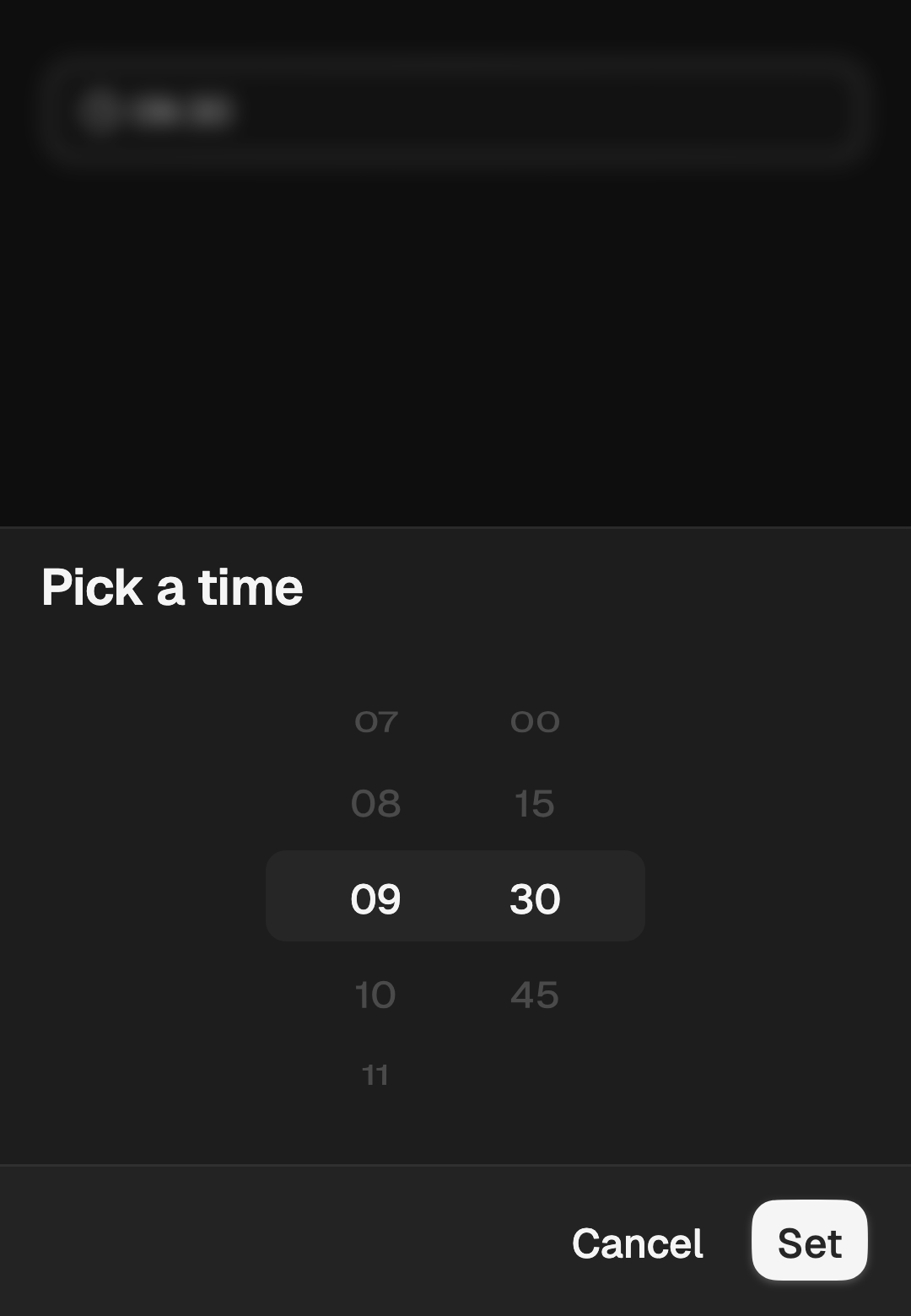
minuteStep sets the increment the minute wheel offers and must divide 60
evenly. A value that arrives off the grid shows as it is and snaps on the first
minute scroll.
FossTimePicker(
  value: time,
  minuteStep: 15,
  onChanged: (picked) => setState(() => time = picked),
);
Bounds and blocked times
minTime and maxTime are inclusive, and isTimeEnabled blocks individual
times on top of them. A blocked time stays on the wheel, dimmed, rather than
leaving a hole, and confirming is disabled while the draft rests on one. With
any bound in play the wheels stop looping.
FossTimePicker(
  value: time,
  minuteStep: 15,
  minTime: const FossTimeOfDay(hour: 9, minute: 0),
  maxTime: const FossTimeOfDay(hour: 17, minute: 30),
  isTimeEnabled: (t) => !lunch.contains(t),
  onChanged: (picked) => setState(() => time = picked),
);
Presentation
The modal opens as a bottom sheet by default. Pass
FossDialogPresentation.centered for a card in the middle of the screen, the
same enum the dialog and the date picker use.
FossTimePicker(
  value: time,
  presentation: FossDialogPresentation.centered,
  onChanged: (picked) => setState(() => time = picked),
);
Controlled open state
open puts the modal in controlled mode. Pair it with onOpenChange and
rebuild on every change, including a dismissal, or the picker and your state
drift apart.
FossTimePicker(
  value: time,
  open: pickerOpen,
  onOpenChange: (open) => setState(() => pickerOpen = open),
  onChanged: (picked) => setState(() => time = picked),
);
Disabled
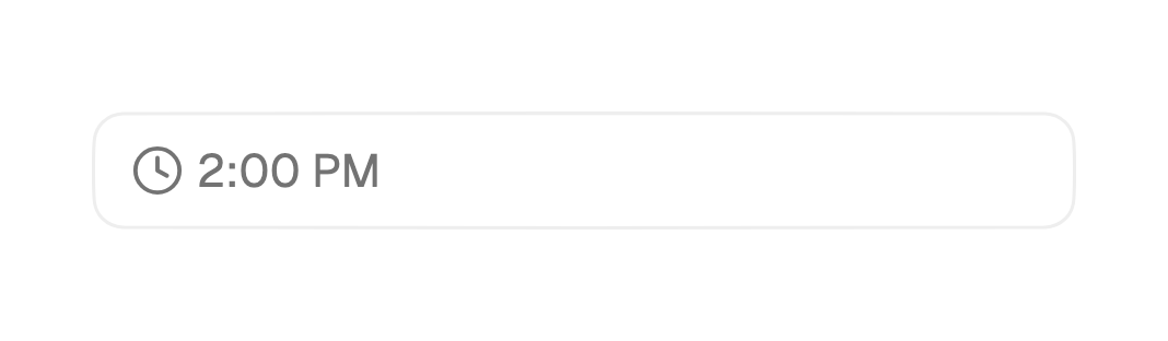
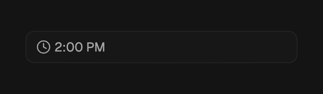
enabled: false dims the trigger and stops it opening.
FossTimePicker(
  value: time,
  enabled: false,
  onChanged: (picked) => setState(() => time = picked),
);
One-off styling
A FossTimePickerStyle tunes the wheel geometry and the placeholder for a
single picker. visibleItemCount must be odd and at least 3, so one row sits in
the centre band with the same number of neighbours above and below.
FossTimePicker(
  value: time,
  onChanged: (picked) => setState(() => time = picked),
  style: const FossTimePickerStyle(
    itemExtent: 44,
    visibleItemCount: 7,
  ),
);
API
FossTimePicker
| Prop | Type | Default | Description |
|---|---|---|---|
value | FossTimeOfDay? | required | The committed time, or null for none. |
onChanged | ValueChanged<FossTimeOfDay> | required | Called with the draft when the footer confirms. Never fires on a scroll. |
placeholder | String | 'Pick a time' | Shown while nothing is selected, and used as the modal title. |
format | String Function(FossTimeOfDay)? | null | Overrides the built-in trigger label. |
use24HourFormat | bool? | null | 24-hour clock, dropping the period column. Null follows the device. |
minuteStep | int | 1 | Minute increment; must divide 60 evenly. |
minTime | FossTimeOfDay? | null | Earliest selectable time, inclusive. |
maxTime | FossTimeOfDay? | null | Latest selectable time, inclusive. |
isTimeEnabled | bool Function(FossTimeOfDay)? | null | Blocks individual times on top of the bounds. |
open | bool? | null | Controlled open state; pair with onOpenChange. |
onOpenChange | ValueChanged<bool>? | null | Fires on every open or close request, dismissals included. |
presentation | FossDialogPresentation | bottomSheet | Bottom sheet or centered card. |
confirmLabel | String | 'Set' | Label of the action that commits the draft. |
cancelLabel | String | 'Cancel' | Label of the action that discards the draft. |
enabled | bool | true | Whether the trigger accepts input. |
semanticsLabel | String? | null | Accessibility name for the trigger. |
style | FossTimePickerStyle? | null | Per-instance overrides on the theme. |
FossTimeOfDay
A wall-clock time with no date and no time zone, stored on a 24-hour clock. It
implements Comparable, so bounds checks and sorting are one call, and it
carries value equality.
| Member | Type | Description |
|---|---|---|
FossTimeOfDay({required hour, required minute}) | constructor | hour is 0 to 23 and minute is 0 to 59; both are asserted. |
hour | int | Hour on a 24-hour clock, 0 to 23. |
minute | int | Minute past the hour, 0 to 59. |
compareTo(FossTimeOfDay other) | int | Orders two times by their position in the day. |
const opening = FossTimeOfDay(hour: 9, minute: 30);
const closing = FossTimeOfDay(hour: 17, minute: 0);
final isBefore = opening.compareTo(closing) < 0;
FossTimePickerStyle
| Field | Type | Default | Description |
|---|---|---|---|
placeholderColor | Color? | null | Color of the placeholder label. |
gap | double? | null | Gap between the clock glyph and the trigger label. |
itemExtent | double? | null | Height of one wheel row, before text scaling. Defaults to 36. |
visibleItemCount | int? | null | Rows a wheel shows at once. Odd, 3 or more; defaults to 5. |
highlightColor | Color? | null | Fill of the centre band behind the selected row. |
Live demo
Open the interactive gallery to try the wheels, the minute step, and both presentations with live knobs.