OTP Field
A segmented one-time-code field with per-character slots, paste support, and validation.
An OTP field enters a one-time code across a row of single-character slots. It sits over one hidden input, so typing advances the caret, backspace retreats, a paste (or the platform one-time-code autofill) fills the whole row, and validation drops rejected characters. The code is a plain string.
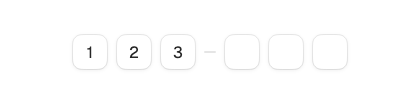

import 'package:fossui/fossui.dart';

FossOtpField(
  length: 6,
  value: _code,
  onChanged: (value) => setState(() => _code = value),
);
Pass length for the slot count. Use value with onChanged for a controlled
code, or omit value to let the field manage its own. onCompleted fires once
the moment the row fills.
FossOtpField(
  length: 6,
  onCompleted: (code) => verify(code),
);
Validation
validation sets the accepted character set: numeric (the default, with a
numeric keyboard), alphabetic, alphanumeric, or none. A rejected character
is dropped, never shown.
FossOtpField(
  length: 5,
  validation: FossOtpValidation.alphanumeric,
);
Grouping
groups splits the row with a small separator pill. The sizes must sum to
length, or the grouping is ignored.
FossOtpField(
  length: 6,
  groups: const [3, 3],
);
Masking
Set obscure to paint a dot in place of each character, for a sensitive code.
FossOtpField(
  length: 4,
  obscure: true,
);
Size
size picks the slot scale: md (36) as the default, or lg (40) for a more
prominent field.
FossOtpField(
  length: 4,
  size: FossOtpFieldSize.lg,
);
States
Set error to mark the field invalid, and enabled: false to disable it. A
disabled field dims and stops responding.
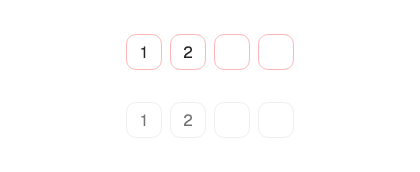
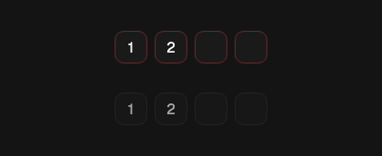
FossOtpField(
  length: 6,
  error: _invalid,
  onChanged: (value) => setState(() => _code = value),
);
Accessibility name
When there is no visible label, pass semanticsLabel to name the field for
assistive technology.
FossOtpField(
  length: 6,
  semanticsLabel: 'One-time password',
);
One-off styling
Global retheming is the first choice, but a single field can override its
resolved slots with a FossOtpFieldStyle. Every field is optional and falls
back to the theme.
FossOtpField(
  length: 6,
  style: const FossOtpFieldStyle(
    slotSize: 48,
  ),
);
API
FossOtpField
| Prop | Type | Default | Description |
|---|---|---|---|
length | int | required | Number of slots, and the maximum code length. |
value | String? | null | Controlled code. Omit for an uncontrolled field. |
onChanged | ValueChanged<String>? | null | Fires with the whole code on each edit. |
onCompleted | ValueChanged<String>? | null | Fires once when the row fills. |
size | FossOtpFieldSize | FossOtpFieldSize.md | Slot scale (md 36, lg 40). |
validation | FossOtpValidation | FossOtpValidation.numeric | Accepted character set. |
groups | List<int>? | null | Group sizes that split the row; must sum to length. |
obscure | bool | false | Mask each character with a dot. |
autofocus | bool | false | Focus the field on first build. |
error | bool | false | Marks the field invalid. |
enabled | bool | true | Whether the field accepts input. |
semanticsLabel | String? | null | Accessibility name for the field. |
style | FossOtpFieldStyle? | null | Per-instance overrides on the theme. |
FossOtpFieldStyle
| Field | Type | Default | Description |
|---|---|---|---|
backgroundColor | Color? | null | Fill color of each slot. |
borderColor | Color? | null | Resting border color. |
borderRadius | double? | null | Corner radius of each slot in logical pixels. |
slotSize | double? | null | Edge length of each square slot, before text scaling. |
textStyle | TextStyle? | null | Style of the slot character; color stays token-driven. |
gap | double? | null | Gap between slots and around a separator. |
shadow | List<BoxShadow>? | null | Drop shadow layers at rest. |
separatorColor | Color? | null | Color of the group separator pill. |
separatorSize | Size? | null | Size of the group separator pill, before text scaling. |
Live demo
Open the interactive gallery to try every size and state with live knobs.